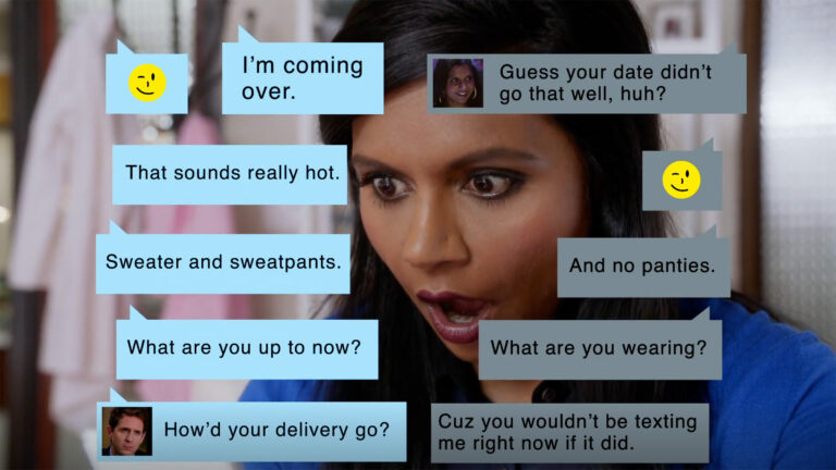
We live in a Golden Age of television, ripe with a never-ending bounty of exceptional dramas. As soon as we’re done with one, there’s another just waiting for us. And with each new show we tackle, we’re treated with a welcome side product of our era of great television: conceptually and visually brilliant opening titles. We’ve now reached the point where we expect nothing less from a new prestige drama.
Whether it’s Six Feet Under, Mad Men, Game of Thrones or Westworld, modern TV titles are more than just visual feasts.
When done well, titles serve a fundamental purpose.
“One of its primary functions should be to prepare you — a curtains-rising-and-lights-dimming type of moment — to be told a story.” says Alan Williams, a creative director at Imaginary Forces who created titles for Jessica Jones, Boardwalk Empire and more.

“It gets you out of reality and pulls you into the eyes of the storyteller.”
We had an opportunity to speak directly with Alan and a number of the leading title designers in the world. One such designer is Patrick Clair, the creative director behind the openings of American Gods, The Man in the High Castle, The Crown, and True Detective (for which he won an Emmy).
He shares a similar sentiment to Alan’s:
“It’s really just giving people a chance to transition back into that world or—if it’s episode one—into that world for the first time by setting a mood and a tone for them that fits with the world and that speaks to the world.”

Different main titles do that in different ways. Some do it by conveying a show’s theme, concept, characters, tone, and more. But all look to capture something essential about the show they’re guiding us into. With that in mind, we took a look at nine iconic modern TV titles to consider what they accomplish, how they do it, and what you can learn from them.
Making the Magic Happen
The best opening TV titles have one important thing in common: the creative directors and teams who make them happen often don’t want you to think about how they were made, or who made them.
“As a director, one of the greatest compliments you can give me is ‘I had no idea you did these titles,” Alan told us. He says the key job of any filmmaker is to draw the audience in, and make them forget they’re watching a TV show or movie.
A crucial means of achieving that is always serving the project, not yourself. “If my comfort zone is 3D, using Cinema 4D and photorealistic renders in Octane, I should never try and force the vision of that show through that very narrow pipeline simply because it’s what I’m good at. It would be easier, and far more comfortable, but if it doesn’t perfectly align with the show’s vision then it’s wrong. It’s the difference between a timeless title and one that people will watch 5 years from now.”
Ironically, it takes a significant amount of work to create something that you don’t want people to notice. Alan broke down his process for us. “My first step in developing a title sequence is to listen and research. Your assets may be a mere pilot script and a 15 min kick-off call with the director. It’s my goal to really analyze and digest that content before ever moving forward conceptually,” he says. “TV show directors and writers live and breathe their show. They want these titles to feel strikingly unique and yet you must do it within the boundaries of the show’s tone and vision.”
That done, the project moves forward. “After that, like any creative venture, I seek out inspiration. Usually, this begins with music, finding a song that I feel best encapsulates the tone of the show and then I repeatedly listen as I dive deep into my ocean of Pinterest boards, film clips, quotes etc., until I find a dozen gems that could collectively lead to a new idea. I begin writing and developing my treatment book from day one.
“It’s incredible how something could look so good or bad in your head but when you simply write it out or attach a few pages of reference to it, it can be seen totally different. It’s after the writing and reference hunting that I work with a team of storyboard artists, photoshop gurus, animators, and a killer editor to flesh out the rest.”

With the research done, the storyboards created, and the Cinema 4D projects rendered, these titles are put to “the test.” Will they become iconic contributions to pop-culture fare, studied and written about for decades to come? To answer that question, let’s look at the aforementioned 9 sequences and see if what makes them timeless and so effective at serving the shows they belong to.
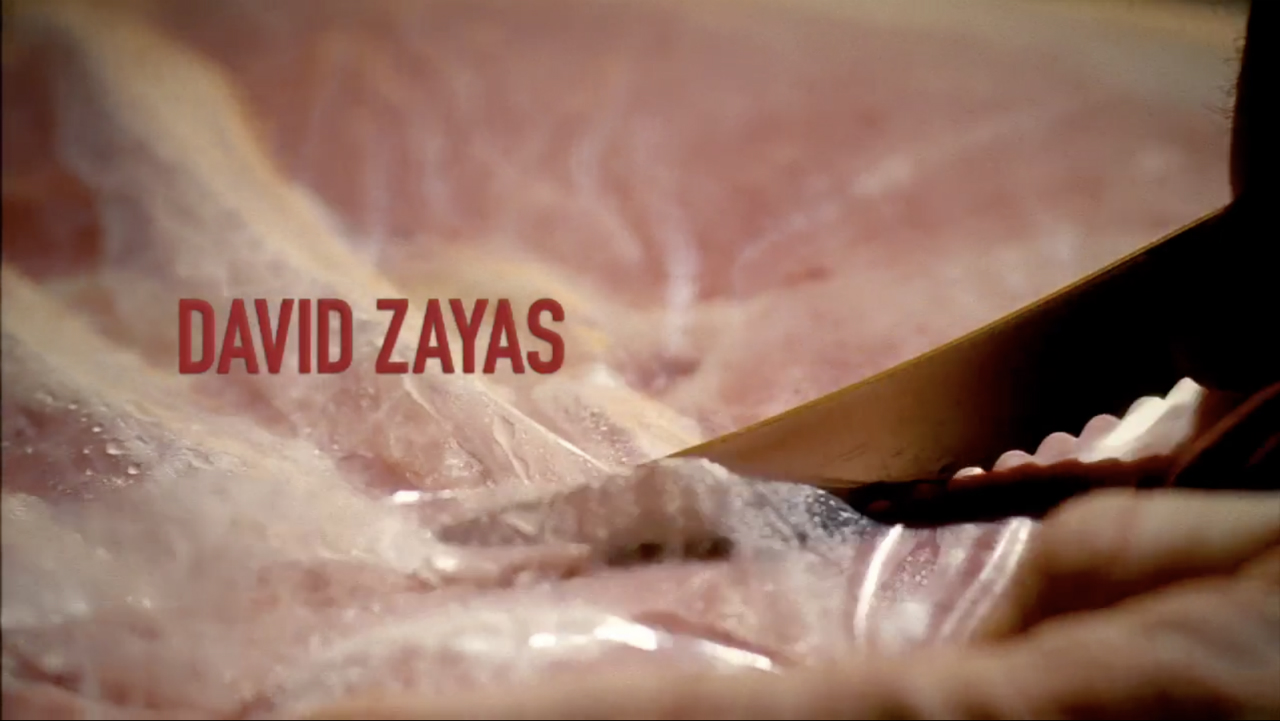
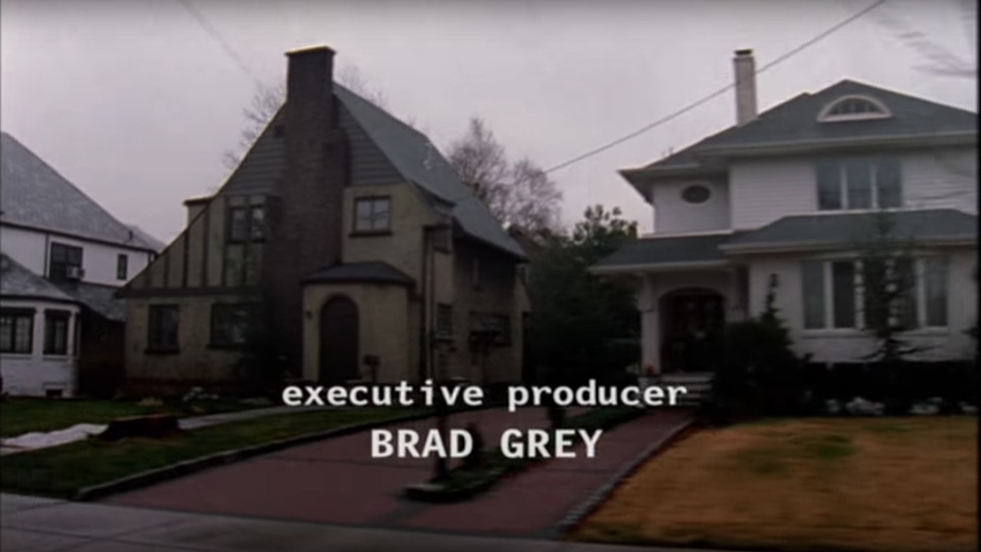
24, Dexter and Game of Thrones
24: Concept in 15 seconds
As opening titles go, 24’s is the essence of minimal: a simple animated graphic of the number “24” in a typeface that recalls the digital display of your dad’s old alarm clock. But simple doesn’t mean unsophisticated, because in 15 seconds the opening manages to succinctly capture the whole concept of the show. As Patrick put it to us: “It totally serves the fundamental of the story, which was about time running out.”
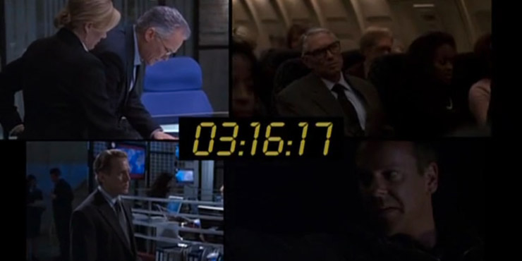
Form mirrors content with the alarm clock aesthetic, but also the added touch of relentless tension and pace of the show is cleverly built into how the “24” emerges at a rapidly accelerating pace, like a time bomb ready to explode. It acts as a starter gun, propelling the viewers into the sprinting pace that marked every episode—but that nonetheless embodies the show concept. Because that pace is, in many ways, the show. And it’s a remarkable feat of efficiency that 24 conveys that with nothing more than a black screen and a digital typeface.
Dexter: A Closer Look at Theme
Throughout its eight-season run, Dexter explored the life (and murders) of a serial killer lurking in plain sight by living an everyday life. That may have been the concept of the show, but thematically it was about something deeper: how darkness lurks within all of us and our normal-seeming world.
For Art of the Title, creative director Eric Anderson recalled something that came up in developing the titles: “Everything, no matter how mundane or beautiful, has an undercurrent of violence to it. It is just a matter of how closely you look.”
Dexter’s opening captures that by (literally) looking closer. A mundane morning routine is revealed to be inherently violent through extreme close-ups. We see a piece of ham sliced open like human flesh, a string of floss tightened around a finger like a garrote being readied, a shirt pulled on and pressed into a face like someone being suffocated.
There’s a cheeky playfulness to the sequence—especially how the edits take us back and forth from innocent to malevolent versions of moments. But nonetheless, cooking, flossing and dressing are transferred into dark deeds reflective of those committed by Dexter.
As Alan told us: “For 90 seconds you don’t just see Dexter Morgan, you become him.” And in doing so, we’re taken into the show’s theme as well. As Patrick Clair shared with us: “It makes you think about the incredibly dark things that Dexter is doing and then it makes you think about the incredibly dark things that we all do in our lives every day.”
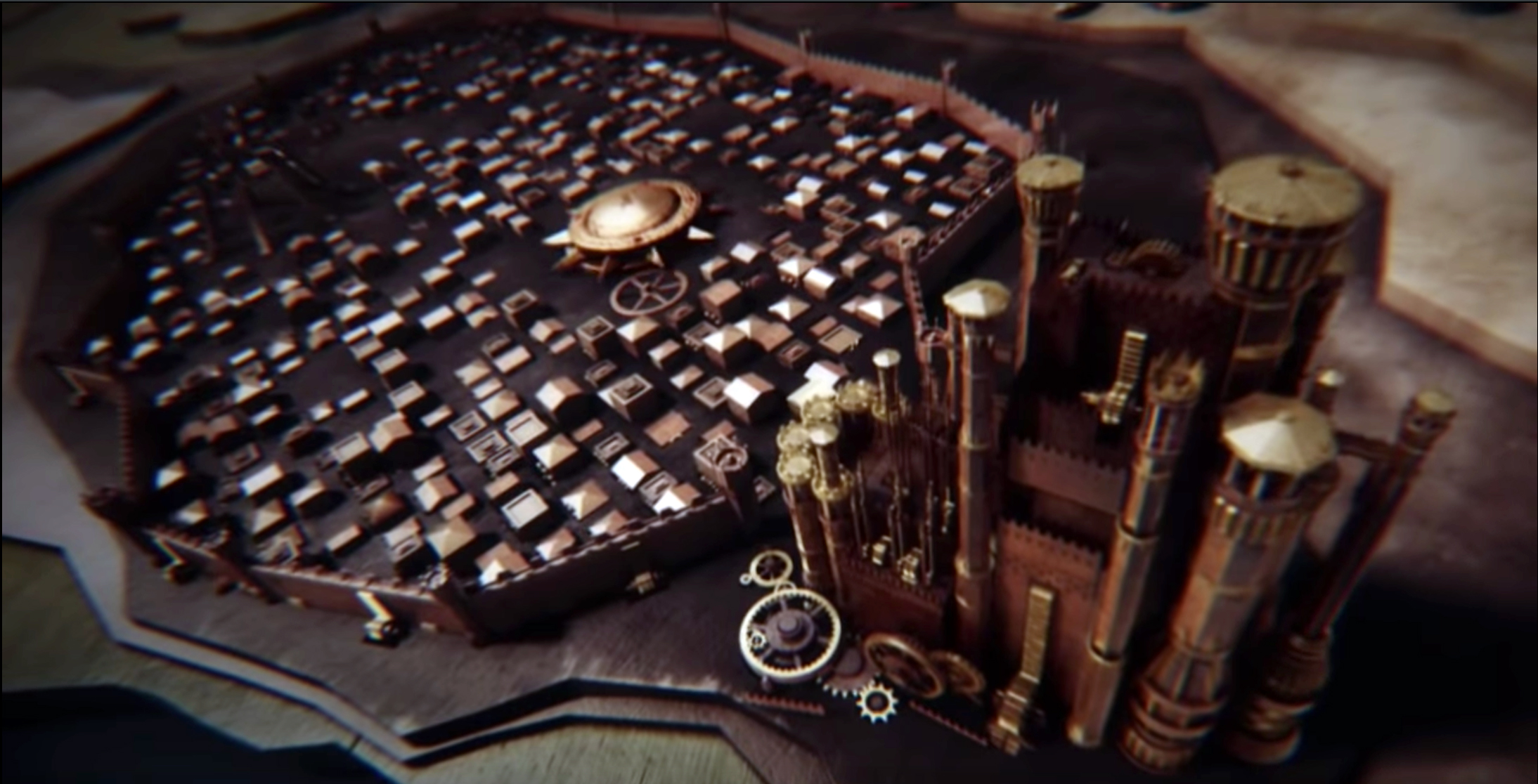
Game of Thrones: A Functional Guide
Old TV shows like Gilligan’s Island or The Brady Bunch often had openings that served very functional purposes: to introduce (or remind) viewers, in very spelled out ways, what the show’s core concept was.
Now, Game of Thrones may not seem like a logical successor to Gilligan’s Island, but their openings do share a utilitarian purpose. In the case of Game of Thrones, that purpose is to familiarize viewers to a place, not a plot.
Showrunners Dan Weiss and David Benioff have said they didn’t necessarily want an opening title sequence per se. They just wanted a way to help orient viewers to where any respective episode would be taking place—not unlike the maps you see at the beginning of fantasy novels.
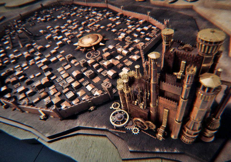
Elastic—the studio that created the opening (and where Patrick worked for a period of time)—ended up creating what has now become an instantly iconic sequence. And its functionality is part of why its creative director, Angus Wall, thinks the titles have been so well received. As he shared with us, “I think it works because it has a very specific function (as the “legend” for the show and episode) and it is visually unique. It’s more of an ancillary storytelling system than a title sequence.”
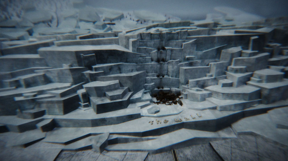
Patrick agrees. “I think it’s cool in myriad ways,” says the creative director about Angus Wall’s work. “It starts with a simple insightful and incredibly badass thought—‘What if we made the map a globe and what if the globe was inverted?’—Just that very sort of simple insight has set up eight seasons of awesome evolving maps that just celebrate everything that’s cool about the Game of Thrones universe. I wish I was so clever every time I go to create something like that.”
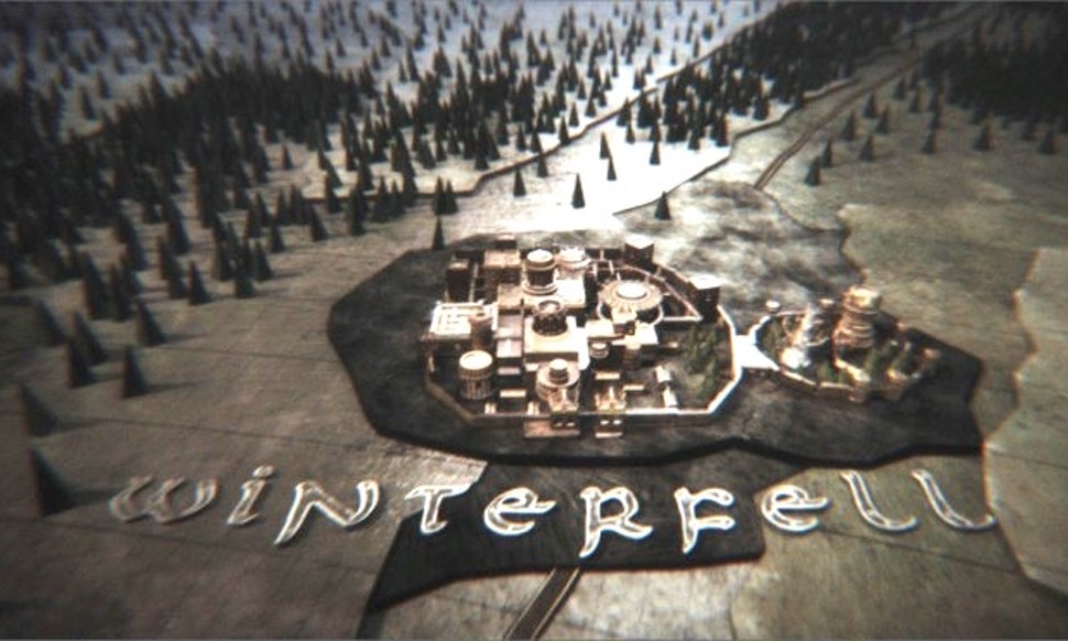
But while Game of Thrones credits do serve a geographical purpose, that’s not to say that the sequence isn’t creatively inspiring. Nor does it lack thematic relevance. Consider how the camera’s movement from place to place nicely mirrors how Westeros’ dense geopolitics see actions in one location ripple out to others. Or, what about how the cog-based machines representing places also neatly symbolize the machinations of the characters and factions within the show? And don’t forget the Dyson sphere with “Game of Thrones” written on it, hovering sun-like above the map, as if it is powering the game of thrones being played below.
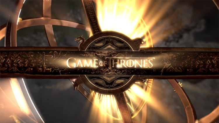
Nonetheless, for all its creative purpose, it never loses sight of its first purpose: allowing viewers to see where they’ll be spending each episode.
Halt and Catch Fire, The Leftovers, and Mad Men
Halt and Catch Fire: Capturing the Journey
The opening of AMC’s Halt and Catch Fire is unconventional in several ways that make it stand out. There’s the overwhelming all-red color scheme few would consider tackling. Then there’s also the fact that the characters are digitally distorted to the point of nearly being unrecognizable. Or the fact that the characters are essentially relegated to background status in favor of a little moving pixeled dot making its journey through the credits.
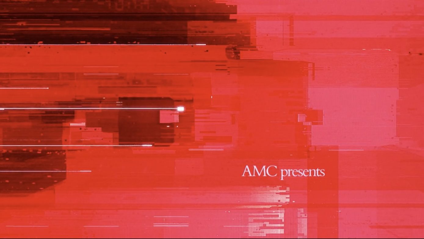
But what drives the opening title sequence so firmly into our memories is its clever concept. Patrick oversaw the creation of the sequence, and he told us that “The most common metaphor for coming up with an idea is a light bulb switching on. We just wanted to tell the story of a light bulb coming on in a 1980 computer.”
That story, in itself, mirrored the thematic one behind the show. “It’s a show about the pressure of ideas. The pressure people put on themselves to come up with inspiration and ideas and the way that can crush them and destroy them and drive them into unstable pieces while also driving them into the stratosphere of success,” Clair explains.
In that way, Halt and Catch Fire stands out because it conveys, albeit in a very abstract way, that journey in an almost self-contained way. But also in a way that never loses touch with what happens through the show itself.
“For a title sequence to have value, it has to have things in it that resonate with the journey of the main characters. That doesn’t mean it needs to have specific story points in it, but it means that the main titles need to give you a deeper understanding of the story and who these people are, what compels them, what challenges them, what they need to overcome, as you go through that series,” Clair says.
The Leftovers: Setting the Tone
If you want a case study for how opening titles can both capture and influence the show you’re about to watch, look no further than The Leftovers. In Season 1, the opening titles offered a solemn Church fresco-like depiction of the Rapture-like circumstances of the show, where 2 percent of the world’s population mysteriously vanished.
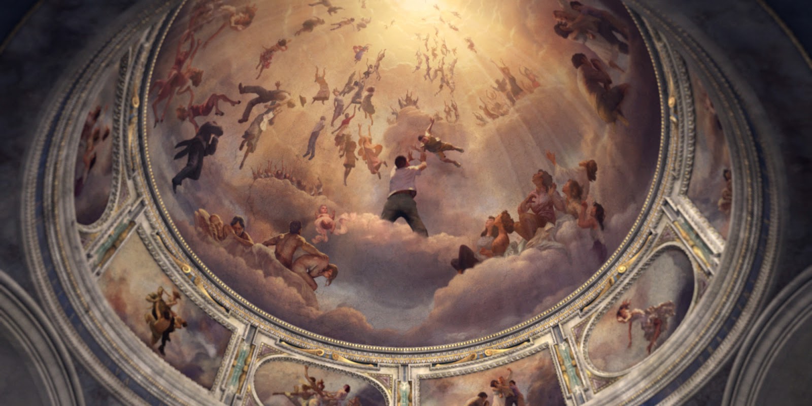
But Season 2 did something unconventional: it offered an entirely new opening, with artistic photographs of everyday moments, left partly vacant by silhouettes of the departed, all while being accompanied by a jaunty folk song.
The shift away from the dour Season 1 opening was very much planned. Gone was the somber tone and suggestion that the show was more about those who vanished. In its stead we got an opening that reflected the show’s philosophy that joy and despair can exist side-by-side, that accommodated the show’s ambiguity towards its mysteries (“Let the Mystery Be” is what the song is called), and acknowledged that the show was in fact about those who were left behind with holes in their lives (and photographed memories).
Mad Men: Setting the Mood
Chances are just reading the words “Mad Men” has now summoned the iconic opening title into your mind. It’s become inseparable from the show, which testifies to how significantly it represents the classic AMC series. Most significantly? It’s mood.
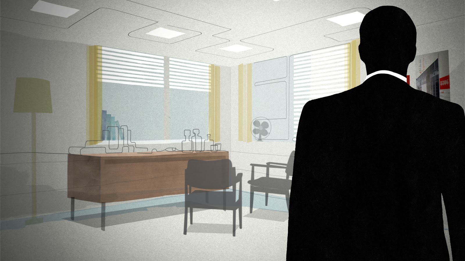
Because we’re so familiar with it now, it’s easy to forget that Mad Men’s opening titles are, well, kind of strange. After all, there’s something almost eerie about how Don Draper’s counterpart steps into his office, accompanied by odd music, and then everything melts around him, sending him into an infinite freefall among skyscrapers emblazoned with huge ads. It’s almost nightmarish. So much so, that when AMC executives were shown it, they were skeptical, and compared it to The Twilight Zone.
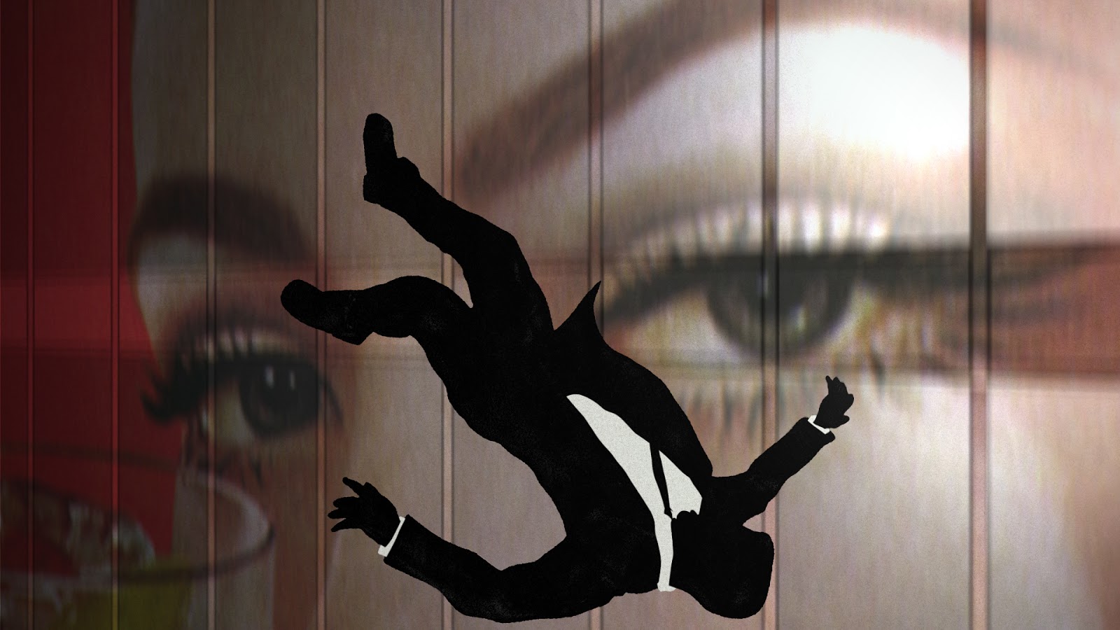
As Patrick put it: “What’s great is if you summed it up in a sentence like… ‘It’s about a man in free fall’. That is a fundamental truth about Don Draper’s inscrutable character that’s as true in episode one as it is in the series finale.”
But inscrutable doesn’t mean impenetrable. In its oblique approach to mood setting, the opening still makes clear this is a show about the advertising world. But its surreal concept also conveys how the advertising world is just a backdrop for the frequent existential freefalls of its characters. The gravity of that (pun intended), and that larger preoccupation, is all right there in the opening, acting as an emotional primer that encourages you to not just see a man in an office, but something more.
Stranger Things, The Sopranos, and True Detective
Stranger Things: The Power of Typeface
If you’ve ever doubted the power and influence of typeface when it comes to design and storytelling, look no further than Netflix’s darling, “Stranger Things.” For viewers with certain pop culture inclination, the moment they first saw the opening titles, geeky delight likely surged through their veins. The combination of a moody pulsing Blade Runner-like synth score, coupled with a genre-rich nostalgic typeface, conjured an instant shorthand evocation of the 1980s pop culture of John Carpenter, Stephen King, and Steven Spielberg. Which is precisely what Stranger Things aspires to do.
Speaking of the prolific author King, his work directly played a role in the conception for subconsciously capturing that essence of horror and homage.
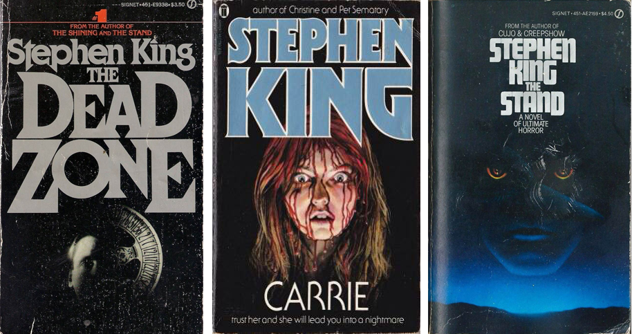
But it’s not just homage for its own sake. It’s homage in service of mood. For one, yes, it’s prepping us for the nostalgic love letter we get in every episode. But like 24’s typeface, Stranger Things’ conveys more about the show. The eerie music leaves little doubt (if not outright adds enthusiasm) as to what we’ll see. And the disassembled letters, slowly coming together to spell the show’s title, nicely convey the frequent uncertainty, confusion, and mystery surrounding the show’s events. It’s that deft juggling of multiple purposes that have arguably made Stranger Things’ titles, even by today’s standards, an instant classic.
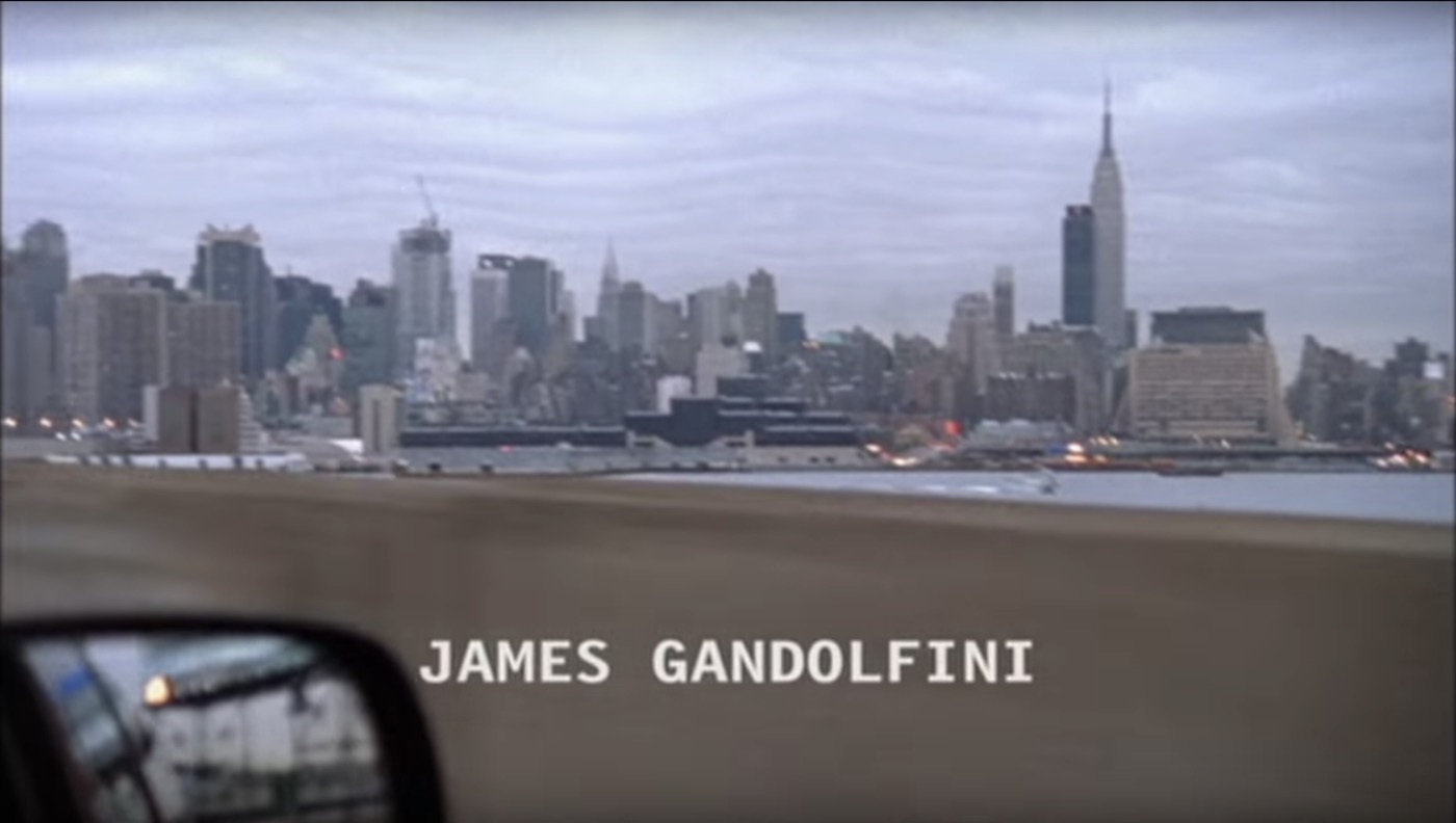
The Sopranos: Establishing a World
If there’s a Ground Zero for the current Golden Age of television and opening titles, it’s The Sopranos. Back in 1999, it broke from tradition by foregoing the standard practice of showing a show’s cast. Instead, it offered something more abstract, artistic, and self-contained.
In particular, it’s a “little movie” conveying the world of Tony Soprano.
To be precise: New Jersey.
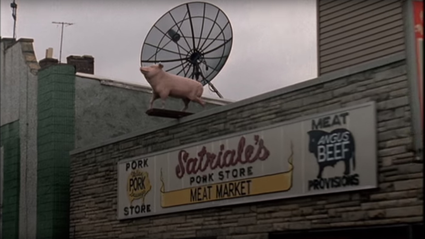
Starting with Tony pulling out of the Lincoln Tunnel into The Garden State, the sequence tracks the world he rules, as his drive sees him essentially surveying his domain—stretching from Manhattan to his mansion.
Furthermore, it conveys that this isn’t a typical gangster world. This one is more blue-collar and industrial, like New Jersey itself, with its lonely bridges, truck-filled turnpikes, construction sites, and empty gas stations. But as much as it’s designed to show us a world, Tony’s drive is also a clever way to transport us into each and every episode. No different than how Tony is transporting himself into his kingdom.
As cutting edge as these titles were for their time, in many ways they harken back to an older decade of television title sequence design. Tony’s drive is not unlike the opening titles of such classic 70s shows as “The Jeffersons,” “All in the Family” “Chico and the Man” and “Good Times.” Those shows’ openings accomplished a very similar objective—establishing not only the visual dynamics of their world, but also when combined with music, communicated a truly cultural world too.
In the case of the aforementioned 70s shows, the culture the music conveyed was more ethnic. “The Sopranos” theme song (“Woke Up This Morning” by Alabama 3), isn’t so much an ethnically cultural song, but instead communicates the grim, hard, violent “culture” of Tony’s gangster underworld.
Whether or not Tony’s drive into Jersey was directly inspired by those sequences from its past, you cannot deny the influence its storytelling and execution had on the shows that came after.
True Detective: (Double) Exposing character
It first goes without saying that the main titles for True Detective are beautiful. The aesthetic alone would earn these titles “iconic” status. But that would mean overlooking what makes it especially remarkable: how it comments on and reflects character.
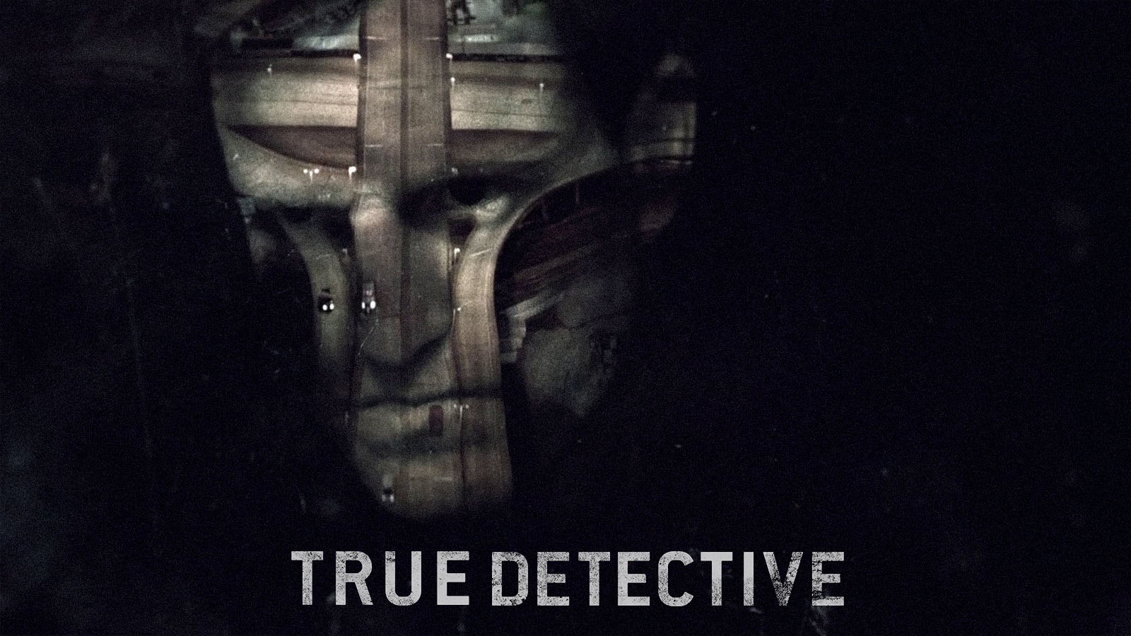
Patrick Clair says that when he met showrunner Nic Pizzolatto, the sequence was conceived around character. “He said that True Detective was using the polluted, exploited, broken landscapes of this part of America as a metaphor for the broken, exploited people at the heart of its story. Be that the main characters or be that the ancillary characters. That led to a very simple thought: what if we made broken portraits out of broken landscapes,” Clair told us.
Place is a vital component of True Detective, but never at the expense of the main focus on people. Deeply broken people, to be precise. The double-exposure symbolizes that through irreconcilable images nonetheless inhabiting each other, reflecting people torn between two different states.
The slight, but nonetheless pervasive, movement within the silhouettes also reflects the constantly stirring inner conflicts and demons (note all the fire towards the end of the titles) within them. By the time the opening is done, you have a deep subconscious understanding of these people in a way that’s rooted in you visually.
A Celebration of Story
“When a showrunner comes to us, they may have spent 10 years developing their story. When I’m given the honor of 45 or 90 secs, regardless of how poetic or abstract it may be, the titles have to point to and celebrate that story.”
These are the words Alan Williams shared with us when giving his overall take on this genre of art and media collaboration.
Whatever else the above titles accomplish—conveying concept, tone, theme, and more—what makes them perhaps stand out more than anything? They celebrate the stories they’re leading into. It’s why they’ve embedded themselves so firmly in our minds. Angus Wall told us that a great opening titles sequence “does something essential to the viewing experience that the show can’t or won’t.”
Because when we see these sequences, whether it’s at the beginning of an episode, during a rewatch, or a random YouTube viewing, they make us think of the stories these shows tell us, and what they mean to us. There’s no greater compliment than that for an opening title.
What are some of your favorite TV title sequences and why? Have any of them inspired you in your work? Which ones (or one) have been indelibly seared on your brain.