Graphic design in film, and real life
Film and television are visual mediums, which at the most basic level means that almost everything that happens in front of the camera (unless it’s removed in post) is meant to be seen. The director, cinematographer, and editor unite to play the role of the Wizard, putting on a show and distracting the audience from all of the pieces behind the curtain that keep Oz afloat.
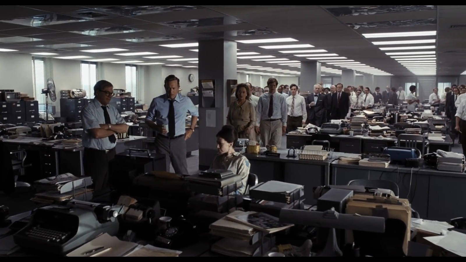
While you’re reading a character’s facial expression, the time on a clock, or noticing a possible threat looming in the background, there can be dozens if not hundreds of other objects in the frame that are meant to complement, not detract from the main subject—tangible, presumably non-sentient objects that add dimension and a lived-in quality to human environments on screen.
You’re surrounded by it
Look around yourself right now. Odds are that in your immediate vicinity there are everyday objects that you only notice when you need them, when they are explicitly singled out, or when you’re bored and your eyes begin to wander. Leafed-through newspapers, stacks of magazines, shelf-worn books, posters, letters, fabrics, signs, postcards, clothing and box labels, wallpaper, and candy wrappers are all examples of objects that exist in our world whether we actively acknowledge them or not.
On-screen, as it is IRL (in real life), someone (or several someones) is responsible for designing and producing those physical objects. Those people are often credited on IMDb as graphic designers.
To be honest, creating graphic design in film or television is a thankless one. It’s great for producers and directors to have graphic designers around because sourcing and using real products from actual brands would be a logistical nightmare (not to mention expensive), but if a designer is doing his/her job well, the average viewer won’t be able to tell that a job was done at all, or that it was done several times over. But there are exceptions.
We spoke to a couple of professionals who have worked in television and film to learn more about the career.
Enter the auteurs
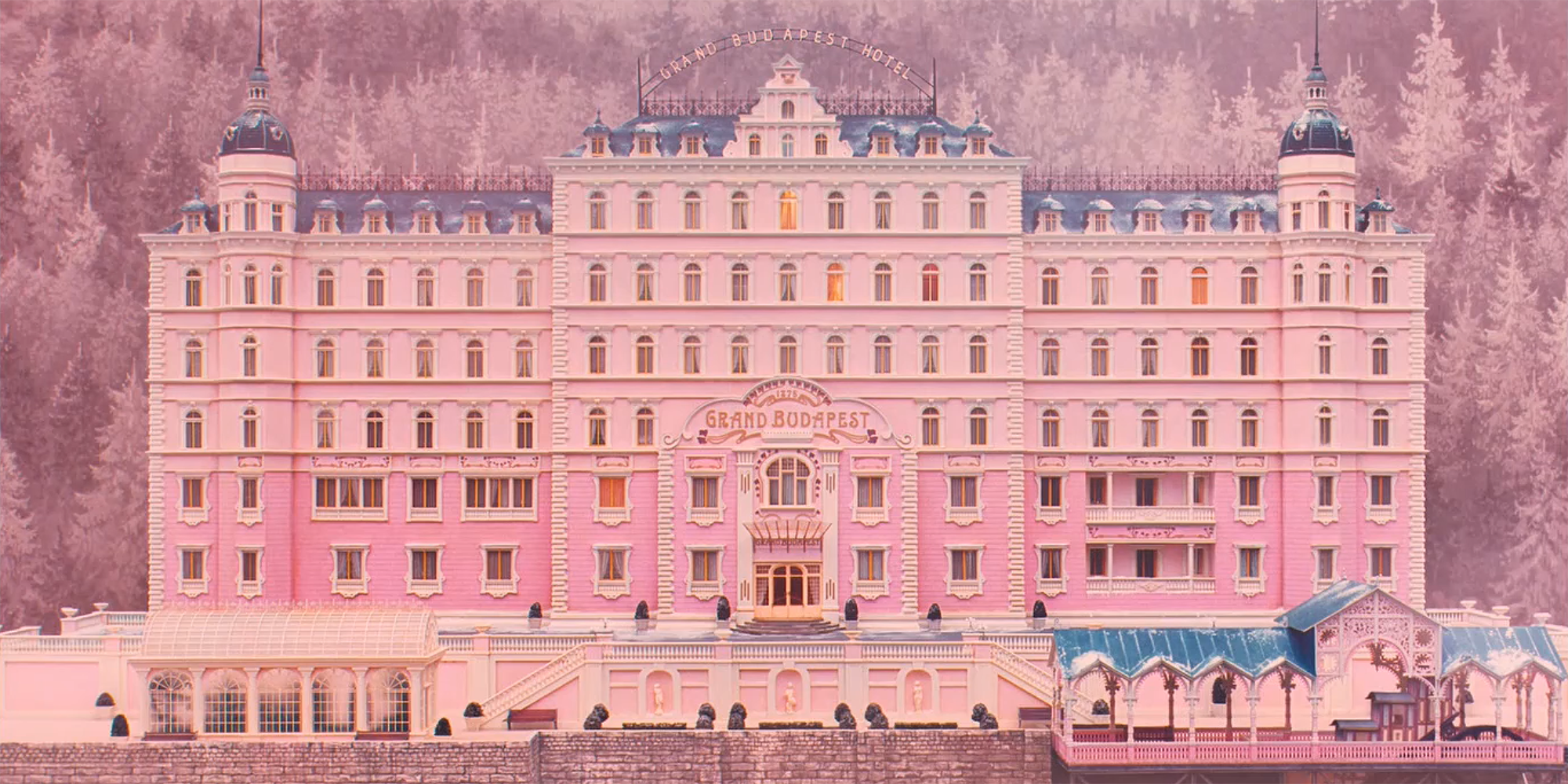
Google “Wes Anderson + graphic designer” and you’ll find the work of Annie Atkins. Actually if you just Google “graphic design for film” you’ll see Atkins’ name and links to interviews, profiles, and features about the work on shows and films including Isle of Dogs, Bridge of Spies, The Boxtrolls, Penny Dreadful, and The Grand Budapest Hotel.
Atkins got her start out of college working on the third season of The Tudors and has since built a career out of graphic design for film, often hand-making objects for productions so that they are as accurate to the time period as possible. Aktins’ work with Anderson is her best known, largely because of the nature of Anderson’s films.
Upfront
While handmade scrolls and newspapers go largely unnoticed in a show like The Tudors or Penny Dreadful, they take center stage in a Wes Anderson movie where every frame is a perfectly symmetrical painting and the camera often zooms in and lingers on objects of importance. That sort of attention welcomes scrutiny, which we will talk about more later, but it’s a good place to jump into our interviews with other designers who, like Atkins, have gotten their hands dirty on the big and small screen and have useful insights into how it all works.
Let’s meet the crew
We connected with two accomplished graphic designers for this article.
Robert Bernard has worked in the art departments for a number of popular television shows including NCIS, Ugly Betty, The Office, Castle, The Newsroom, Brooklyn Nine-Nine, Veep, and several seasons of American Horror Story.
Martin T. Charles of SagaBoy Productions also has credits for episodes of The Newsroom and other television shows, but a long scroll through his IMDb page reveals dozens and dozens of film credits from the ‘90s until today, with D2: The Mighty Ducks, Fear and Loathing in Las Vegas, How the Grinch Stole Christmas (2000), A.I. Artificial Intelligence, Minority Report, The Artist, The Avengers, 42, and A Wrinkle in Time, to name a few.
To accommodate their busy schedules and to get two different perspectives, we gave both graphic designers the same prompts. Here’s what each had to say about their experiences, things they’ve learned along the way and tips for budding graphic designers, and what they think about the current state and future of graphic design for film/TV.
The Process
Walk us through the process a bit: what’s the first step after landing the job? Are you given a script? Do you get to meet with the director/writers?
RB:
“The first thing to know is that every project is different and will have different needs. Features and episodic are also very different animals, in terms of prep time and managing the workflow during filming. Typically the graphic designer is one of the final members to come onto the art department. The Production Designer, Art Directors and Set Designers have already been very busy getting construction going, and it’s up to us to come in and work on the specific art unique to this new world. Getting familiar with the script and the needs of the project are the main focus early on, and meetings with the director/writers is not common during prep. Those meetings happen with the department heads, while the rest of the crew is busy doing what they do best, trying to make those words on a page into something an audience will enjoy.”
MC:
“Landing your next job is quite exhilarating! If it’s a new production designer, before I interview or when I get the call, the very first thing I do is research him or her and the director. That sets the time for the approach of the project. Once the deal is made, it’s time to dig in after the NDA is signed. I would read the script to get an overall scope of the movie, but immediately go back to take carefully detailed notes. Every word and scenario has to be interpreted and cross-checked with the production designer because he would already have an idea of the graphics. My hope is that we would be on the same path or at least close. When there are specific scripted terms or descriptions that need further clarification, we then go to the director and writers.
Research
What percentage of the job is research and what percentage is physically designing/making the objects?
RB:
Some shows are very, very research-intensive. Period pieces for example, where recreating that world is paramount. Other shows will use limited research to guide a style for a specific location or set. We have to create a convincing environment for the actors to work in, so knowing what big and little details will help the audience suspend disbelief and keep the focus where it needs to be: the story being told.
MC:
As a general rule, period films are mostly research for the overall look of that era, but factious companies, props, products, etc. have to be designed to match the period. For example, ‘42’ was all about baseball, and all of the advertising at the ballpark was about recreating the actual products and companies. But when you walked down a neighborhood street, the businesses were all fictions designed to fit into the period.
What Does & Doesn’t Work On Camera
Are there any general tips you’ve learned along the way about things that do or don’t work on-camera that have changed your process?
RB:
In many parts of the job, things are simply what they are: company logo, a billboard, a newspaper, a tube of toothpaste, etc; and as the graphic artist, it is important to know when your designs will need to be the center of attention or need to blend into the background so as not to distract from something else going on. It’s a learning process for learning which materials work based on where filming will happen, for installation at a location, on set, or if the work will be going straight to a playback company or post-production. A simple rule is that bright whites and glossy surfaces make the job of the DP much harder, so it makes everything easier to avoid those unless specifically needed.
MC:
Here’s a simple one. If you want white on camera, your graphics have to be off-white or it will create hot spots on film. You learn as you go, and after 80 plus films, I’m still learning on how to make my graphics read better on film. Typically you have split seconds, if that, to communicate your ideas, so the graphics have to be absolutely clear. You can’t expect the audience to figure out your thoughts. What works in life almost gets lost on film unless it’s part of the story.
The Future of Graphic Design
Where do you see the future of graphic design for film/TV? Are there enough filmmakers who still want that authenticity, or has it all gone to post?
RB:
There will always be a place for artists in film and TV. And where our work makes its way into the film, either on set or in post, it’s not as important as the finished project. Those hundreds of names you see in the closing credits are there for a reason. Each has a unique skill and expertise. Without each of their contributions and talent, the film would be lesser for it.
MC:
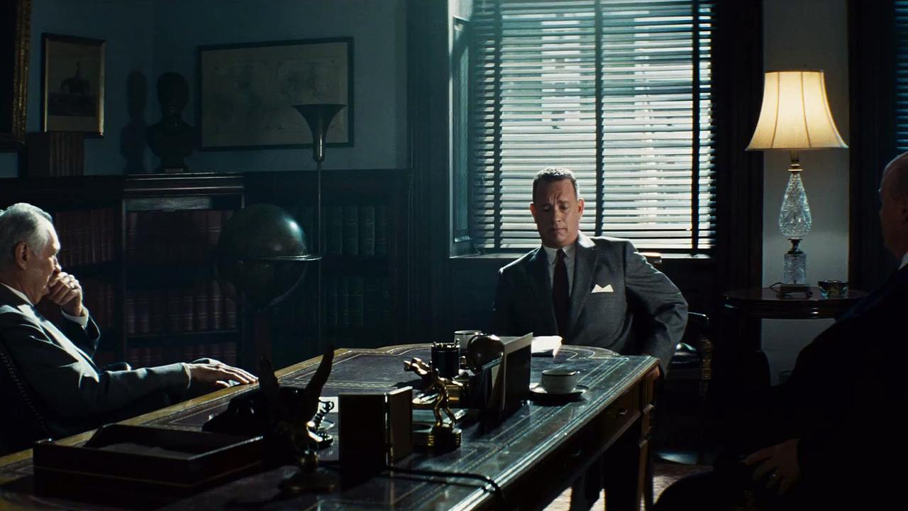
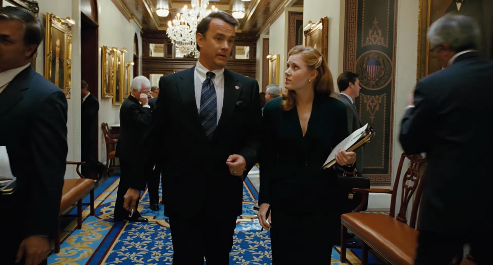
As long as there are physical sets, there’s going to be a need for graphic design in film. “Charlie Wilson’s War” is a perfect example. How could you have Tom Hanks standing on the Capitol lobby floor without the tile floor and wall graphics? His and the director’s reaction to the set was priceless and most rewarding.
Related: The Most Iconic Title Sequences of All Time and Why They Work
When graphic design goes wrong
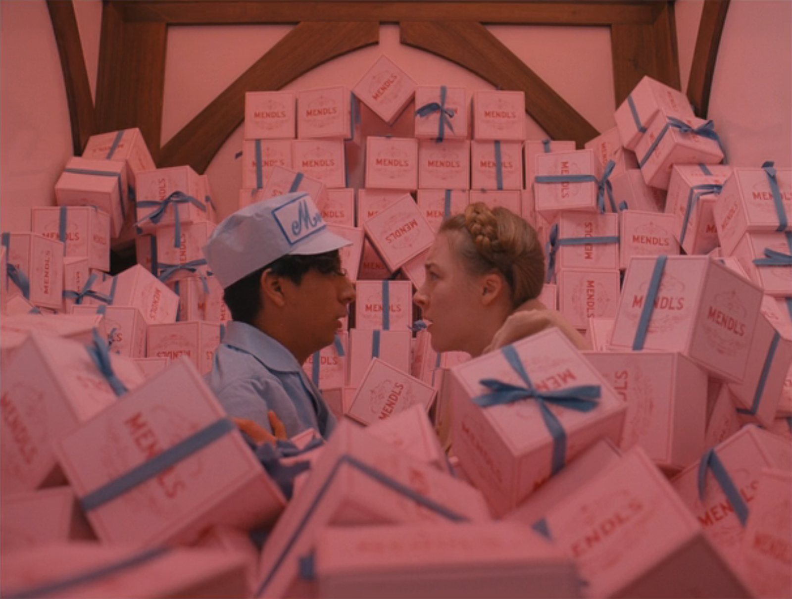
Like Martin T. Charles alluded to in his final thoughts, graphic designers do sometimes get it wrong, and it does show. One of Annie Atkins’ classic stories was shared during a lecture at the 2017 AIGI Design Conference. It’s from the production of The Grand Budapest Hotel and involves one of the film’s most iconic props.
A small snag
Atkins says that half-way through production, Wes Anderson contacted her department. There was a spelling mistake in the word “patisserie” on the pink and blue Mendl’s boxes. And these boxes play a major role in the film. Because every one of the 2000 boxes had been painted by hand and had already been used in filming, there was no way to start over or to physically fix the mistake. “It was something that had to be fixed in post-production,” Atkins says. “That’s a lengthy process when you’re fixing 25 frames per second, and it’s quite costly.”
That example doesn’t diminish the hard work that Atkins and the rest of the art department did on that film. Nor does it show that post-production is a more efficient method for achieving the same result. Filmmaking is a collaborative process. While technology can replace skilled craftspeople, we lose something when entire worlds are created using computer graphics.
Robert Bernard, Martin T. Charles, and Annie Atkins have each spoken about the importance of their work for the actors. They deliver their most compelling and believable performances when they have real props to look at, hold, and interact with. Graphic designers for film and television may not be the most lauded names in the credits, but they’re among the most important.