


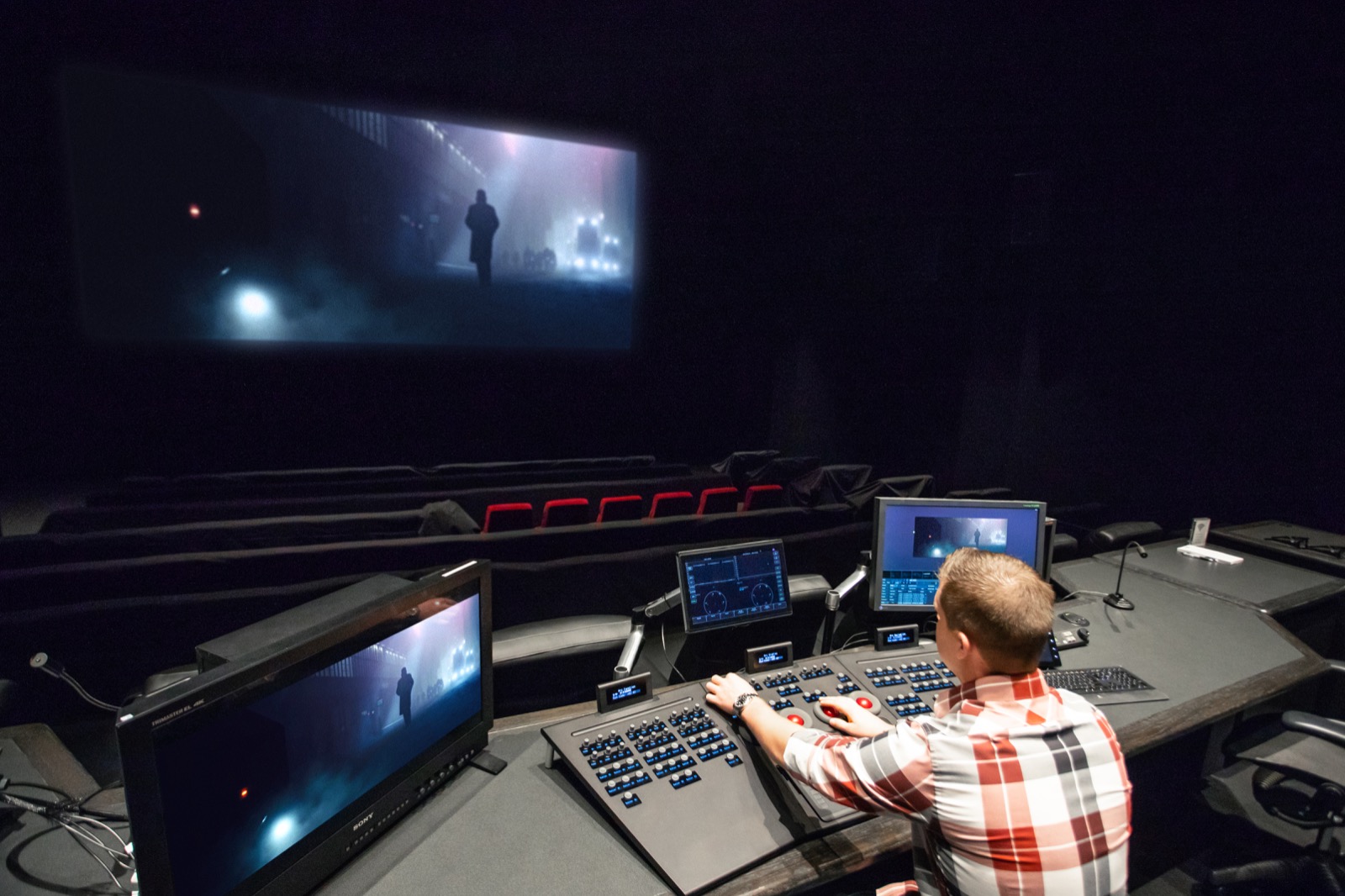
In the world of post-production, few settings can elicit the vivid excitement or intense envy of the professional color grading suite. With enormous displays, cushy chairs, perfect mood lighting, and oh so many buttons and knobs, they have an almost mythical reputation among those who can only peek inside their secluded walls. It’s enough to get you thinking of building a color grading suite of your own.

Not just a pretty space
But high-end grading theaters are more than just luxurious indulgences—they’re a critical part of professional color workflows. Well-thought-out color grading suites allow colorists to work faster and more precisely. And with much more creative control than they could otherwise.
That said, the utilitarian function of grading suites doesn’t subtract from their often impressive visual form. In fact, the tools and venue of a proper color suite can add value far beyond simple workflow efficiency. If your talents are high-dollar, clients expect that your tools should look the part. So impressive facilities give an appreciable sense of confidence to clients entrusting you with their project.
But what if you’re a mere mortal without a Hollywood budget to build a massive DI theater?
Thankfully, it’s now easier than ever to build a pro-level color grading suite for a reasonable cost. If you’re looking to upgrade your personal color workflow, or your team wants to handle color work in-house, here are the basic requirements you’ll need to build a color-suite of your very own.
The Suite
The first thing to understand is that the color suite is a specialized, highly-controlled environment. It’s built for a very specific purpose, and that’s working with color as efficiently and precisely as possible. This purpose has special requirements that won’t add much to other post-production workflows, like editing or VFX.
That means building out a color suite is a significant investment that really only fulfills a single function. You need to determine if such an investment will pay off for your project/workflow before you even get started. Of course, tools are only as useful as the person using them. Any filmmaker considering such an investment should already have sufficient coloring talent to justify it. Or have a plan to gain the requisite skills.
Space
Assuming you can justify this investment, the first task is to select an actual physical workspace. Color grading suites can be almost any size or shape, but your post-production context will dictate exactly what you need. If you’re planning on having 10 or more clients in the room, you’ll need a small theater. But for one or two reviewers in the suite at any given time, a nominally-sized office should do just fine.

There is also the option of setting up your suite(s) for real-time remote color grading, where others can watch you work without actually being in the room with you. This type of advanced functionality involves building out multiple spaces in separate locations for color work. Not to mention needing robust AV equipment and networking infrastructure. It’s an expensive solution, but might be worthwhile if your team or clients spend a lot of time and money travelling to your suite.
Light
Once you have your space selected (or constructed), your next task is to control all ambient outdoor light. Light control is the first, fundamental step to creating a color grading suite. After all, colors are just bits of visible light, so any stray light that enters the suite introduces stray colors that will interfere with the image on screen.
You might think you’re safe as long as sunlight doesn’t hit your display, but alas, it’s not so simple. Ambient light influences your brain’s perception of color, and because natural light changes throughout the day, your eyes automatically adjust without you realizing it. Even a little light reflecting off the back wall of your suite can be a problem.
Lightless
The straightforward solution to ambient light pollution is to place your suite in a windowless interior space. This is great for maximizing light control since no sunlight can leak into the room. But consider the downsides. Lack of exposure to natural light can have negative emotional/physiological effects. Especially if you work in it the entire day. So if you go this route be sure to go outside every once in a while.
But, it’s not impossible to turn a room with windows into a color suite. All you have to do is make sure there a substantial blackout curtains, or even hard shutters, to block out as much sunlight as possible.

Once you have complete control over ambient light in your suite, it’s time to add your own. Make sure every bulb in your suite has a 6500k color temperature. This balance corresponds to the D65 white point of your computer monitor, which will prevent your eyes from adjusting to an off-colored light source.
Off the charts
You also need to make absolutely sure the bulbs have a Color Rendering Index (CRI) of at least 90. The higher the CRI of a lightsource (up to 100), the more accurate colors will appear under their illumination. In general, it’s a good idea to make sure all the bulbs/fixtures in your suite are the same model, to eliminate any inconsistencies in your light source.
When it comes to light placement, it all comes down to preference. The only specific requirement is to ensure none of your lighting reflects directly onto your picture. Other than that, you can distribute fixtures around the suite as needed, so that other tasks (like walking around or reading) are not impeded.
One specific fixture placement many colorists endorse is a bias light or backlight. This is a light that goes directly behind your monitor and illuminates the area around your image in your peripheral vision. This might seem unusual, but there is strong evidence such light provides tangible benefits to the user, like reduced eye strain and increased perceptible image contrast. It also has the extra benefit of looking really darn cool.
Dimming lights can be useful for most suites, but you will need to buy fixtures and bulbs with this capability. Not all CFLs and LEDs can dim. On top of that, you’ll need to make sure the dimming hardware is high-quality. Anyvisual flicker or audible buzz from dimming will seriously degrade your working experience over long hours. (Do note, some lights change color when dimmed, which will disrupt the lighting balance of the room.)
Paint
The final step in building your color grading suite is to establish a neutral color environment. How do you do that? By painting the walls neutral gray, specifically 18% gray or middle gray. The name of this color is derived from it’s position on CIE lightness scale, roughly halfway between absolute black and white. The “18%” refers to the amount of visible light this color reflects.
This color gray is optimal because it keeps your perception of color constant. If your walls were bright yellow, your eyes will compensate somewhat. This affects your visual perception, and you won’t see yellow in your footage quite as much. That might mean your actors come out looking a bit like bananas, which your client might not appreciate. So, gray walls serve as a neutral point on which your eyes can establish a baseline of color and brightness.
This paint can in some cases be mixed at a local store, but the results are rarely consistent or accurate. The best option is to order the paint from a specialized manufacturer. Keep in mind this paint can be very expensive (~$80 per bucket), but the results are difficult to match.
However you source your paint, get a sample and test it in your suite to make sure it’s suitable. Once you have selected a paint, any wall that is in your view (including your peripheral vision) needs a coat.
After you’ve finished building a color grading suite of your own, it’ll be a great environment for grading and correction. Now, you need to fill it.
The Screen
The first thing you’ll need in your suite is a viewing device. (Though don’t forget the ergonomic chair and desk, too!) Your projector screen or monitor is the digital window into your creative world of color. But, some windows are better than others, so here’s how to pick the right one.
Display size
Despite what some might think, bigger screens do not always equal a better experience. Don’t think you need to buy the biggest screen you can afford just to impress your clients. In might not help your work, and in fact might make it more difficult.
Determining the ideal screen size for your space might seem ambiguous. Obviously, a single 24-inch display is insufficient for viewing in a theater-sized suite. Equally, a 12-foot projector screen is overkill in a room built for 2 people. So what’s the ideal size?
Believe it or not, ergonomically ideal screen size is mathematically determinable based on the size and layout of your workspace. There’s even a SMPTE Standard for it. For professional post-production environments, SMPTE recommends a screen should have a maximum vertical height ⅓ as tall as the distance from which a user intends to view the screen.
Wait, what?
Before you reread that last sentence again, here’s an easier explanation. Most of us normally measure screens by their diagonal length (corner to corner), rather than their vertical height (top to bottom), so it’s understandable to be confused by this standard. But there is a reason SMPTE uses this different measure. Diagonal screen length changes relative to the aspect ratio of an image, so you can’t just rely on that measurement alone to determine ideal screen size. Vertical screen height, on the other hand, easily translates across screen sizes of any aspect ratio, so it’s a more fixed reference point for how “big” a screen is, ergonomically speaking.
To give an example with the SMPTE method, imagine you sit 4 feet from your screen. That’s 48 inches of distance between you and the display, so the ideal screen would be 48 divided by 3, or 16 inches tall (vertically).
But manufacturers don’t always advertise the vertical height of a display, so here’s an easier method to figure out the ideal screen size/viewing distance.
Just like before, take the distance your eyes will be from the display, but this time divide it by what we’ll call the aspect ratio factor. This is just an approximate value derived from the heights and widths of common aspect ratios.
Do the math
Here’s that method in mathematical terms:
(viewing distance) / (aspect ratio factor) = (recommended screen size)
For 16:9 displays, the aspect ratio factor is 1.5. Like in the example above, if you sat 4 feet (48 inches) away, the recommended screen size is approximately 32 inches (diagonally). And wouldn’t you know, 16:9 screens that are 32 inches in diagonal length are just about 16 inches tall.
For 16:10, 3:2, and 21:9 screens, the aspect ratio factor will be different (1.6, 1.7, and 1.2 accordingly). Keep in mind, these values are just approximations. If you want a more precise measure of display dimension by aspect ratio, here’s a handy chart.
And if you’re planning on installing a projector screen, remember that your screen placement will necessitate your desk being a considerable distance from the wall. This will require special considerations for room layout and cable management.
In theory, using the ideal screen size for your space will give you a full view of the image without much eye strain. However, these guidelines are just a good reference point. Your exact ergonomic preferences and visual acuity should be the deciding factor, so going with a screen slightly bigger or smaller should be fine.
Display resolution
In general, you should always grade footage on a screen of the exact same resolution. If you try to grade 4k footage on a 1080p screen, you’ll lose a ton of visual information in gradients and images with lots of detail. And if you try it the other way (like grading HD footage on a UHD screen), you will fight against upscaling artefacts. Both scenarios are bad for high-precision color work.
However, you can always display lower resolution footage at 100% in a windowed-view on a higher resolution screen. So if you color 1080p footage most often, a 4K screen gives you plenty of future-proofing capacity without introducing issues. Choose the highest resolution display you can afford, as this provides the most room to grow into newer formats.
Display technology
Along the same lines as resolution, you should aim for a display with the best panel/bulb technology your budget allows. While different display technologies have a myriad of advantages and disadvantages, arguably the most important specification is contrast ratio. For serious color work, 1000:1 is widely considered to be a minimum. However, if you plan on working with HDR content for an HDR delivery, that minimum will increase drastically.
In the past, plasma screens produced the darkest, richest images, but this technology has become antiquated. The newest high-performance screens use OLED technology. These displays are expensive, but their visual capabilities are remarkable. That said, there are tradeoffs to using an OLED screen, like image burn-in and hardware fragility. If this is a serious concern for your workflow, it might be wise to save your money until a new technology becomes available that solves these issues.
Display bit depth and color space
Another important technical specification you should aim for is a 10-bit display. A 10-bit display (along with an adequately equipped workstation) gives you the ability to work with 10-bit footage, which enables much finer image control (over a billion colors vs only about 16 million in 8-bit displays). There are also 12-bit displays available, but these are hugely expensive and require complex equipment and technical standards few workflows have yet to adopt.
You’ll also need to determine the necessary color space capabilities of your displays. If your workflow will be delivering exclusively for web, then sRGB is sufficient, but broadcast work will need to conform to Rec. 709 (and soon Rec. 2020), and cinema work will need DCI-P3. Of course, many projects will need to be delivered to several or all of these destinations, so a display that covers multiple color spaces might be a good idea depending on your workflow’s demands.
Other display considerations
Beyond the above technical specifications, you will have to decide which type of display actually fits your workflow needs. For example, if you’re grading for cinema, you’ll want to grade on a cinema-like projector. But if you’re grading for web, you should use a computer monitor. You should look for a screen that most accurately represents how viewers will encounter your work.
Once you have a display in your suite, there are a couple of other ergonomic factors that will influence your color grading experience. The first is your display’s brightness. In order to conform to SMPTE standards, you should set your monitor to about 25% brightness (as measured by a light meter with the screen showing pure white). This level of brightness is just enough to see your immediate surroundings in the suite, but low enough that your screen doesn’t produce hurt your eyes in the dark.
But even after you’re picked the right size, highest resolution, best quality, and most appropriate display for your workflow, there’s one more thing you’ll need to do: calibrate it.
Calibration
Serious color grading requires proper calibration of the display. Without it, the visual style of your film might not turn out the way you want it. A character’s skin might look sickly, or a scene might have an unintended emotional tone. To understand the solution, let’s first explore the problem.
Digital colors are just values calculated by a computer. Unfortunately, different technologies, manufacturing tolerances, and environmental conditions all affect the complex electrochemical mechanisms that make our screens work. So, no two displays will produce exactly the same colors. And since your computer can’t “see” the colors your screen produces, it has no way to verify they are correct.
Calibration fixes this issue by allowing the computer to cross-check the display’s color output against known values. If a color value is being displayed incorrectly, the computer will be able to detect it and adjust the color settings of the monitor to compensate.
Probing
The most common color calibration tool is known as a probe. These are usually small hardware devices that connect to your computer, and then attach to or rest on the surface of your screen. The computer will run a test pattern of colors (usually included in accompanying software) that the probe measures when they are displayed on screen. The color calibration software analyzes the results and adjusts the gamma and color gamut output within the monitor’s color profile, so that the displayed colors exactly match the calculated values of those colors.
Some of the most popular external color calibration probes are manufactured by X-Rite and Spyder. These probes are relatively cheap, so they should fit into most any budget. Even if they were several times more expensive, they would probably still be worth the investment.
You will often see monitors advertised as being factory-calibrated, which can be helpful, but it’s still a good idea to invest in a calibration device. Monitors drift over time, so it’s essential you have a way to re-calibrate them. However, this doesn’t mean you always need an external calibrator. Some high-end professional displays (like some models from Flanders Scientific and Eizo) have integrated calibration tools. These units can be pricey, but for certain workflows they may be worth it.
Following these considerations will guide you to an excellent screen to begin coloring your work. The final thing you need to complete your pro-level color suite is a way to manipulate those images.
The Control Surface
Any professional colorist will tell you that the fastest, most efficient way to manipulate an image is with a hardware control surface. Any serious color grading suite will feel incomplete without one. While you can certainly achieve excellent results using just software controls, once you’ve gone to the effort of building a color grading suite, there’s really no reason to skimp on this final investment.

That said, control surfaces can be a big investment. DaVinci’s full control panel costs $30,000. And there are actually even more expensive options. But you don’t have to spend a new-car’s-worth of money to get adequate color control hardware.
Over the last decade, a number of affordable systems have come to market, with some costing only a tenth of DaVinci’s full board. There are even some options (with fewer features) that only cost a few hundred dollars. Of course, the tradeoff is between price and capability. More expensive tools give you more creative and technical control.
Getting hands-on
Pretty much any parameter of an image can be adjusted with a control surface–brightness, hue, saturation, tonal ranges, secondary qualifiers, and vignettes. That’s why there are so many buttons, dials, knobs, and trackballs. Each one does a specific thing. If this seems redundant to the buttons and wheels in your favorite software tools, that’s no coincidence, though you might be thinking of it backwards. Software color grading and correction tools evolved to mirror the hardware controls that were originally made to be manipulated by hand. They were only later adapted for the mouse and keyboard.

So, naturally, given the origin of these tools, it’s easy to see why color grading benefits from a physical toolset. Tactile controls allow for intuitive operation and help the user develop precise muscle memory. Of course, if you’re used to a hardware control surface with trackballs, then software color wheels will make perfect sense. But, you won’t be able to work with them as quickly, simply because you cannot manipulate an intangible cursor on a screen as precisely as a physical trackball.
Therefore, the main benefit of a hardware control surface is speed. Instead of making individual adjustments one at a time, you can adjust as many settings as your fingers can reach. When multiple corrections interact together, you can play with them and explore their influence at the same time. With your hands resting over two color wheels on the board, you can adjust brightness, saturation, and hue for two separate tonal ranges all at the same time. Try doing that with just your mouse.
No peeking
With enough practice, a skilled colorist can make almost any color adjustment without ever taking their eyes off the image. That saves time, which saves money, which can give a control surface a hefty return on investment.
High-end colorists can manipulate almost every aspect of their board without taking their eyes off the screen.
But we also need to consider the soft-return of such an investment. Whether it’s right or not, clients now associate control surfaces with serious color work. If they see you using one (and using it well), they will perceive you to be a skilled artist. And worthy of their repeat business. This is not to say that you can’t keep clients if they see you use software tools. Obviously that’s not the case. But many clients will have a higher regard for tools they’re not familiar with. After all, those mechanical buttons and switches look awfully fancy to people who don’t understand what they do.
At the end of the day, a control surface is just another tool. If you know how to use it, you will be able to color your project faster and more accurately. But, it’s an advanced tool that will only really add value if your workflow (and skillset) can utilize it. So spend accordingly.
Conclusion
So those are the basics of building a color grading suite of your very own. You’ll need to choose a space, control the light, balance your colors, install a screen, and choose a physical toolset.
So what are you waiting for? Go create your space!


