“The film went from a Japanese Saturday matinee horror flick to more of a Hitchcock, the less-you-see-the-more-you-get thriller.” – Steven Spielberg
Watch the movie Jaws, and you’ll learn a lot about filmmaking. The strongest lessons are what not to show, and when not to move the camera. For this post, I’ll show some clips from Jaws and two other films. These are clips that create on-screen drama with a minimum of camera movement. Call it a meditation on what makes a filmmaker move everything but the camera.
Note: clips from Jaws, Ida and Songs from the Second Floor are included with the sound removed, to allow you to focus on how the story is told visually.
Jaws (1975) by Steven Spielberg
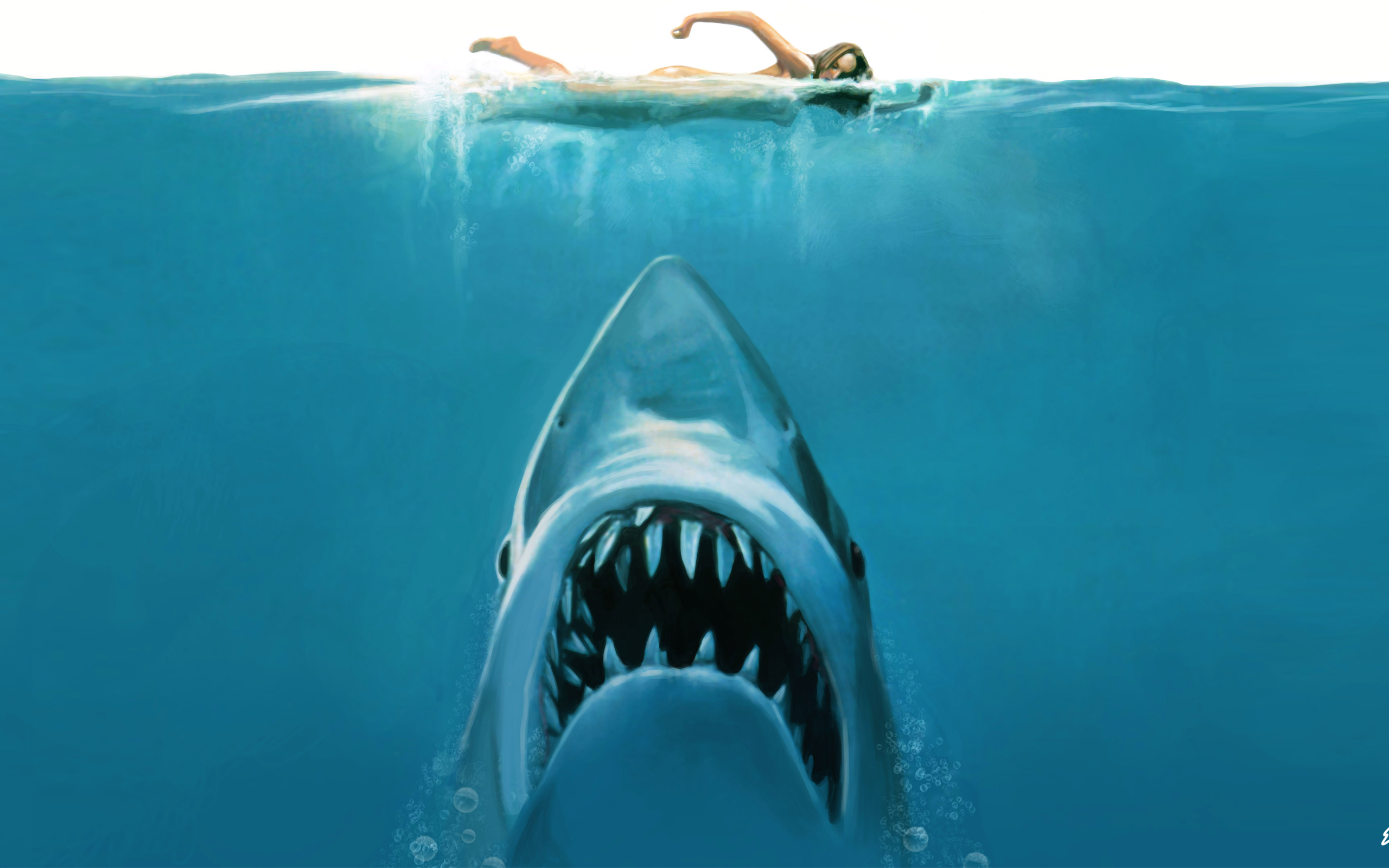
Entire semesters of film school are spent deconstructing Jaws. For good reason. The film is a masterclass in building suspense through composition and editing. Done out of necessity not planning. Spielberg was over budget, and over schedule, with a mechanical shark failing constantly.
Rather than relying on the spectacle of robot sharks, he built suspense using pacing, camera, composition and editing. A film that could’ve been a forgettable monster movie, ended up a Hitchcock thriller.
Jaws: Ferry Scene
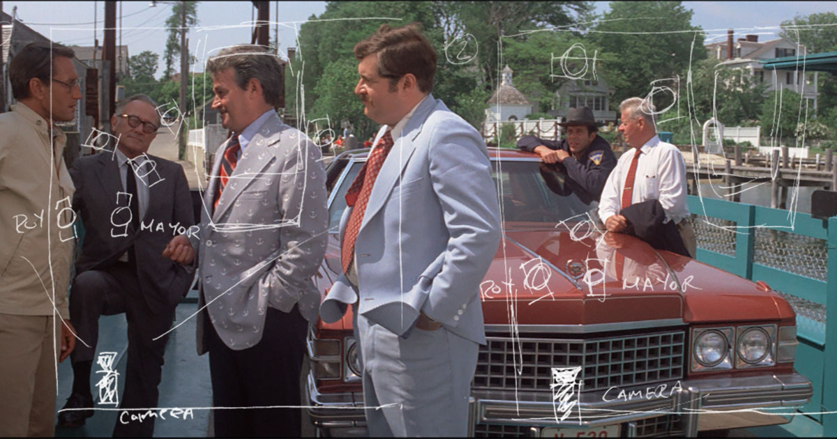
In this shot, the camera remains static while the world moves. The men talk on a car ferry for nearly 2 minutes, and action holds your attention without a single edit.
Spielberg choreographs the conversations, starting with a group discussion, far from the camera. As the shot continues, the mayor isolates Roy Scheider from the group. By the end of the shot, the mayor and Roy stand alone. The men are right at camera where we, the audience, listen to their private conversation. This is staged like a scene in a play. It feels natural since it all takes place on a tiny auto-ferry — literally a stage floating in water.
Jaws: Beach Kill
The beach-kill scene is an incredible lesson in building suspense with a sequence of single shots and minimal camera movement. A series of false alarms that ends with a shark attack and panic. Much has been written about this scene, but I want to look at the final shot in the sequence – the aftermath.
Parents gather their kids as they come terrified, out of the water. The camera moves, slowly towards the water line, following a woman in a sunhat calling out the name “Alex.” She’s immediately readable as a mother searching for her child. The rest of the crowd moves away from the water, she is alone at the water line — the winner of the worst kind of lottery.
Jaws is a film about the unlucky victim devoured by nature, and the randomness of it all. The victim’s mother alone on the left of frame, as the world runs away to the right, expresses this central theme in a single image.
Jaws was the first summer blockbuster with much attention is given to practical visual effects and Bruce the mechanical shark. However, at its heart, Jaws is a suspense film. The drama and scares are served up by shot composition, editing and music. When the audience gets a glimpse of the shark, it is about the unexpected moment, rather than effects or camera movement.
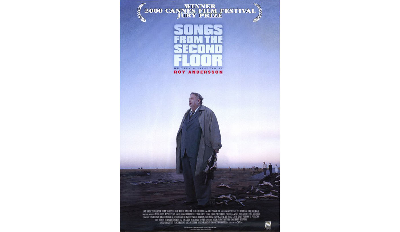
Songs from the Second Floor (2000) by Roy Andersson
This is a film told entirely in static shots to great, dry comic effect. This is a deliberate style choice for Andersson. His other work presents cinema as a series of tableaux populated by characters living out absurd moments.
Film Quarterly summarized Andersson’s approach as follows:
“Beginning with Songs from the Second Floor (2000), Andersson devised a signature method of studio-shot vignettes, staged on elaborately simple sets that give a heightened perception of depth. Discrete and self-contained, each vignette is captured in a wide, extended take from a fixed camera. People are shown in full body shots, usually indoors, generally in modest circumstances. No close-ups. The camera often stands at a slightly frustrating distance, undermining the audience’s sense of superiority to the characters. Not exactly discomfiting, these images are not reassuring either.”
– Film Quarterly Fall 2015
Songs from the Second Floor is the first in a trilogy of films, all using the same style, something Andersson calls “Trivialist Cinema”. The scene creates discomfort in the audience by design.
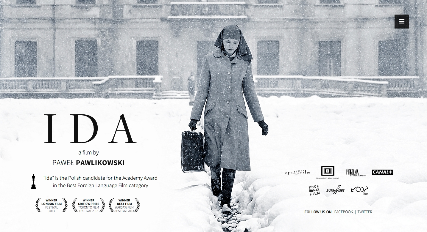
Ida (2013) by Pawel Pawlikowski
Ida is an incredible Polish film that you should watch immediately, if you haven’t seen it. I shared this opening sequence because of how well it economizes camera movement. Using just eight locked-off shots, stretched out over a minute and twenty seconds, Pawlikowski shows us exactly where our main character is starting from.
In a Hollywood movie, this amount of screen time is covered in 30 shots, not 8. The use of off-center framing and bold contrast of shadows on buildings create a striking image. The sequence imparts a feeling of what it must be like to live and work in a convent. Here’s the next shot, just a camera on the floor, pointed at an open window.
In 53 seconds, the scene moves from a benign moment of a woman opening a window to a suicide. No build-up, no moment of looking out the window. No close up on her face as she contemplates the decision. Instead, a simple, effective, and powerful moment of cinema; no surprise that it warranted an homage from the most popular show on television.
Learning to move everything but the camera has never been more important. With the recent Cambrian explosion in camera support, filmmakers are now free to fly cameras around in unimagined ways. This is why every music video, short film and no-budget drama has an excessive amount of moving frames. But these are a few examples showing that not moving the camera, letting the story play out in front of the audience, can be a more powerful choice.

