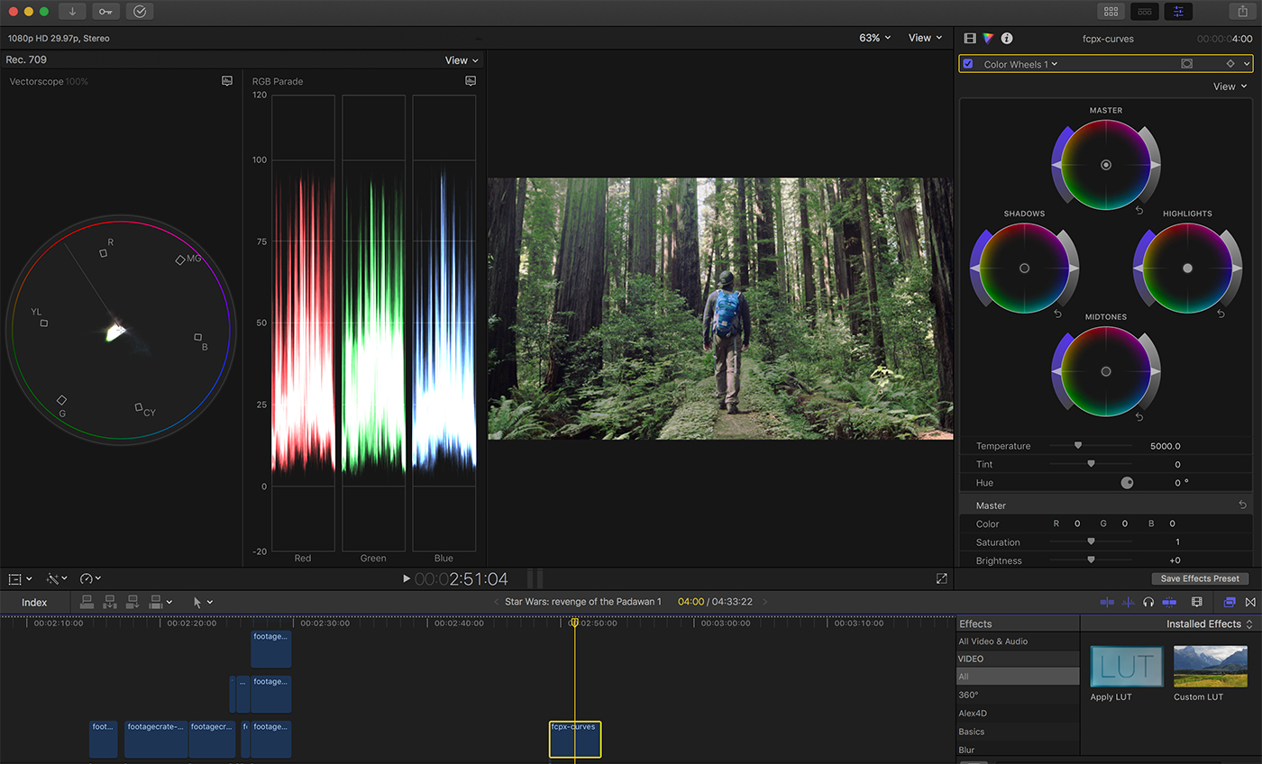
With the popularity of flat image profiles and the advent of HDR workflows on the horizon, color grading inside your NLE is more important than ever. With FCP X 10.4, you can do more with color grading (and do it more quickly and intuitively) than ever before. I’m going to walk you through the new tools and show you just how cool they are.
Contents
Beyond the Color Board
Final Cut Pro X has not been a stranger to color grading. Since its inception, Final Cut allowed you to color correct using a tool called the color board. The color board was initially built into a video clip, and by moving through various panes you could adjust the exposure, saturation and color of an image. A big problem with the color board was if you came from Final Cut Pro 7, had a background in photo editing software, or were familiar with professional color correction applications, the color board was quite foreign to you.
Instead of the traditional color wheels, the color board represented the same information in a flat, horizontal field. There were pucks assigned to Highlights, Midtones, and Shadows that you could move up or down to adjust color, saturation, or exposure as needed. While the color board is not a bad way to interact with a color, it didn’t follow the established color grading paradigms.
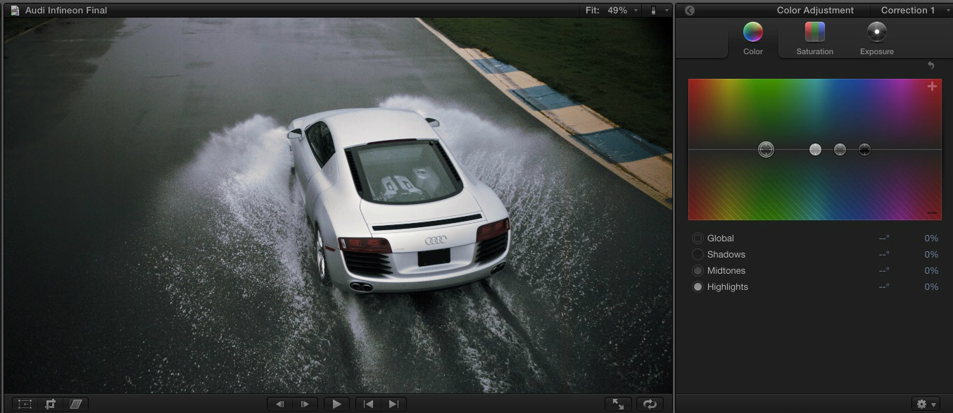
Another issue was your inability to keyframe a correction (although there was a way to cheat this by blading a clip and dissolving between 2 corrections).
Not any more
Now flash forward to December 14th, 2017 when Apple released Final Cut Pro X version 10.4. The most significant changes all had to do with color. If the changes for color could be summed up in one word, it would be flexibility. The options you have for working with color have been vastly improved and expanded with the addition of color wheels, color curves and hue and saturation curves.
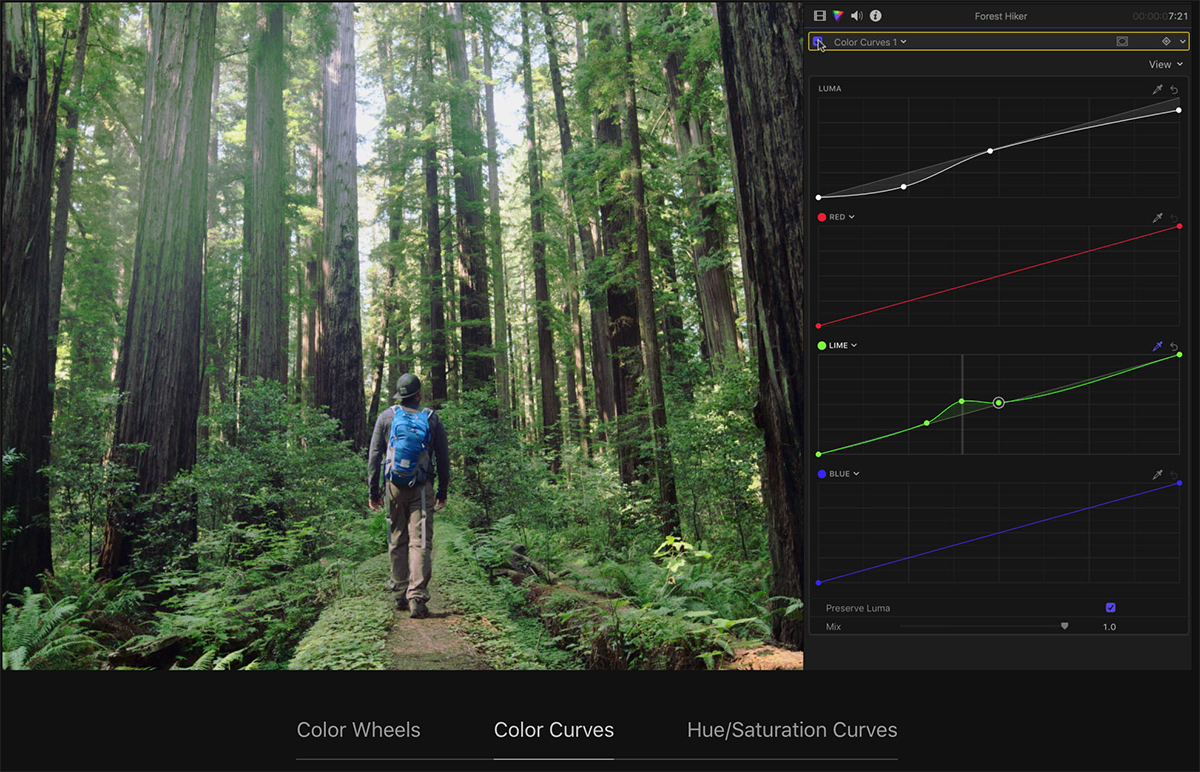
This article will take a look at these new additions and explain how you can use them with the help of existing color tools. I will also explain how you can optimize Final Cut to use them more efficiently. Finally, we will take a brief look at performing a color balance correction with an eyedropper along with your ability to now load custom LUTs inside of FCP X.
Introducing the Color Inspector
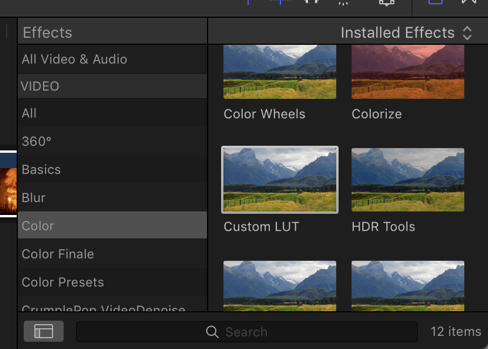
There are a few ways to add the new color grading effects to a clip. One is to use the Effects Browser. Select the clip you want to apply the effect to and press Cmd + 5 to bring up the effects browser. In the Color category are the three new color effects that use the color correction tools: Color Wheels, Color Curves and Hue/Saturation Curves (Please note: the old Hue/Saturation effect does not give you access to the Hue/Saturation Curves in the Color Inspector). There is also an effect that allows you to load Look-up Tables (aka LUTs.)
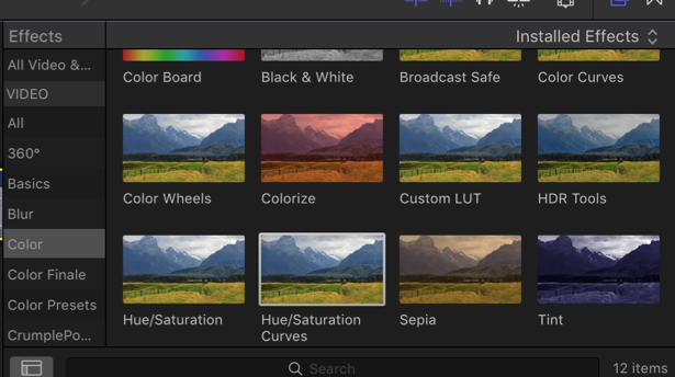
If you double-click any of these color effects, it will be applied to your selected clip and show up in the video inspector. You can adjust its controls in the new color inspector by pressing cmd + 6 or clicking the triangular Color Inspector icon.
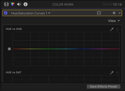
Adding multiple effects
You can apply multiple color effects to a clip. Whichever effect is selected in the video inspector represents the set of tools that will be displayed when the color inspector is activated.

Besides adding color effects from the effects browser, you can add them directly in the color inspector. Inside the color inspector is a drop-down that will display all the color corrections on a clip and the ability to add additional corrections.
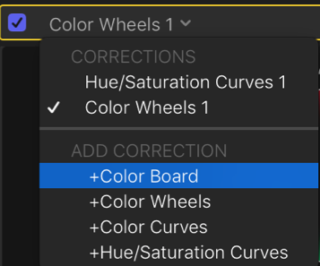
More effective
A much more effective way to add these effects would be to assign keyboard shortcuts to them. The default keyboard only has shortcuts for the color board as it’s assigned as the default effect. But you can change the default color effect that shows up in the inspector when no corrections are applied. It’s currently set to color board but can be changed in preferences.

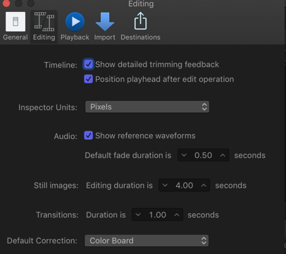
I’ve included a link to a video describing the above and more in how you can set up keyboard shortcuts for faster color grading.
Making adjustments with Color Wheels
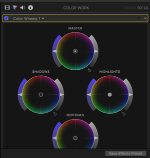
If you came from FCP 7 (or any other traditional NLE), you’ll feel right at home with color wheels. To apply them, select a clip in the timeline then press cmd + 6 to go to the color inspector. In the drop-down menu where it says “No Corrections,” click the arrow just next to it to activate the drop-down menu. Then select “Color Wheels” to add a color wheels correction.

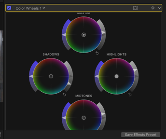
Inside the color inspector, you can decide how your color wheels are displayed. Currently, it shows you all the wheels at once in one window from top to bottom.
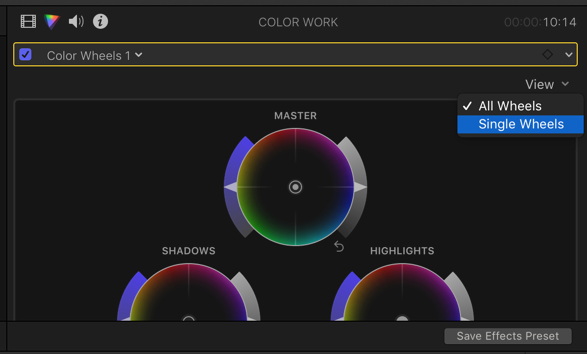
Or you can change this to a single view and have each wheel displayed in panes.
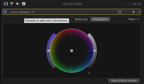
You can customize your keyboard to easily move between the color panes with shortcuts. (The link to the video above in the previous section demonstrates this.)
All wheels, all the time
Depending on how many windows are open in your workspace, you can extend your inspector and show all color wheels in one line as seen in the image below.

When making adjustments with any color effect, it’s best to have your video scopes active.
In the below example, I pressed cmd+7 to bring up my video scopes. From the view menu, I chose a one-up display with the scope showing in monochrome only. From the scope menu, I chose a waveform scope set to luma, my preferred way to see contrast within an image.
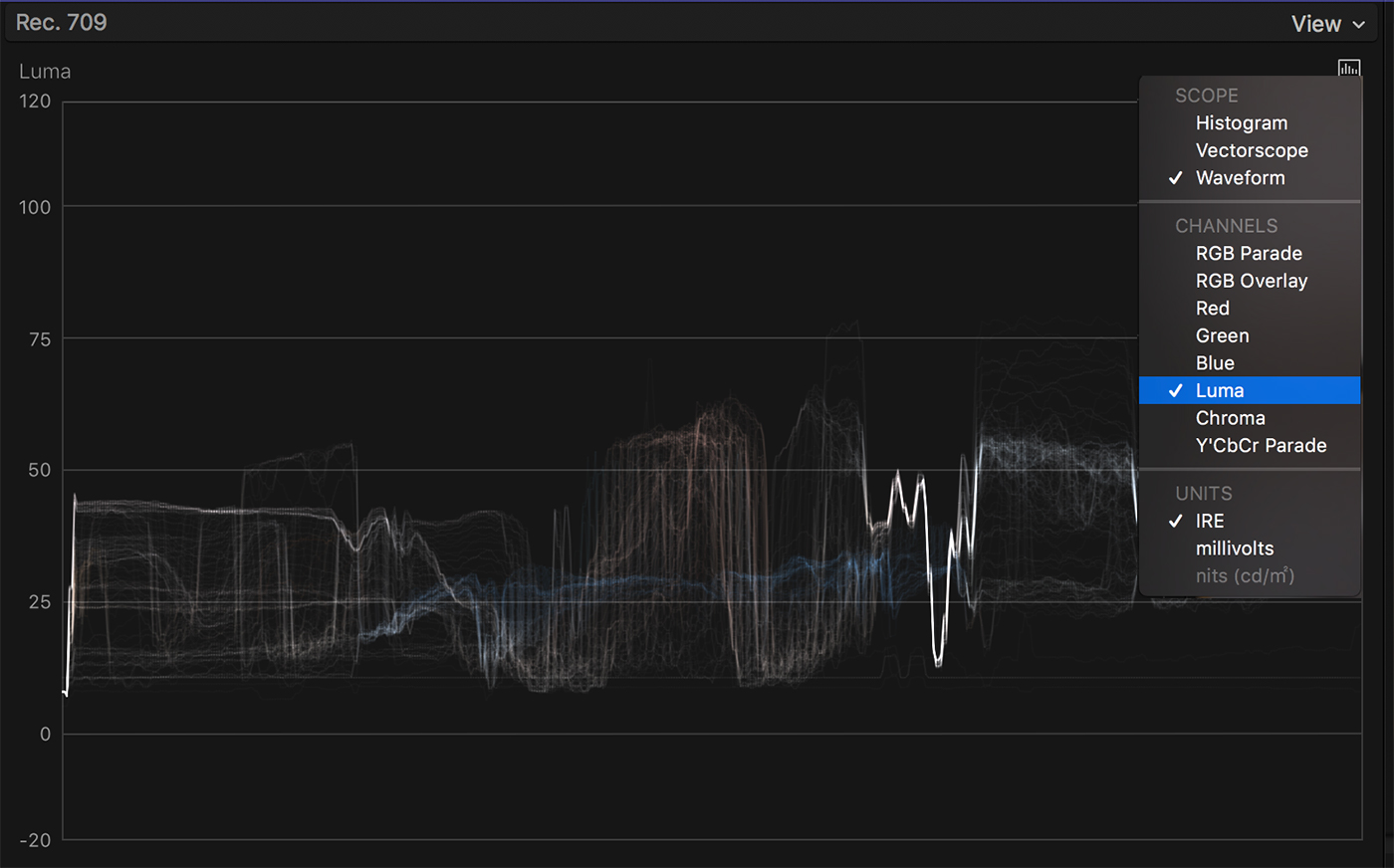
In looking at the waveform, I can see the video clip displayed from left to right and all the luminance information available. Usually, the goal is to expand contrast in your image. In the world of broadcast, you want your deepest shadows to be at 0 and your brightest highlights to be at 100. If you’re going to the web, you can be a bit more lenient with the scale.
While examining the image, you can see it lacks deep shadows and could use a lift in overall exposure. Dragging the grey sliders on the right of each wheel makes exposure adjustments. In the below example, the master color control was used to bring up the entire waveform equally. Exposure was brought down in the shadows and brought up slightly in the midtones and highlights.
A closer look
If you look carefully at the luma waveform, you can see what parts of the scope are being affected while making adjustments. You can also turn your effect on and off in the color inspector to see a before and after by clicking the checkbox next to the effect.
After adjusting exposure, let’s look to see if the image is properly white balanced. Let’s switch the scope to a waveform RGB Parade and turn off monochrome under the scopes view menu.
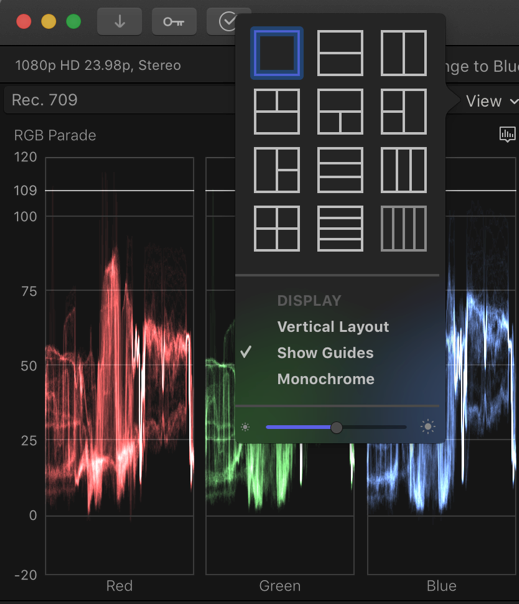
When looking at this scope, the overall color grading goal is to balance (at least initially). In the image, you can see more blue in the deep shadow area and a lack of green in the highlights. By selecting the puck in the middle of the shadows color wheel and dragging it away from blue, you can balance the bottom part of the scopes. You can also select the puck in highlights and drag it towards green.
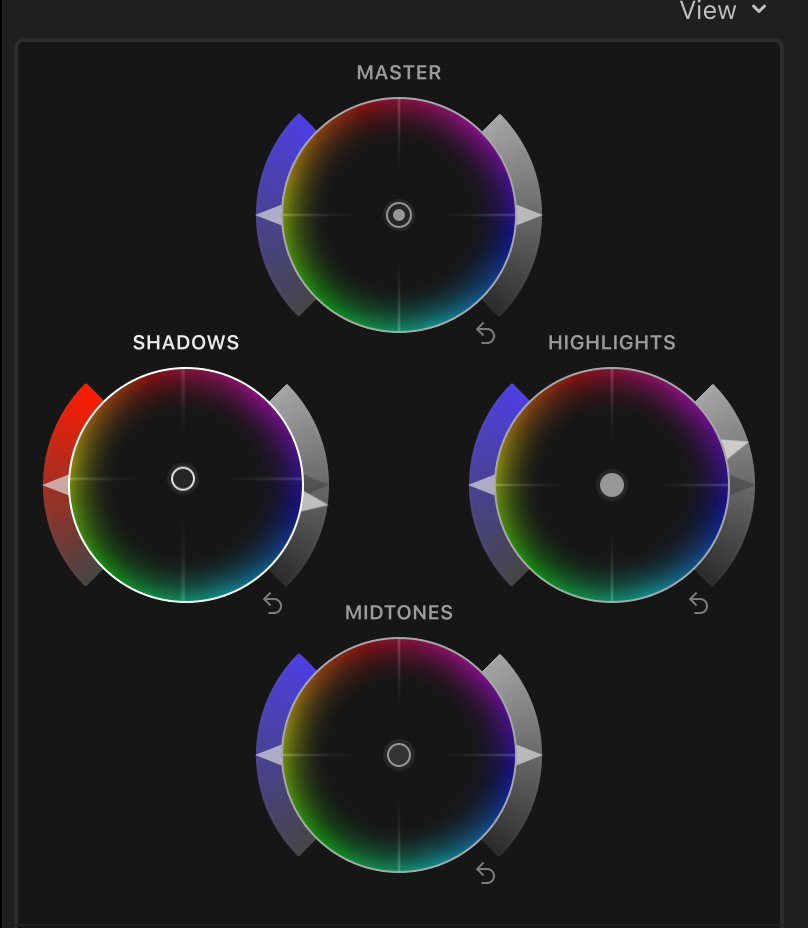
Little adjustments usually go a long way and you can always reset a wheel by clicking on the “reset” arrow at the bottom right of the wheel. Notice how the bar on the left of the wheel changes color to whatever color you’re dragging towards.
The arrow on the left of the wheels allows you to adjust saturation. When adjusting saturation, the best scope to use is the vectorscope. It pretty much is a color wheel but has a few additional features. It shows you how saturated your clip is by showing you a blob of traces. With white in the center, the further out your blob reaches to a specific color, the more saturated it is.
The skin tone line
The vectorscope also contains a line commonly referred to as the skin tone line. If you have Caucasian or lighter-skinned subjects in your scene, more than likely you’d want a majority of that blob to rest on the line as displayed below.
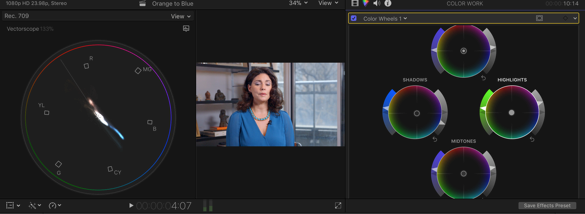
You can also see an arm of the blob reaching towards blue based on the vibrant blue shirt in the image. With the ability to adjust saturation separately in the shadows, midtones, and highlights, we can better target saturation of muted colors instead of our entire image. We can also achieve this with our Hue/Saturation curves.
Temperature, tint, and hue
At the bottom of the color wheels are ways to adjust the temperature, tint, and hue of the overall image.

While the individual controls of color wheels can’t be keyframed, right next to the word ”Color Wheels” is a keyframe creator. This will give you the ability to keyframe/animate your collective adjustments.

Lastly, there is a lot more you can do with color wheels than shown above. In the above example, very basic color grading adjustments were made. You can combine these with additional color wheels or color effects to add more style to your projects and even combine them with built-in shape masks for secondary correction.
The fellas over at Ripple Training do a great job demonstrating these basic color wheel adjustments.
Making Adjustments with Curves
Color Curves, the second color effect to be added in FCP X 10.4, can also be added to clips via the effects browser or the color inspector. If you come from a photo editing background, you might feel right at home with curves. The ability to manipulate curves is one feature added to FCP X that significantly ups its color grading game.
When you add Color Curves to a clip, you have the ability adjust the luma, red, green and blue channels of your footage.
In the below example, a color curves effect was added, and the view in the color inspector was set to single. The luma waveforms are open and set to monochrome. You can see the image is rather flat and lacking detail in the upper mid-tones.
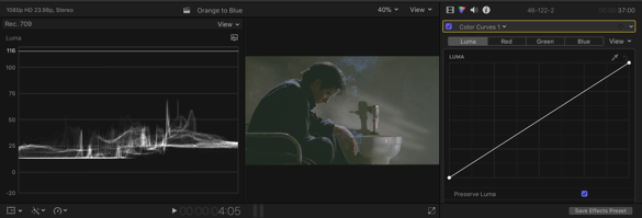
Using luma curves
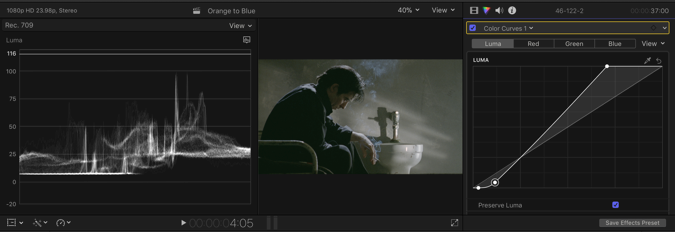
Using the luma curves, you can increase exposure in the clip just like what was shown with color wheels. If you drag the bottom part of the curve to the right, you’ll darken the shadows. If you drag the upper part of the curve to the left, you’ll boost highlights. You can do this while monitoring your waveform and analyzing the darkest and brightest spots of an image. If you want to affect more luminance values close to the shadows or lower mid-tones, you can click the lower part of a luma curve to add a point to the curve and bring it down slightly. When you drag it, notice how the new point anchors to the curve.
If you make an unwanted change, you can always select a point and press delete or reset the entire curve with the hooked arrow at the top right of the window.
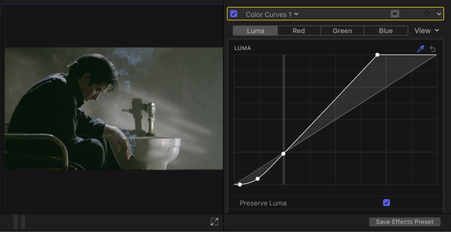
Since we also want to boost midtones based on the brightness of the skin, we’ll use the eyedropper at the top of the curve window and sample the person’s hand. After clicking and dragging on the image to make a selection, a point gets added on the curve. By dragging the point up slightly, you give the midtones a boost in that specific area.
If we switch our scopes over to the Waveform RGB parade, notice a lack of green in the shadows and lower mid-tones.
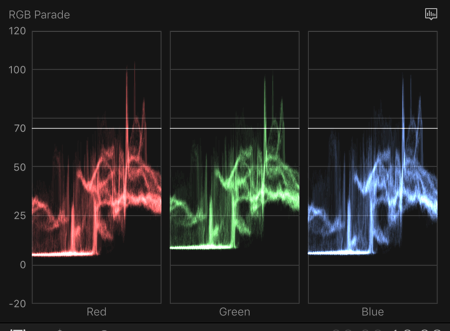
In order to balance the image, we’ll add a point to the green curve and drag down to balance out the lower part of the graph. You can slide that point up and down your curve until you have the right selection.

Blue steel
While the image is now fairly balanced, on playback, I notice a slightly blue tint to the smoke from the cigarette. By heading over to the blue color curve pane and selecting the eyedropper, I can sample the smoke. While the curves show the area you selected by a line, a point has not been added yet. Also, in this case, the curve has changed from blue to Aqua as you can see by its name. In FCP X, curves aren’t limited to RGB values.
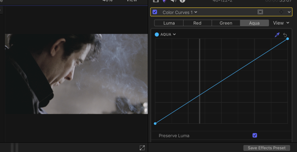
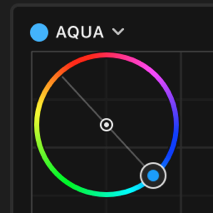
What’s interesting about FCP X’s curves is that you can adjust other colors by using the eyedropper. When you sample a color, your color curve changes color to match. Alternatively, you can use the drop-down beside the name of the curve then select the color of your choice manually.
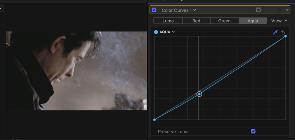
By adding a point to the Aqua curve and dragging it down, you can remove the color cast on the smoke.
You can also use FCP X to add shape or color masks. When we use FCP X masks in color correction, we perform secondary color corrections that affect a part of the image, rather than the whole. The next new color effect is all about secondary correction—Hue and Saturation Curves.
HUE vs SATURATION Curves
Hue and Saturation curves are great for adjusting specific Hues as well as Saturation values in an image. In the below image, we’ll change the color and saturation of the women’s shirt.
In the color inspector, we’ll add a Hue/Saturation curve. There are several curves to choose from: Hue vs Hue, Hue vs Sat, Hue vs Luma, Luma vs Sat, Sat vs Sat, and Orange vs Sat. Each curve allows you to sample an image by using an eyedropper, and each allows you to alter the image in a different way.
With these “A vs B” curves, you will select particular values in A and change the B property of that selection. So a Hue vs Luma curve means that you select certain hues, and change their luma (brightness).
HUE vs HUE
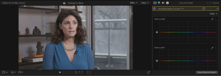
To change the color of the shirt, select the eyedropper to the right of the hue vs hue. On the image, click and hold on the blue shirt to sample a range of the blue values.
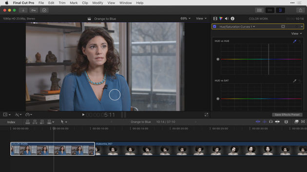
The hue vs hue curve now contains 3 points. The point in the middle is the hue sampled. The points on the outside restrict the colors affected by the correction.
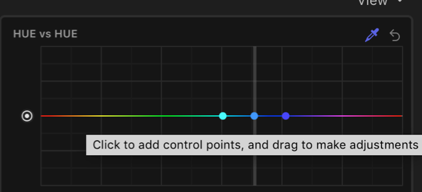
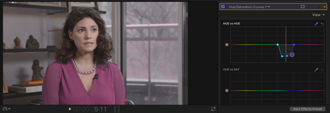
If you select the middle point and drag up or down, you begin to change the color of the shirt. Click between the outer points and new points will be added. If you want more hues involved in your adjustment, you can drag the two outer points farther apart to expand the range selected.
Cross check
When making any adjustment, it’s always best to check the before and after, by clicking the checkbox at the top left of the effect. Here, you may have noticed that the women’s necklace and part of the window are included in the adjustment. This is where adding a shape mask could come in handy. In the below example, a shape mask was added and a square mask was created around the women’s shirt. Now the purple tint that was coming from the window is gone because only what’s inside the mask is affected.
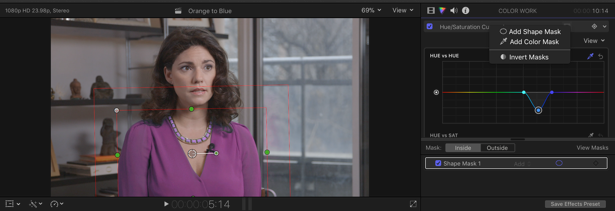
For the necklace, we can add a second Hue/Saturation effect and select the necklace with the eyedropper. By playing with the range, you’re able to bring back the blue. It’s also always best to go back to the original Hue/Sat correction and make subtle color grading adjustments to compensate for the new change.

The above example brings up an important point. In Final Cut Pro X you can combine several color correction effects onto clips and achieve very powerful results. The sky’s the limit when you start to combine corrections.
HUE vs SAT
To finish this example, let’s head back to my first Hue/Saturation effect in the color inspector. Let’s scroll down to the next curve called Hue vs Sat and sample a Hue with the eyedropper. By bringing down the middle point, you can decrease the overall saturation of that hue in her shirt.
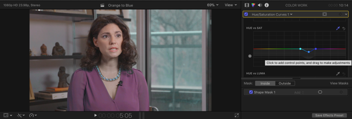
HUE vs LUMA
Similar to the Hue vs Sat curves, this curve selects hues and allows you to adjust their luminance. You can manually add points or use the eyedropper.

LUMA vs SAT
This curve comes with two points. The point on the left represents your shadows and the point on your right is your highlights. If you drag the left point up, it will increase saturation in the shadows and down will desaturate it. Use the eyedropper to sample a specific luminance value that you can use as an anchor to adjust a saturation value lower or higher than it.

SAT vs SAT
This curve also comes with two points. When working with Sat vs Sat, think of your image as divided into two parts. One part contains values that have a lot of saturation. The other contains values for the less saturated elements. The point on the left controls saturation for the less saturated values. The point on the right controls the more saturated values. Dragging either point up or down affects those saturation levels respectively. If you’ve worked with Adobe Photoshop’s vibrance effect, you can achieve similar results. Use the eyedropper to add points to use as an anchor.

Areas of the image with less saturation have been brought up. And areas of the image with more saturation have been brought down.
ORANGE vs SAT (or any color you want vs SAT)
This curve also has two points. By default, it’s set to orange because it works great with varying saturation that might occur in the skin tones.
When you want to increase saturation in the orange colors with less saturation, drag the point on the left up. When you want to decrease saturation in the more saturated oranges, drag the point to the right down. Use the eyedropper to sample any color in your image and watch the curve switch to that color while adding a mark where that saturation sample you selected lies. Adjust the line to taste.
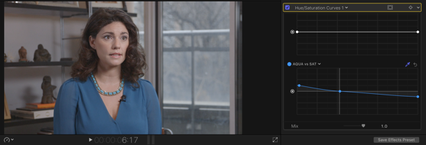
In the image above, the eyedropper was used to sample the blue shirt. A point was added by clicking close to the line where the saturation values lie. The saturated aqua colors were brought down slightly and the others were boosted. The point added was used as an anchor.
You can also choose a different color by clicking the downward arrow next to the word Orange vs Sat. Drag the point on the outer circle towards the color you want to adjust.
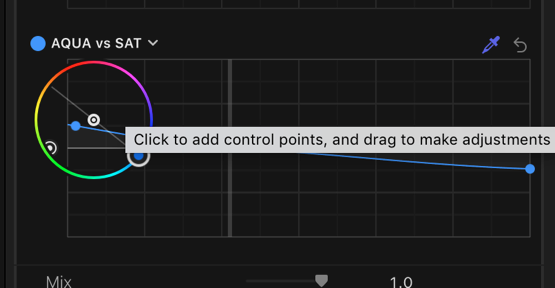
Lastly, just like color curves and color wheels, the overall Hue/Saturation curve effect can be keyframed.
White Balance
Now let’s take a look at a few other options available for color grading in FCP X. One happens to be Balance Color, available under the “Color and audio enhancements” menu. This is the “Magic Wand” menu at the bottom left-hand portion of the Viewer. Or select it from the Final Cut Pro “Modify” menu.
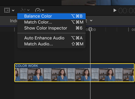
When applied to a clip, it automatically white balances it by analyzing scope information. It doesn’t always work great in some situations. But you have options. In the video inspector, you can change the method of color balance from automatic to white balance. An eyedropper appears along with instructions in the viewer telling you what to do next.

Use the eyedropper to select a color in the image that’s supposed to be white. The image will adjust accordingly. Don’t be afraid to try selecting multiple points to see what color grading effect it has on your image. You can then toggle between automatic and white balance to see which looks best.
Custom LUTs
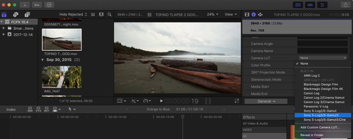
Another great addition is the ability to apply custom Look-up Tables (LUTs). LUTs give you the ability to add predefined looks to your image which can be tweaked to your preference. In previous versions of FCP X, you were forced to use a 3rd party plugin or use pre-installed camera LUTs (Note: Camera LUTs show under the General Metadata View of the inspector window). Now in the info inspector is the ability to add a custom camera LUT.
In the effects browser, there’s also a Custom LUT effect that can be applied to a clip in the timeline. Once applied to a clip, you can then load any LUT you want from your system via the inspector window.
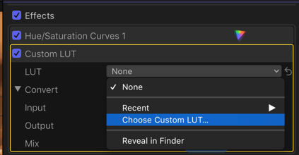
Under the video inspector, choosing a custom LUT to load from your system.
Conclusion
Not too long ago I encouraged you that if you had previously given up on FCP X, now was the time to give it another look. The addition of the color grading features in 10.4 makes it even more exciting. One could argue that all the primary and secondary color grading can now all be done in FCP X. The newest version offers flexibility for any creator to work with the color effects they’re most comfortable with.
These new features build on a list of others not mentioned in this article. Like native 360 video support and HDR content delivery. Combine this with its already existing toolset and we just may have a game-changer.
To continue your journey into color grading and its mysteries, why not try this article on ACES, or this essential guide to LUTs.

