The most exciting and daunting part of a creative project is often the beginning. A creative brief is set before you, budgetary and timeline limitations are outlined, contracts are negotiated, and the “real” challenge begins: defining the creative.
Recently, Coat of Arms took on such a challenge. We pitched to a large financial institution in their international marketing campaign. The campaign aimed to entertain and to educate customers who use the institution’s banking kiosks. Eye-catching videos were to depict life events that require banking assistance (e.g. buying a home, attending college, getting married, retirement, etc.) and were to play on large, 42” digital displays outside their banking kiosks in malls, airports, and other commercial spaces.
Competing against other vendors, Coat of Arms was tasked with defining a style, creating unique characters, and fully animating one scene from the script drafted by the client’s agency of record, Critical Mass. The script we were given outlined that…
“A futuristic glass dome house overlooks the sea. Inside a party is going on. The DJ bot switches up the music – it’s dubstep! Everyone breaks out dancing (doing the robot). The sound waves vibrate the dome and reverberate into the water, disturbing a sleeping giant robosquid. He emerges from the ocean, his beady eye fixes on the house. One tentacle suctions on the glass and whips it away like a frisbee. He reaches into the dome with another tentacle, pulls his own vinyl track out of one of his compartments and plays it. The scene ends with robot squid dancing (doing the wave with his tentacles).”
After reviewing each vendor’s creative pitch for this script, the client would award the contract to the artist who had captured the style they preferred, which Critical Mass had outlined in a brief.
Preparing for the Pitch
While pitching is exciting, it’s stressful, does not come with guarantees, and requires an out-of-pocket investment. As with most pitches, the client offered no budget for the pitch itself and no funds were to transfer until another contract for the entire campaign was awarded and negotiated.
In preparation for our pitch, we collaborated with Critical Mass (Singapore) to define the client’s goals and preferences. Using Frame.io, we uploaded creative concepts, styleframes, and character sketches to Critical Mass for review. The agency provided notes to get our creative closer to the banking institution’s vision. Some of Critical Mass’s direction included: “[The] style should be modern, sophisticated, and elegant – not childish. [Likewise,] it must have wit, humor, [and] charm…[Robots should have] emotive expressions.”
To define their creative goals, Critical Mass used a few videos for reference. In their brief, they indicated that they liked the sophisticated style of our video entitled Project Imagine, which we created for Marriott.
They countered our video with the colorful, humorous, and dynamic McDonald’s video called “Arch Enemies” by Leo Burnett and Buck.
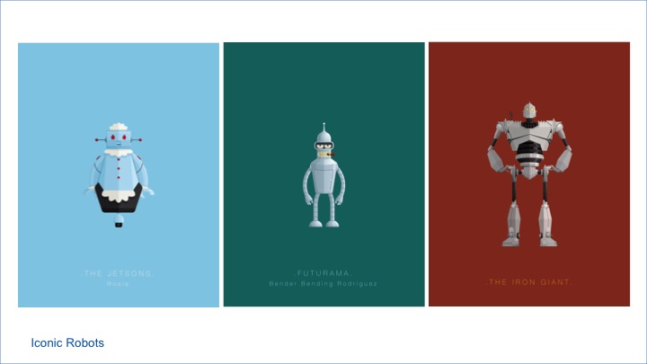
Along with these video references, Critical Mass sent some robots they liked from other artists, including The Jetsons, Futurama, and The Iron Giant, among others.
In an effort to guide us through their script visually, Critical Mass sketched the important and necessary scenes from their “Buying a House” script. Because the pitch was due in only a few weeks, we were given the freedom to select any segment of this storyboard to design and animate.


Rough Storyboards by Critical Mass
Pre-production on the Pitch Video
With a clear sense of what the agency and client desired, we brought illustrator Manuel Santos and illustrator/animator Ricardo Nilsson on board to work on character sketches. For this first phase, we explored as many divergent options as possible internally: robots that were sleek and modern, futuristic robots with more utilitarian tools, and retro-vintage looking robots. Here are a few of our favorite black and white sketches from this exploratory phase.
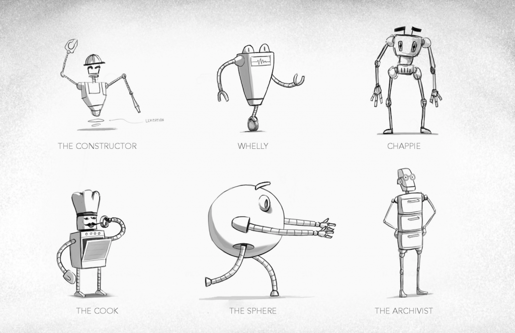
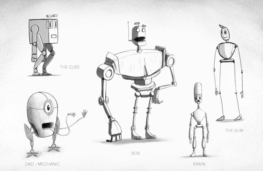
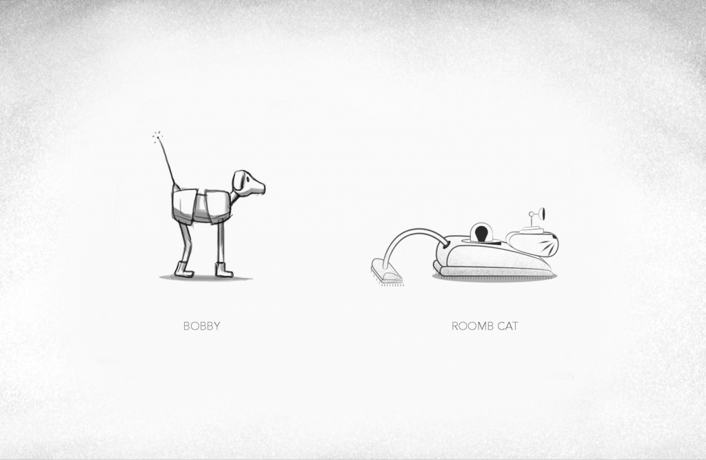
After several internal passes, we shared our early work with the Critical Mass team. They gave us some great feedback and specifically reiterated that they liked the comedic characters like the Archivist, the Brain, The Sphere, and Roomb Cat. The agency asked us to retain the current direction and style but requested that we give each character more personality and quirky surprises. In particular, they indicated that Bobby the robo-dog was cute but that it didn’t have enough character or comedic elements.
With this feedback and lots of new ideas, we refined the robots further, explored colors, and added some texture. In particular, we put a cone on the robo-dog’s head, gave him “rear” wheels, and placed a bone just outside of his reach. Perhaps a bit cruel but a memorable and interesting character surely.
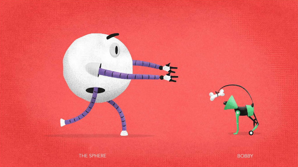
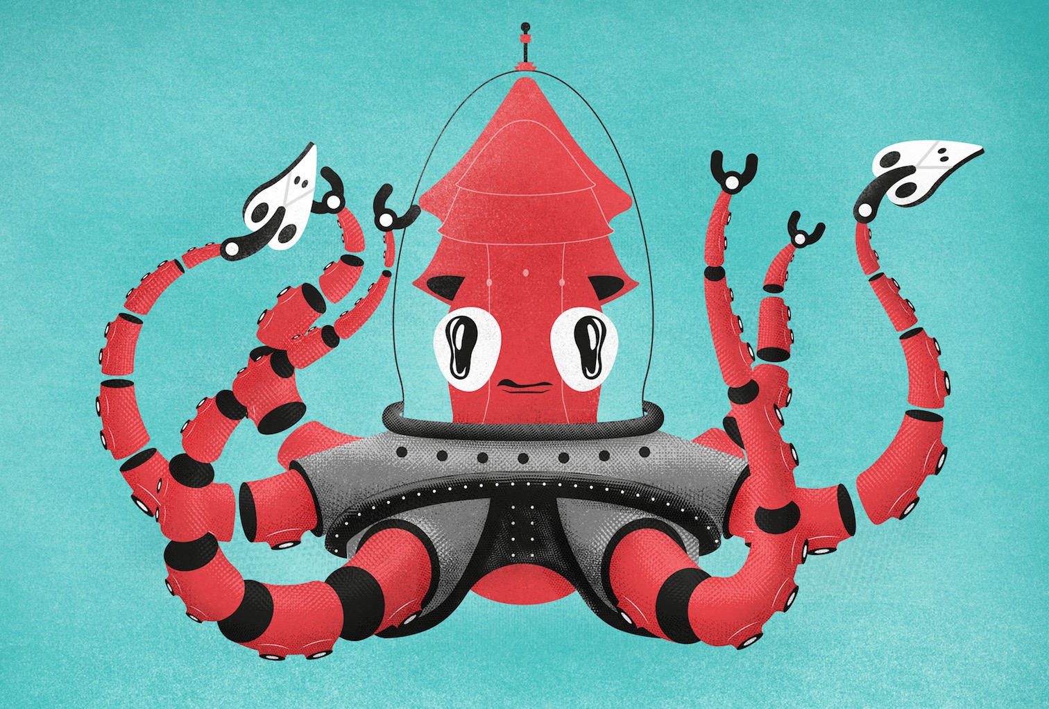
With characters defined for the script, refining the textures and colors became the focus. You’ll notice how Santos changed the background to a blue-green and added a texture that made the robots look more plastic or metal in the images above and below.

Typically, an illustrated/animated video that is up to one minute in length requires four to six weeks of work. This pitch allowed only two weeks for all assets. So, within days of defining the characters, animator Ricardo Nilsson began testing the characters. His first tests manipulated the “DJ.”
Next, Nilsson animated the dancing characters from the selected scene, including “The Archivist,” “Slim,” and “Bobby.” Finding a balance between rigid robot movements and a sophisticated, smooth animation was difficult. Nilsson worked hard to give each character’s motion an awkwardness that felt purposeful and a rhythmic grace for their unique dance moves. Nilsson noted that “the most difficult thing about animating the robots [was] finding the right dancing style for each [robot’s character.] After defining what kind of moves each robot should perform, it was all about keyframing and making it look as smooth and natural as possible.”


Nilsson used After Effects and PuppetTools 3 on each character to save time and to stay on schedule. He also used the Reposition Anchor Point, the AfterEffect script, that allows you to reposition the anchor point of selected layers around the layer edges while keeping the layers at the same position in the comp window. Below you can see these rigs and anchor points in action within Nilsson’s screen capture of the obnoxious robot, “Selfie.”
“Selfie,” one of Nilsson’s and our favorite satirical characters in the piece, is hilarious. He struts his stuff, poses, points at the camera, and snaps a shot of himself with a selfie stick that extends from his mouth. This character is unique, memorable, and reminds us how ridiculous we look when we take selfies.
The Pitch Video
Take a look at the final pitch video with “Selfie” and the rest of the robo-dancers partying it up below. Big thanks to Shawn Wilson for the sound design.
Winning (and Losing) the Gig
To really polish our pitch and set it apart from the competition, Coat of Arms compiled all the stills, gifs, the video, and some short descriptions into one document. We then crossed our fingers and sent the pitch to Critical Mass. A few days later we got great news! The financial institution had selected our pitch and wanted to proceed. But then, dah…dah…dah…the paperwork commenced. A new contract was negotiated, insurance concerns were addressed, and then, somewhere along the way, the banking institution’s staff changed. The project that was green-lit was put on hold and ultimately canceled. Very sad news for all of us.
This creative could have collected dust on our “bookshelf;” instead, we decided to share it with you, to not only give the art an audience but also to share one of our successful failures. All too often great creative is put on the back burner, goes unfunded, gets canceled, or is pegged as too ambitious, too artistic, off-brand, off-message, not quite right, and the list continues. And while the investment into a pitch can be ominous, the rewards are manyfold even when you don’t “win.” With this pitch in particular, we developed our relationship with three talented and incredibly kind artists, Ricardo Nilsson, Manuel Santos, and Shawn Wilson; we walked away with a portfolio piece that stands apart from the crowd; and we proved to ourselves that we can successfully pitch.
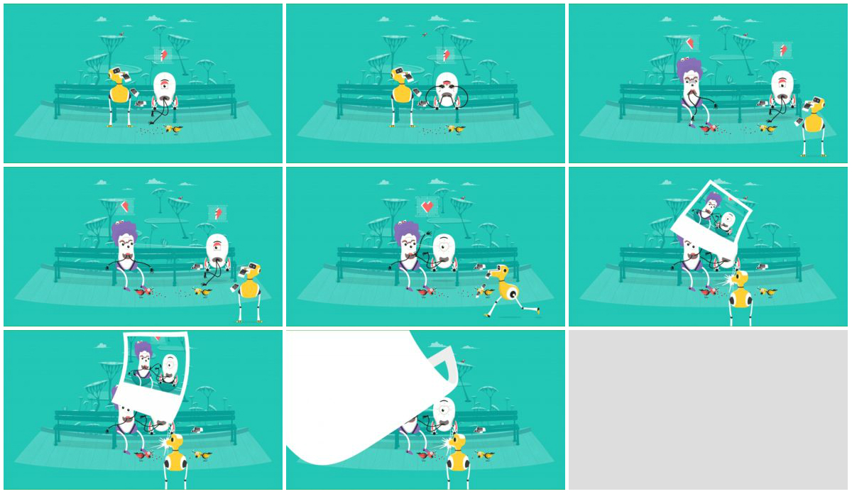
In fact, we were so gung-ho to get ahead on this project, we had started on the second script in our client’s roster of ten before we were told it was canceled. As you’ll see in these boards, the story depicts a forlorn robot who wishes for a partner. Finally, he meets the girl-bot of his dreams and they prepare to marry. See! Every great story has a happy ending.
How do you approach a pitch? We’d love to hear about your adventures in pitching in the comments.


