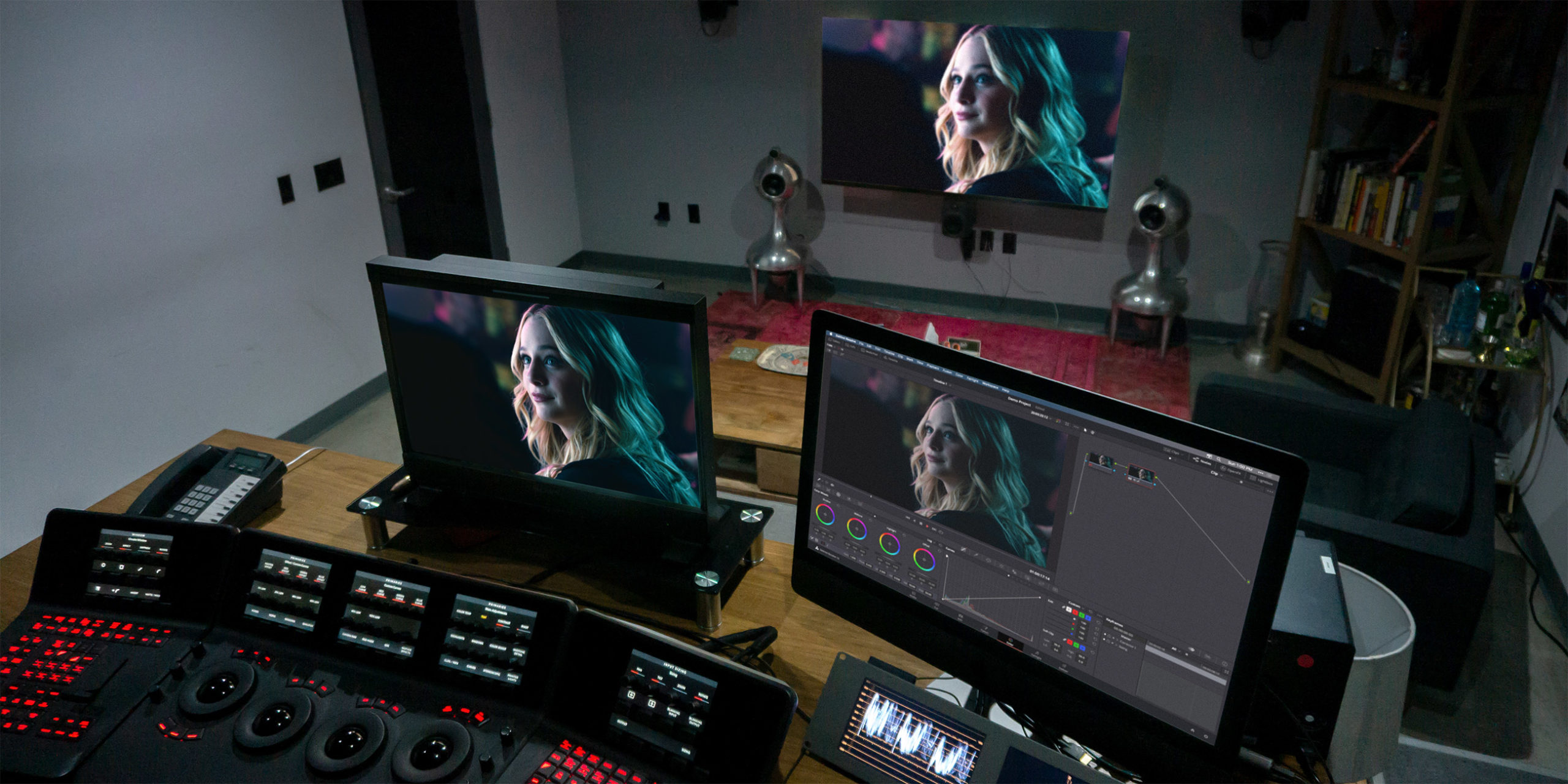
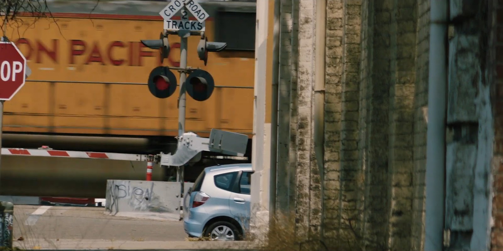
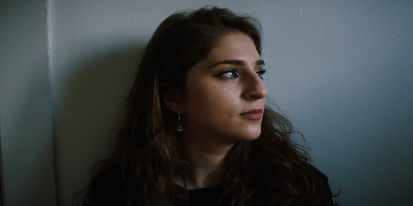
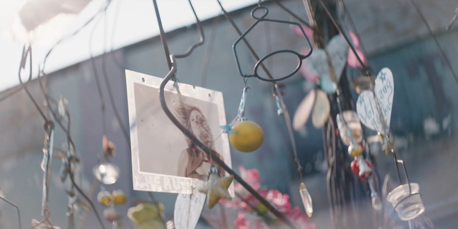
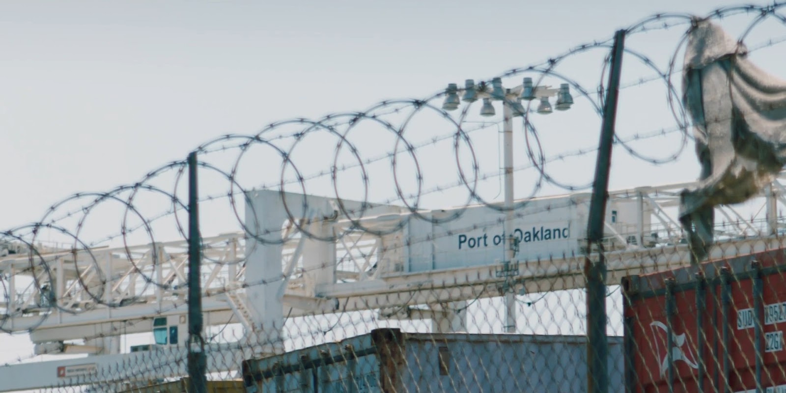
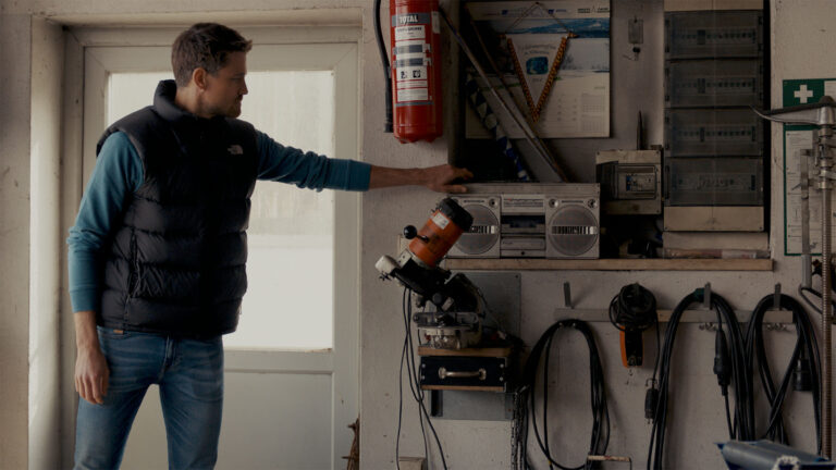
Take a step inside a grading suite for a few minutes, or ask a client to give notes on a project’s color, and you’re bound to hear the word “contrast” almost immediately.
But even though contrast is one of the most basic considerations of color grading, it can feel complicated and amorphous, even for experienced filmmakers.
Contrast can be applied to our images in many ways, goes by many names, and is influenced by a huge variety of tools, from the cameras we shoot with and the monitors we use, to the codecs and delivery platforms we choose.
Beyond these technical details, contrast majorly influences the creative qualities of an image. But does that mean achieving “great” contrast in your image is simply a matter of subjective taste, beyond objective principles or best practices?
Filmmakers tend to think about contrast like this far too often, but experienced colorists know better. No art form is devoid of meaningful conventions and proven methodologies, and color grading is no exception.
That means that skillful use of contrast requires both artistic creativity and practical technique. You need to understand both if you want to use contrast effectively in your filmmaking.
In today’s article, I’ll show you the best practical tools to help you get the best contrast out of your footage. We’ll also explore the “high-con” and “low-con” looks that are so prevalent in cinema, and see the pros, cons, and best creative strategies for using these looks for your own projects.
What is a look?
If we’re going to discuss looks, then we need to agree on what that term actually means.
The term “look” is often thrown around in production and post-production circles as a catch-all for the overall visual style of an image. That’s too vague and imprecise for any meaningful discussion, so let’s refine that definition a bit.
In my experience, a look is the creatively-intentional, visually-consistent, and technically-crafted signature of an image.
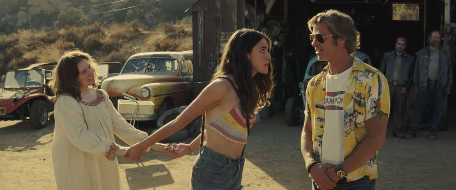
Colorists spend a lot of time working at the level of individual shots. We correct for technical things like exposure and color casts, and think creatively to make skin tones clean and colors pop. But this is not crafting a look.
The look of a film is the macro-level thinking and work of color. It’s the common thread that runs through every shot, that visually binds the piece together into a cohesive whole. It’s planned in pre-production, crafted on set, and solidified in the grading suite.
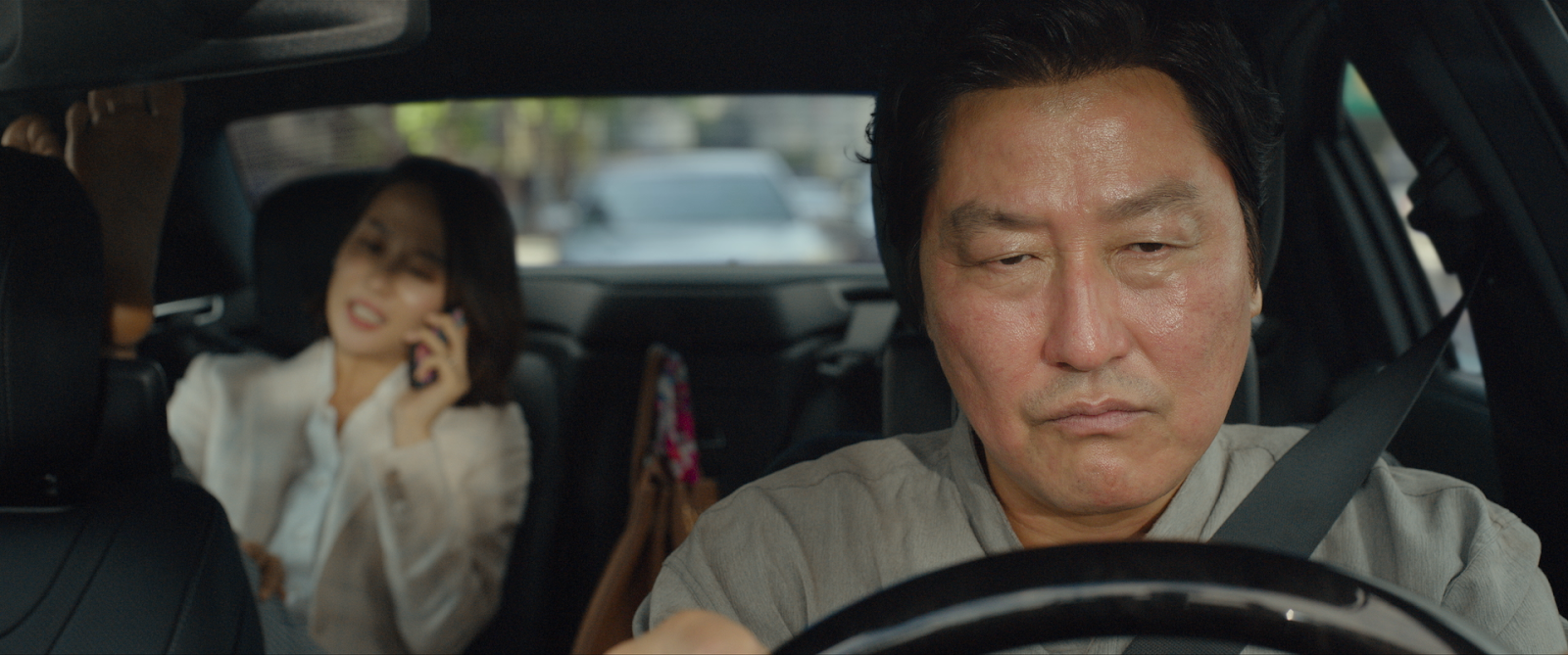
Without this commonality between scenes or shots, the tone and/or flow of a story can feel disjointed to viewers. And, honestly, an inconsistent look can make your work feel amateurish and low-budget. So if you’re not already discussing the look of your project early on in production, you might want to start.
With this in mind, here are some basic principles that hold true for any look—high-con, low-con, or anything in between.
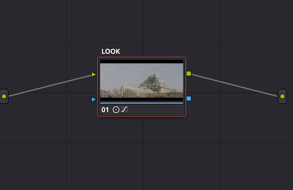
1. A look should be built from one or more consistent operations
Since any look is about macro-level consistency, its parameters really shouldn’t change in order to accommodate a particular shot.
Of course, every shot will ultimately need individualized attention, but such adjustments should happen in separate nodes or layers, and be independent of your look.
As a simple example, let’s say we’ve built a look for a video that adds a splash of contrast in the shadows. At some point, I’m likely to land on a shot that happens to naturally have deeper shadows than its neighboring shots. When I do, my natural inclination will likely be to tweak my look node just for this shot.
This works, but it can also lead to inconsistencies and nagging doubts—once you begin making individualized fixes to your look, it’s difficult to know when to stop.
You’re better off making a shot-specific adjustment in another node (or layer), or adjusting your look’s parameters globally as you gauge its effect on different frames.
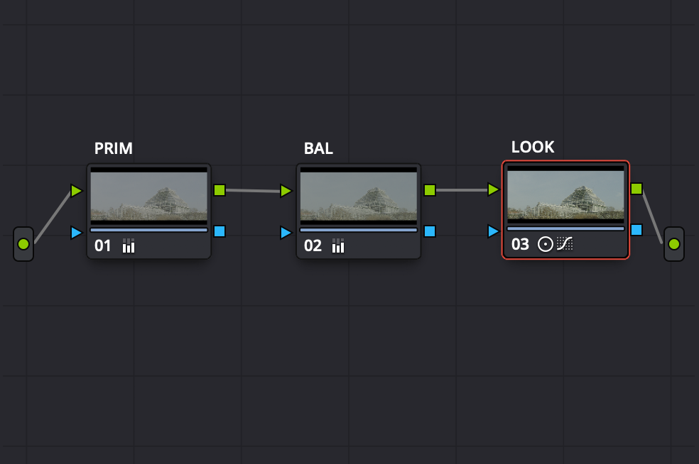
2. A look should be consistently applied at the same point in your signal chain/node graph/layer stack
This is really an extension of our first point. A consistent adjustment applied at different points in the signal chain will not have a consistent effect.
Practically speaking, this means your look node (or layer) should be placed either at the very front of the chain, or at the very end.
I prefer to place mine at the end, because this means that by the time any image hits the look node, it has a consistent exposure and balance following my individualized adjustments.
3. A look should consistently give pleasing results
Designing a great look for your video requires you assess a look’s effect on the entire piece, and not just a single shot or scene.
As discussed above, some individual shots will always need a bit of special attention, but your main focus when designing a look should be the whole body of footage.
How does the look you’re evaluating serve the piece on the whole? Too contrasty? Too desaturated? Too warm? Just right?
Answering these questions isn’t complicated, but it does require you to set aside the impulse to immediately start fixing things at ground level.
As a rule of thumb, a good look should make at least 80% of the shots in your video look better to your eye than they did without it. Your look needs to be moving you closer to what you want, not further from it. This may sound obvious, but seemingly obvious points can often be the easiest to forget.

Now that we’ve sharpened our definition of looks and gone over their key principles, let’s explore the “high-con” and “low-con” looks in detail.
The “high-con” look
In simplest terms, a good high-con look is about discarding the finer tonal details of an image in favor of creating maximum visual impact.
This aesthetic is present in countless films and TV shows (Avengers: Endgame and Game of Thrones, to name a few), and is near-ubiquitous in commercials and music videos — formats which fiercely compete for viewer attention.

But for an even clearer example, we can look to another visual medium: comic books.
Comic book illustrators don’t seek to reproduce every minute tonal detail in their work, but rather to structure an eye-popping image that reads as quickly and loudly as possible.
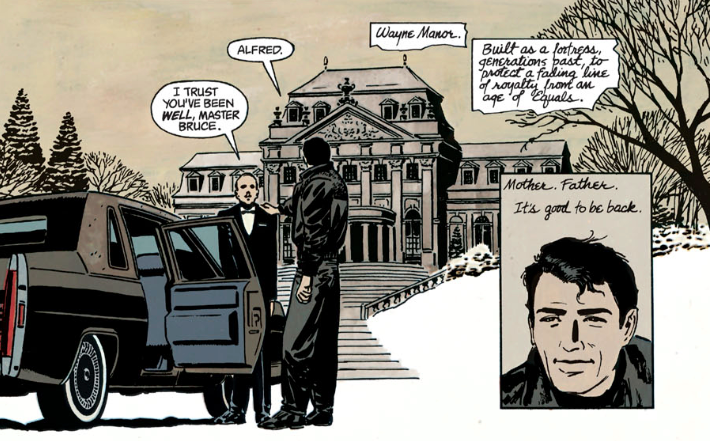
While most photographic content is unsuited to such an extreme, the concept remains the same: distill the image into an impactful and essential form.
Strengths of a high-con look
Here are some of the key strengths of deploying a high-con look:
It grabs the eye more strongly than lower-contrast material: Because our eyes need contrast to function, we’re inherently drawn to it. All other things being equal, a higher-contrast image will grab the eye more readily than a lower-contrast one.
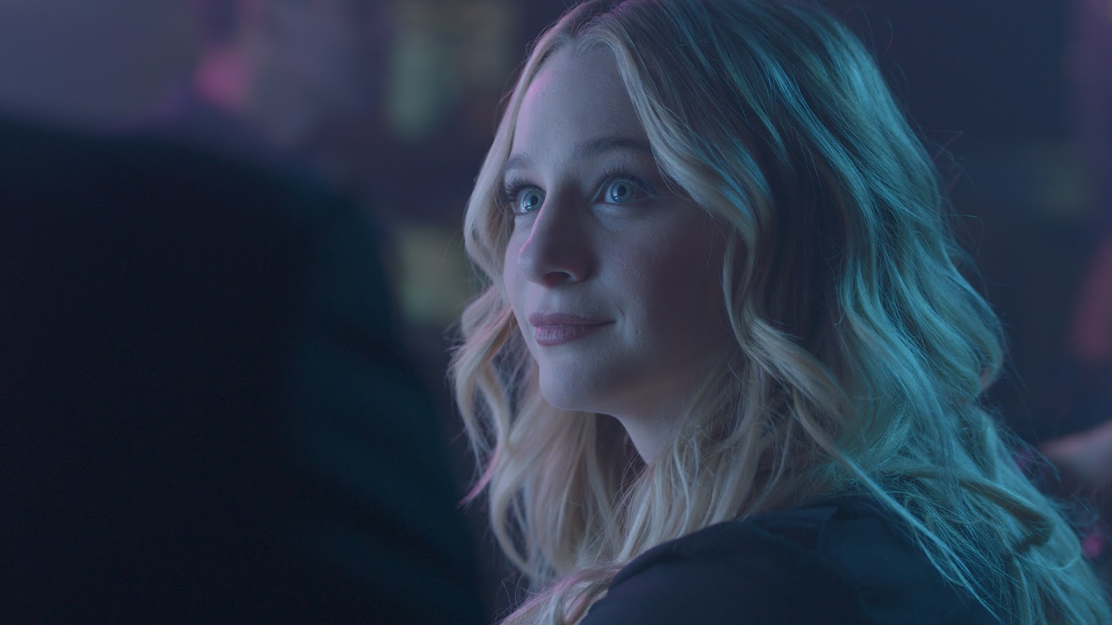
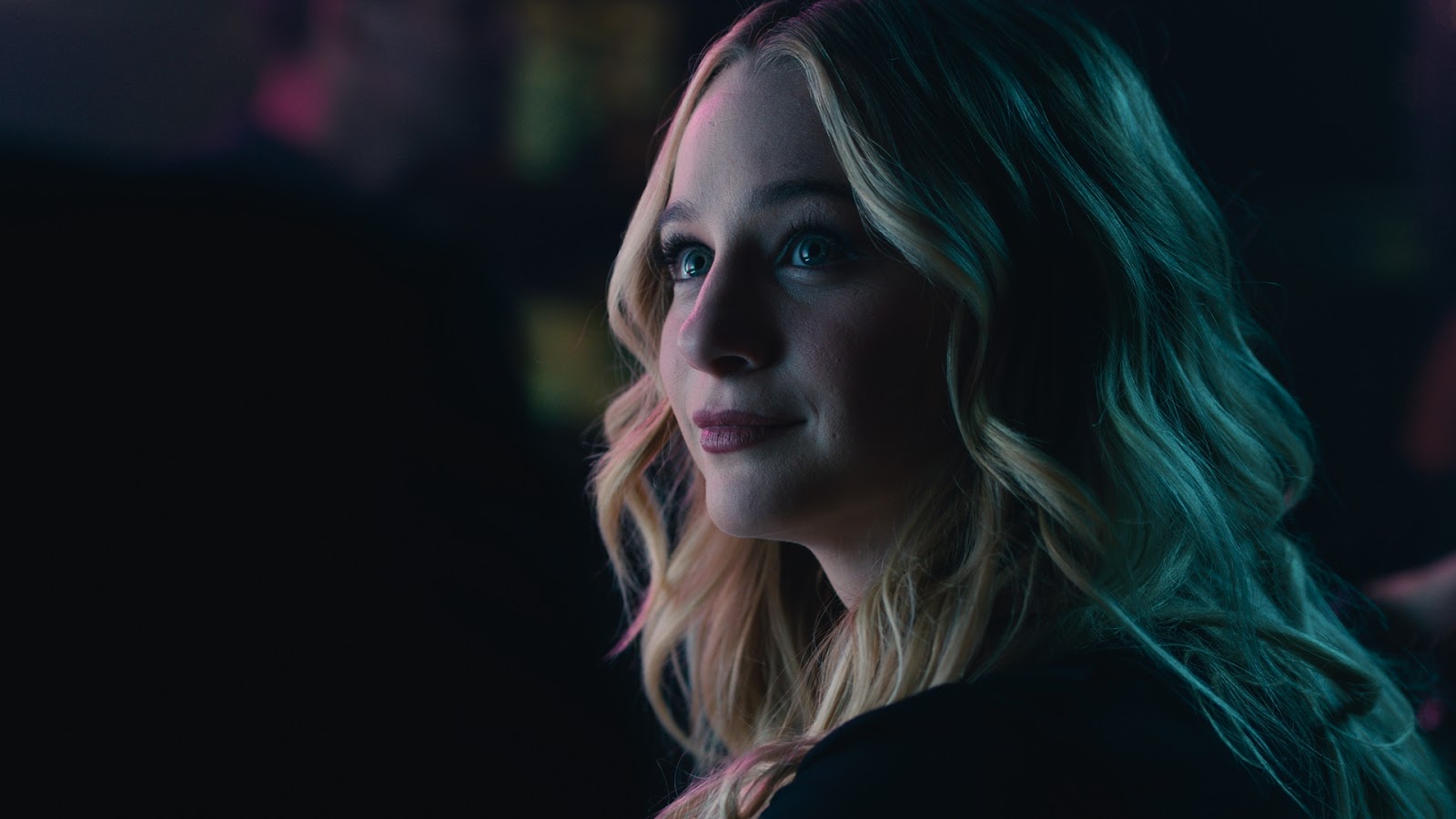
It creates a more finite, better separated set of tonal zones: One of the results of introducing contrast into our images is that it creates greater separation between shadows, midtones, and highlights, which simplifies the image and makes it more visually legible.
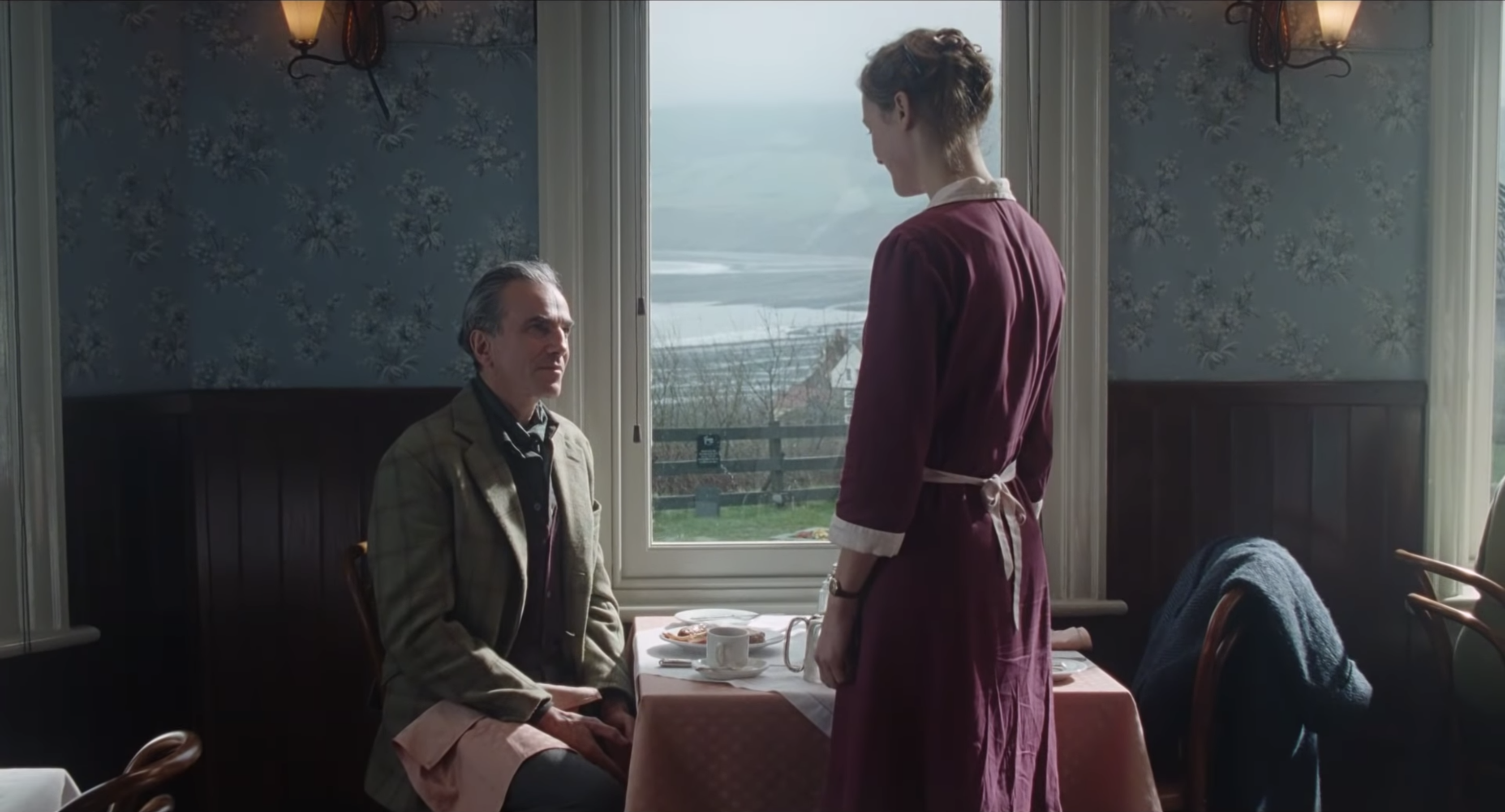
It make colors “pop”: Because increasing contrast generally increases perceptual colorfulness as well, higher-con looks tend to make the colors in our images feel richer.
Disadvantages of a high-con look
Now for the flip side of the coin: here are some of the potential dangers of deploying a high-con look.
It can repel the eye: Pushed too far, contrast can create a harsh, uninviting image that quickly repels our gaze. The contrast-cranked TVs in Best Buy may succeed in momentarily seizing my attention, but my next impulse is to squint or look away.

It can diminish pleasing tonal variations and details: As discussed above, increasing contrast tends to “clump” similar tones together. This can be pleasing, but it can also be detrimental when taken to an extreme or mis-applied.
It can make images feel overly-manipulated: It’s easy to go too far with high-con, resulting in an image that feels “worked on” and calls attention to the colorist. And trust me, you usually don’t want that.
Tips for using a high-con look
Finally, here are some key strategies for success when you’re building a high-con look:
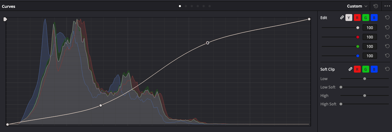
- Apply your look’s primary contrast using an S-curve, ensuring deep shadows and peak highlights are protected from hard clipping.
- Don’t be afraid of losing tonal detail — this is not only inevitable, but part of the aesthetic appeal of a high-con look. If you wish to preserve every nuance, high-con may not be the right look for you.
- As you’re feeling your way to the right contrast level, think in terms of creating maximum “snap” — you’ll find there’s a point past which you’re simply crushing details without increasing this.
- Keep an eye on your image’s saturation. Because increasing contrast also increases perceived colorfulness, it’s easy for colors to reach an unpleasant intensity. You may want to counter this with an overall reduction in saturation, or a saturation roll-off.
The “low-con” look
In simplest terms, a good “low-con” look is about maximizing the depth of an image by preserving tonal detail and inviting the viewer to look into rather than at the screen.
Where we might say the goal of a high-con look is to command the gaze, the goal of a low-con look is to seduce it.
In execution, this look has to succeed in balancing the need for contrast and separation against the aim of preserving as much tonal detail as possible. Some great recent examples include 1917, Marriage Story, and Big Little Lies.
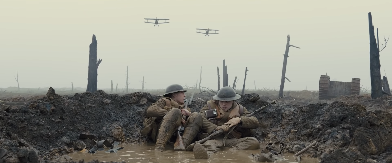
Strengths of a low-con look
Here are some of the potential strengths of deploying a low-con look:
It can engage the viewer more subtly than a high-con look: Where a high-con look tends to sweep the viewer off their feet, a low-con look can make them feel they’re discovering and exploring something on their own terms. As they’re drawn into the image, their attention is rewarded with ever-greater visual depth and nuance.


It can feel more naturalistic: Higher-con looks have a certain self-declaring quality to them, and viewers understand on some level that they’re experiencing a manipulated image, but they don’t care because it’s so visually pleasing. Low-con looks, on the other hand, can feel transparent and un-manipulated, drawing attention to the contents of the image rather than the image itself.
Dangers of a low-con look
Just like a high-con look, a low-con look carries its own potential dangers:
It can leave the viewer with a surplus of visual information: Because low-con looks generally do less to simplify an image, they can leave the frame with excessive detail, making it laborious and time-consuming for the eye to “read” the frame and find what’s important.
Low-con looks can feel “flat” or unfinished: Taken to an extreme, a low-con look can leave your content feeling like a vital part of the post process was skipped. Our eyes need contrast, and an image with too little of it can neither draw nor hold a viewer’s gaze.

Tips for using a low-con look
Here are some key strategies for success when building a low-con look:
- Consider drawing your look’s primary contrast as an S-curve or other non-linear shape. This will allow you to create a bit of density in the bottom of the image, as well as some “ping” in the highlights.
- Remember: it’s low-con, not no-con. Don’t think about withholding contrast, but rather about preserving as much detail as possible, while still creating enough “snap” to make the frame engaging.
- Keep an eye out for opportunities to subtly shape the frame with vignettes or other shapes — this can be a huge help in creating visual interest and guiding the eye
- Because lower contrast tends to make images feel less colorful, you may want to add an overall saturation increase to counter this. A good rule of thumb is to introduce 5-8% saturation for every 10% decrease in contrast.
- Another strategy for increasing perceived colorfulness is to use split-toning—pushing blue and green into darker regions, and adding warmth to your brighter regions.
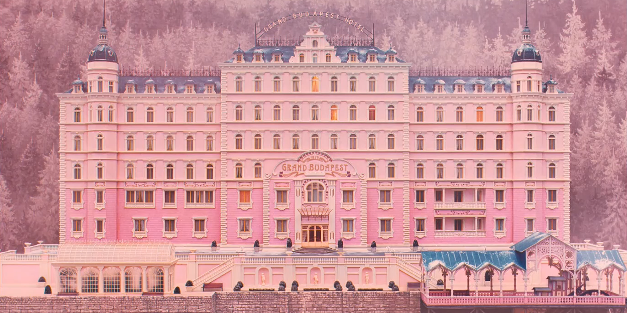
Which look is right for me?
In deciding on and designing any look, the creatives’ eyes and taste are of course the most important single factor.
But the reality is that not all looks work for all content—can you imagine if Parasite had been graded like a Marvel movie?
So how can we assess not only our own taste, but the unique needs of our content? Below are some practical guidelines for deciding on whether a higher-con or lower-con look is likely to best serve a given piece of content.
None of these should be taken as hard rules, or as a substitute for your creative vision, but they can be helpful in narrowing your focus as you evaluate the best treatment for your images.
Image attributes best served by a higher-con look:
Healthily exposed (or even slightly overexposed) images: These types of exposure generally hold up better to a heavy hit of contrast and are less likely to feel “crushed” by it.
Lower, more controlled lighting ratios: A lower lighting ratio by definition means lower contrast, allowing room for contrast to be added without “overcooking” the image.
Extraneous tonal detail: Content with an overabundance of texture and detail throughout the frame can benefit from the simplification that higher contrast provides, allowing the eye to focus on what’s important.
Muted colors: Less saturated colors will benefit from the boost of color that comes with a higher-contrast look, and are less likely to bloom or clip
Content consistent with an “elevated” aesthetic: As we’ve discussed, a higher-contrast look is generally a more overt one, which often works better for fiction, fantasy, or other forms of storytelling that fundamentally involve a departure from everyday reality.
Image attributes best served by a lower-con look:
Underexposed frames: Underexposed frames are inherently more fragile, and can be easily crushed by a higher-contrast look. You’re better off letting more of the original image pass through untouched, preserving the information captured in-camera.
Higher, less controlled lighting ratios: Because images with higher lighting ratios (stronger key light, less fill light) have inherently higher contrast, there’s less room for additional contrast before things start to clip and fall apart.
Visually rich tonal detail: If you’re in love with the subtle tonal details of your images, and feel they add to your story, rather than distract from it, you’ll want to preserve these details by taking a lighter touch with contrast.
Rich, saturated colors: If your content consistently features these kinds of colors, you may have less need for the colorfulness that added contrast contributes, and may even find that increasing contrast pushes those colors from rich to garish.
Content consistent with a “naturalistic” aesthetic: Because lower-con looks tend to feel more transparent, they can go hand in hand with content intended to feel more naturalistic or authentic—for example, a documentary or relationship drama.
Closing
I hope this article has helped demystify some terminology and expand your thinking surrounding high-con and low-con looks.
Ultimately, these two terms are just shorthand for the far ends of a nuanced spectrum we want to learn to navigate with every piece of content we master.
Most content and looks will fall somewhere between those two poles, and you’ll have to apply equal parts principle and visual sensitivity to find the perfect solution. Keep working on developing both of these muscles!
As you’re doing so, here’s a parting exercise to try in your next grade: take a crack at building an extreme high-con look, pushed as far to the edge as you can stand. Save this look, then repeat the exercise with creating an extreme low-con look. Next, toggle between the two extremes, and evaluate what works well in each, what feels off, and see if you can create a third look based on the best of both.
It’s a challenging exercise, but it can yield great results you’d never arrive at with a more traditional approach.
Feel free to post your results in the comments and let us know if you have any questions!

