Contrast ratio is one of the core concepts in color grading and is a topic that we should all be more aware of. For me, it connects to photography, and it’s an idea I think that we could all be more aware of and to incorporate more in our color grading. So in this article, we’ll be looking at contrast ratio in DaVinci Resolve, and then I’ll share how I use this concept to guide and inform my color grading practice.
What is photographic contrast ratio?
First things first, what do I mean by photographic contrast ratio? Well, when we use the term in the world of cinematography, we’re referring to the ratio between the light reflecting off the key side of our subject versus the light reflecting off the fill side of our subject.
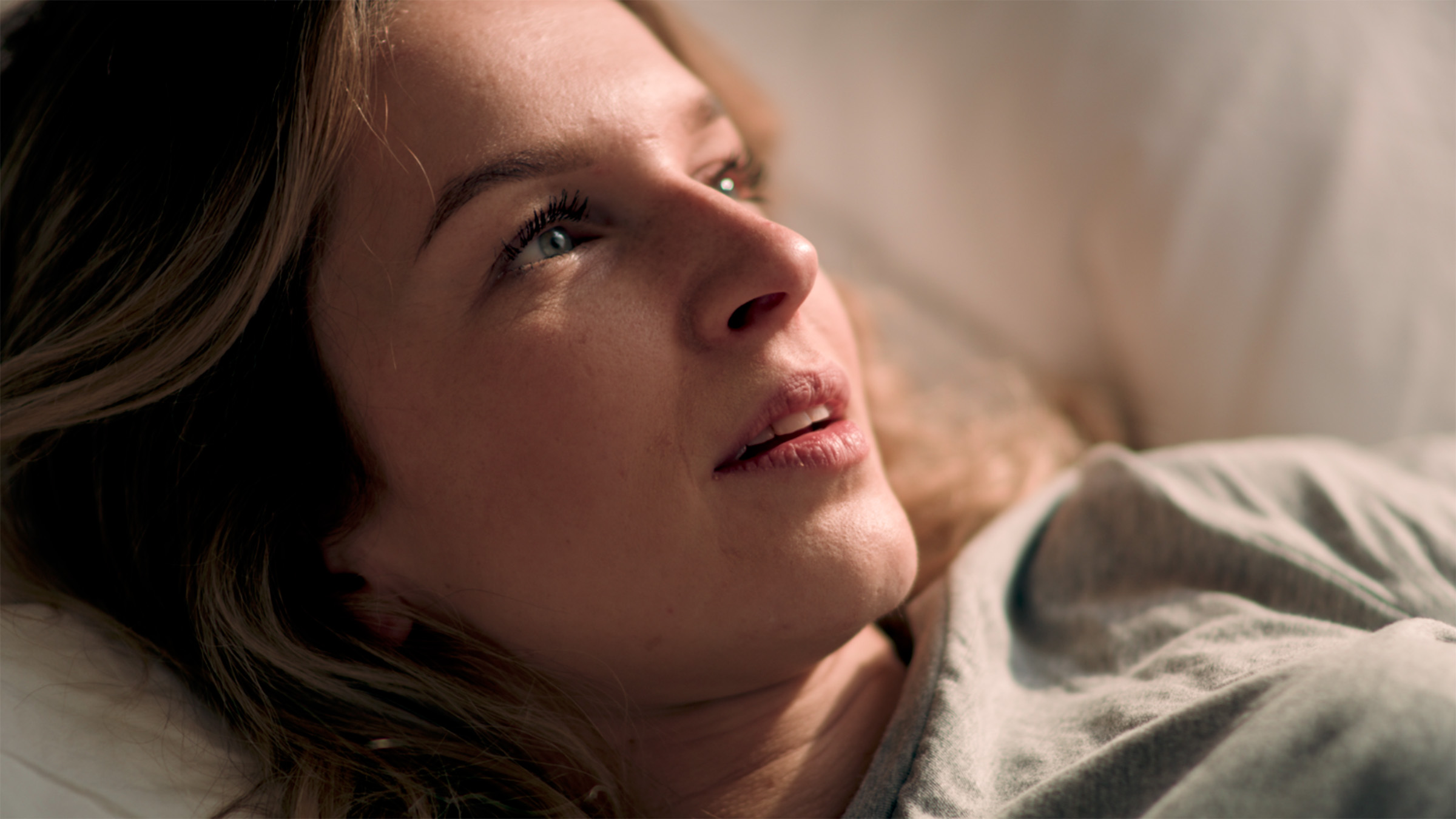
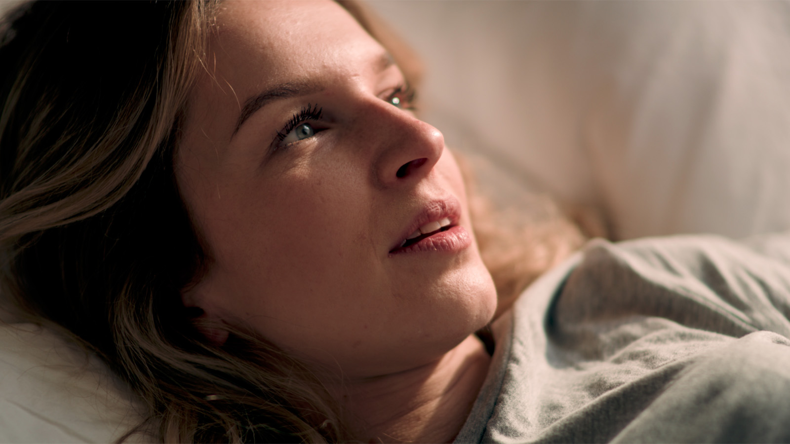
For instance, this sample image has a moderate to high contrast ratio because there is a significant difference between the light on the key side and the light on the fill side of the subject.
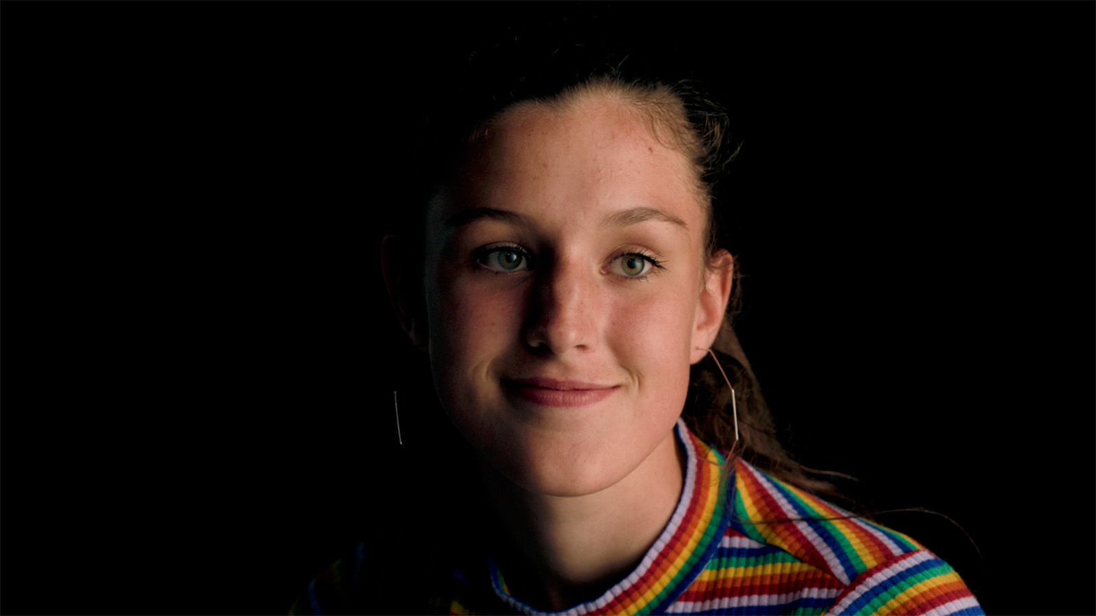
A great way to assess contrast in your initial image is to look at your subject’s nose. By evaluating how prominent and visible the shadow from their nose is, you’ll have a pretty good indicator of how high or low the contrast ratio is for that scene.
Assessing the contrast ratio of a scene
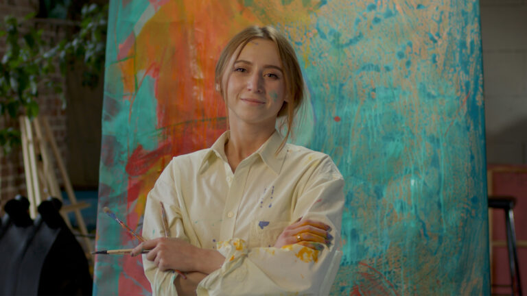
This leads us to the first way to use contrast ratio, and that’s as an assessment tool. When initially looking at an image, you should assess what the inherent contrast ratio of that image is. While our first sample image had a moderate to high ratio, the image below has a low contrast ratio.
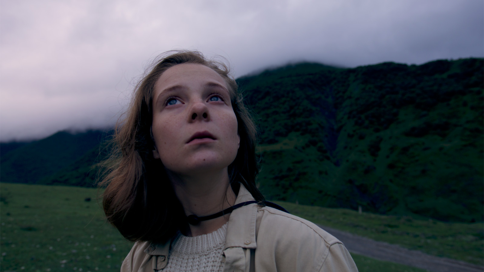
In this shot, the key light is the sun which is diffused by all the clouds in the atmosphere. If you consider the key side and the fill side of our subject’s face, there’s not much difference. That’s always going to create a much lower contrast ratio than if the scene was lit by direct hard sunlight.
Now, what is this initial assessment good for? For me, it means we can use the following rule of thumb: if you have a scene with a moderate to high contrast ratio, you’ll generally take a more conservative approach with contrast when color grading. On the other side of the spectrum, if you have a scene with a lower contrast ratio, you’ll likely increase the contrast ratio when grading.
If you have a scene with a moderate to high contrast ratio, you’ll generally take a more conservative approach with contrast when color grading.
So, the higher the contrast in-camera, the less contrast in post. And the lower the contrast in-camera, the more contrast in post. Of course, that’s not a one-size-fits-all prescription, but it is a useful rule of thumb.
Adjusting exposure with contrast in mind
Before jumping in and adjusting the contrast in our images, we’ll first need to get our exposure right. Exposure is the first step of any grading adjustments that I do. However, we’re still considering that initial contrast ratio assessment because we’re going to judge exposure based on the key side of the subject’s face.
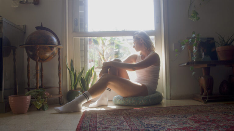
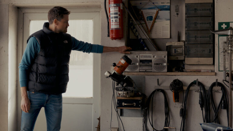
Our third sample image has a moderate to high contrast ratio with a relatively high exposure. Let’s say we want to change the feeling of the scene by dropping the exposure significantly. If you haven’t already, add a serial node at the start of the node tree and label it Exposure.
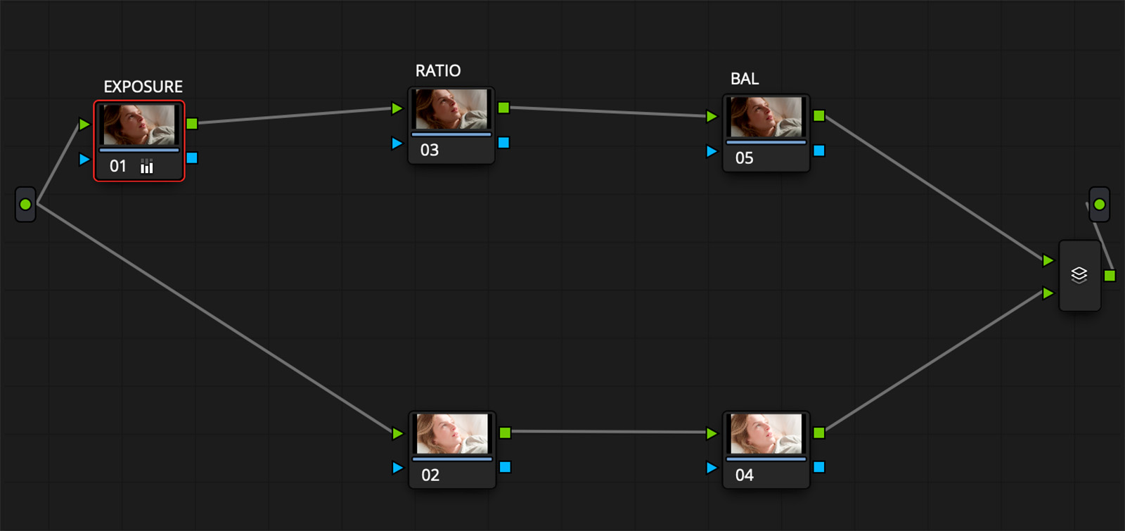
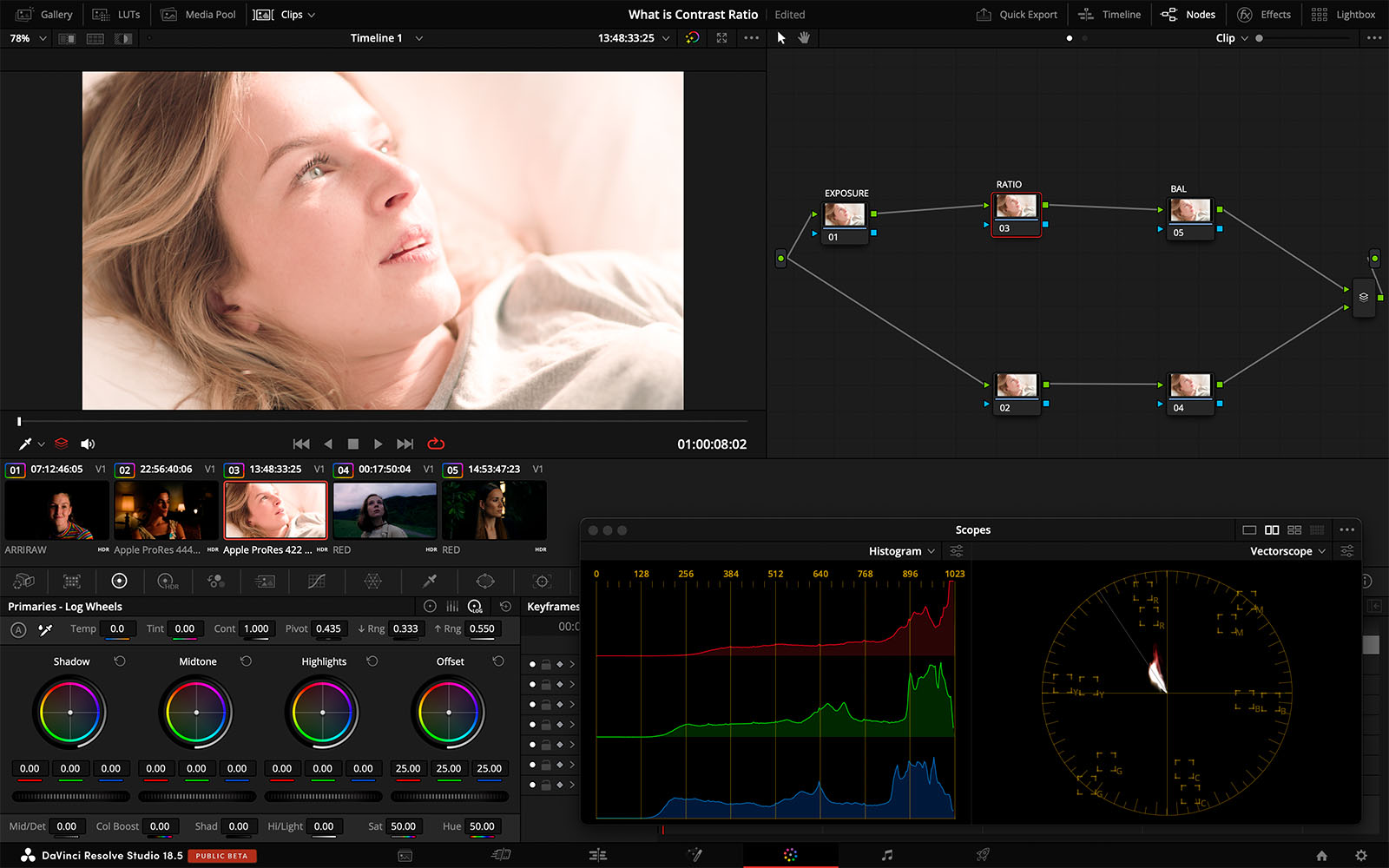
With your Exposure node selected, go to your Primaries tab and drag the Offset wheel to drop the exposure down. This reduces the brightness of the key side and emphasizes some of the facial details, making things a bit moodier. But when you look at the image as a whole, this exposure reduction also crushes some of our shadows in the fill side of her face, making the image feel a bit heavy, as you can see below. And, in this case, we don’t want to make it that dark.
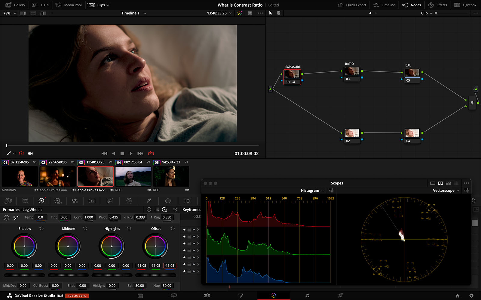
Not to worry. We’ll fix this by adjusting the contrast ratio. While there are many ways to do this—we could use Lift and Gain, for example—I prefer to use the simplest tool that gets the job done. In this case, I’m going to use my go-to preference, Contrast Pivot, which is found at the top of the Primaries tab, just labeled “Pivot.” So add a serial node to the node tree after your Exposure node, and label it Ratio.
With this node selected, go to the Primaries tab and drag the Contrast value down to bring back a better balance to the overall contrast ratio. Then, lower the Pivot value to shift the contrast softening so that it affects the shadows more than the highlights.
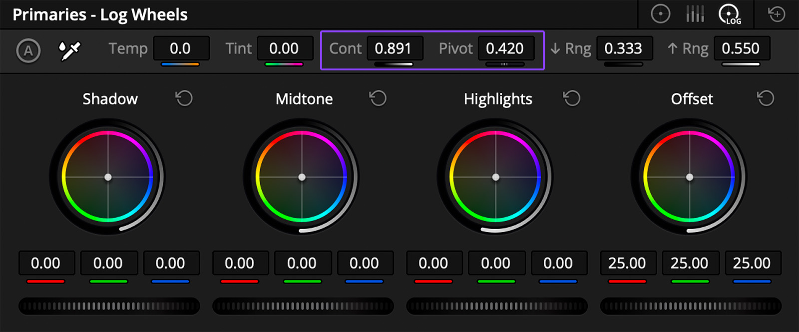
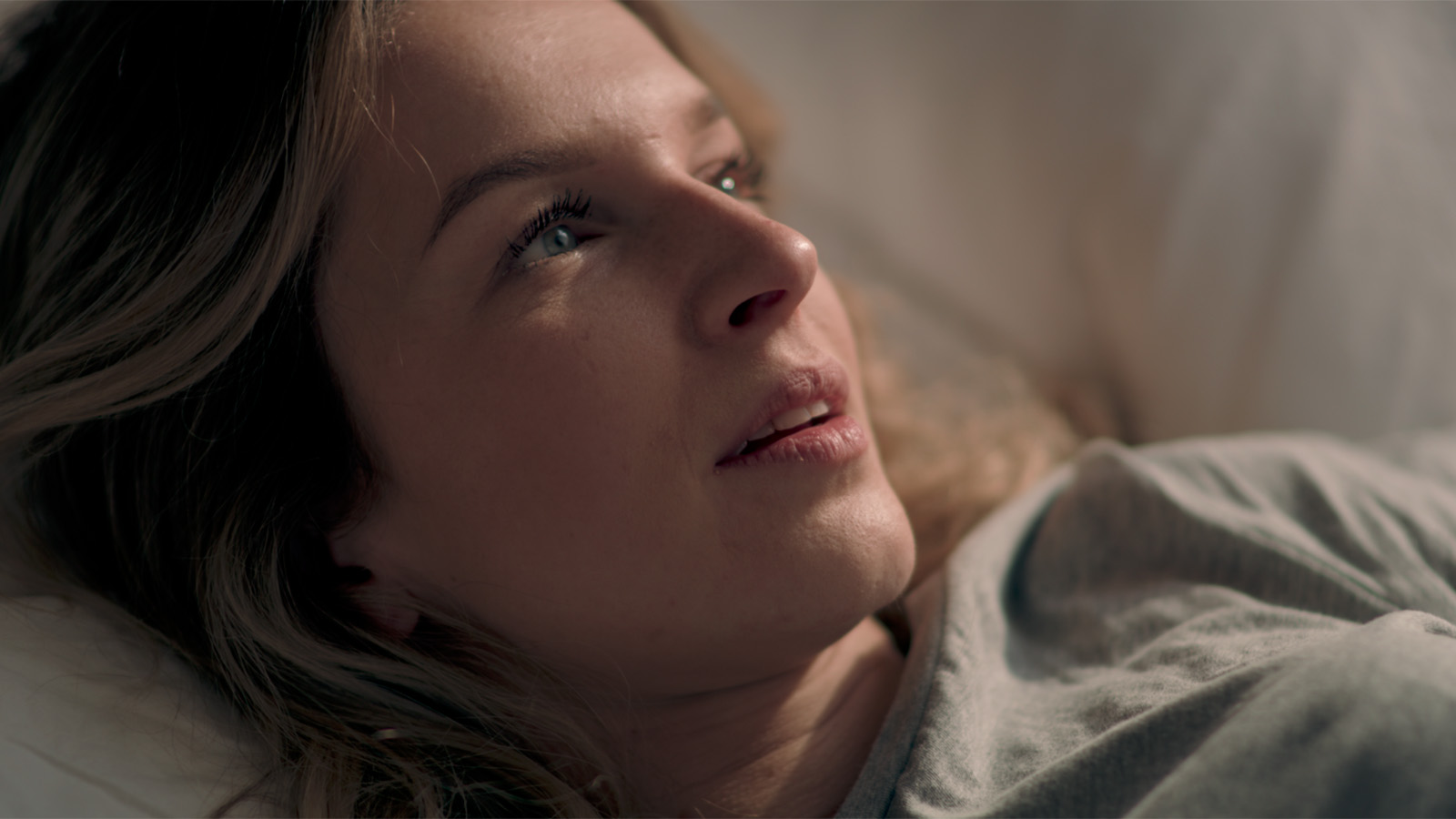
In simple terms, all we’ve done is assessed the original image, then taken the shortest path to driving it where we want it to go.
A different approach
Let’s do a quick experiment and come up with a completely different recipe to grade this same image. (If you’re following along, make sure you reset your Exposure and Ratio nodes.) This time, we’ll set the Exposure to a value that’s more open that it was in our previous example, which lowers the contrast ratio of the scene when compared to the original camera negative. It looks like this.
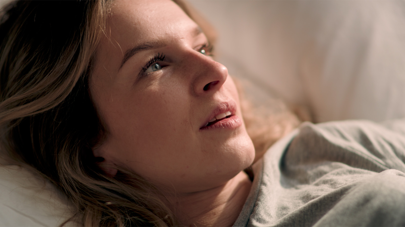
Now, we’ll introduce contrast to the image, specifically on the fill side.
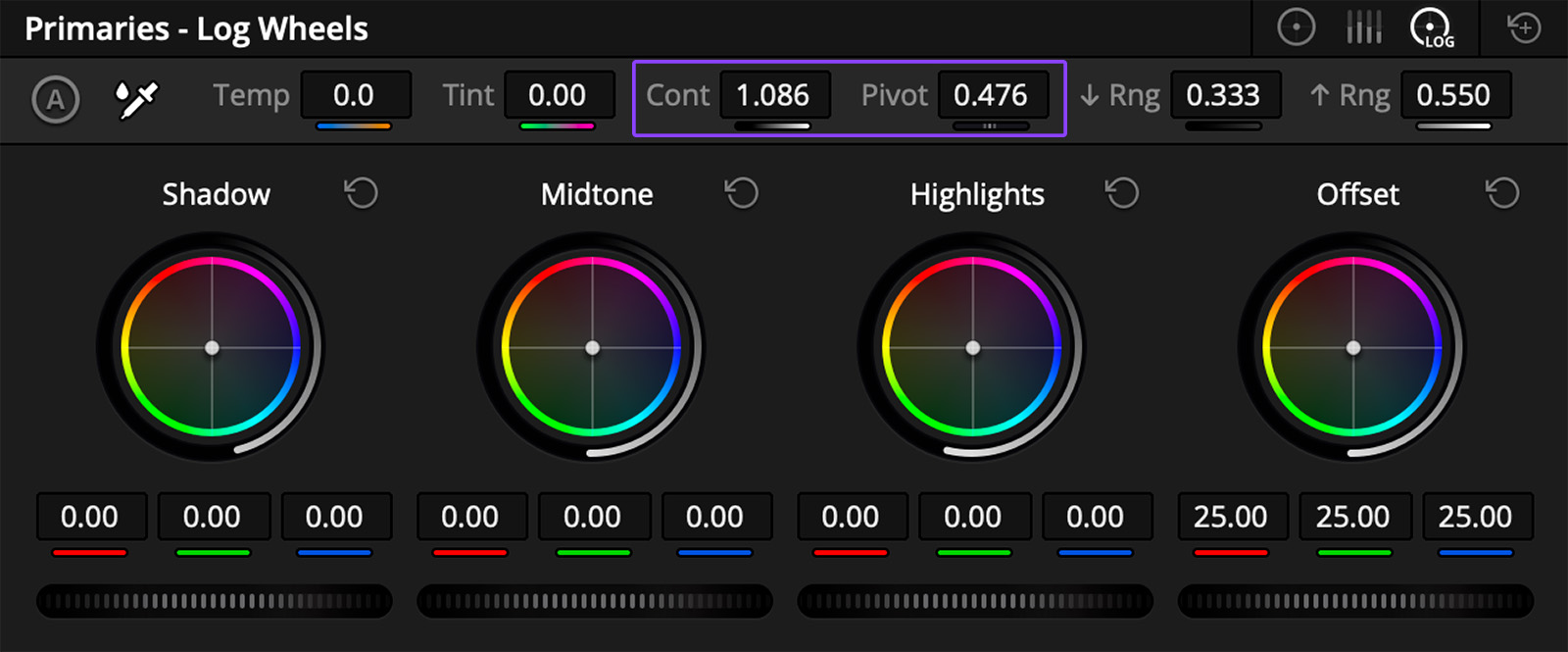
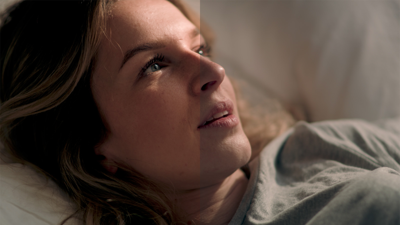
When you compare the results of these two adjustments, as shown above, you can see that they’re totally different. The tools we used were simple and easy to control, and applied in a way that supports the original contrast ratio of the in-camera footage. Breaking it down into to simple steps, we have our original footage from which we can assess the original contrast ratio. We then decide what our intent is and adjust the exposure to bring the image closer, then use the Contrast and Pivot controls to add (or reduce) contrast based on the look we’re after.
This is not the only way to reach this goal—it’s a big subject and there are a lot of different tools that we can use to manipulate it. But the important thing to remember here is to anchor our work in to the intentions that were captured on set, maintaining a photographic context for the contrast in our grades.

