If you’ve read any of my other articles here on Frame.io Insider, you know how passionate I am about the idea of thinking photographically about color grading. By this I mean carrying the concepts and methods of cinematography into the color suite. All too often, we discard the ideas of cinematography when we enter post-production and swap in an entirely alien set of tools and language. That comes at the detriment of what we’re trying to accomplish for our images.
Before we start, I want to emphasize that there is no such thing as “over” or “under” exposure. Exposure is an expressive tool. Just because an image feels more airy or open or bright, that doesn’t mean it’s overexposed. And just because an image feels more moody or murky or makes you lean forward to see the hidden details, that doesn’t mean it’s underexposed. Exposure is simply a matter of creative intent.
Just because an image feels more airy or open or bright, that doesn’t mean it’s overexposed.
The only exposure that’s “over” or “under” is an exposure that does not yet agree with the creative stakeholder’s intent for that shot. That’s what we’re going to focus on today as I cover how to move exposure as a colorist using DaVinci Resolve.
Building our color-grading foundation
As always, I’d point out the foundation that I build all my grading projects upon. First of all, I’ve set up my overall color management for the project, which means I’m using good color science to automatically take me from what my camera saw into what my display can reproduce for all of the clips on this timeline. If you’re not familiar with color management, check out my DaVinci Wide Gamut series for a great overview of my workflow.
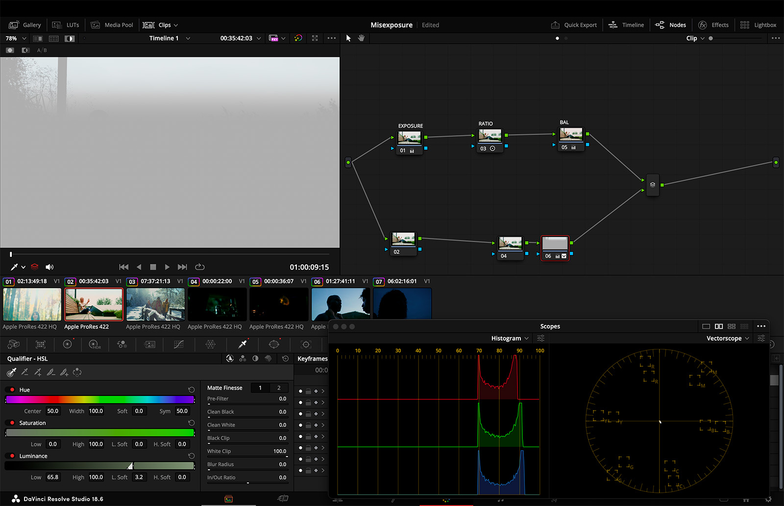
My next foundational step is creating a template node graph for all the clips in my timeline. Each node is prelabelled to capture the idea within that node, the primary three being Exposure, Ratio (contrast), and Balance (color.)
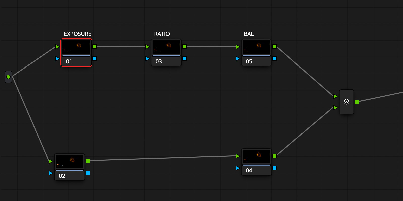
There’s nothing currently happening in these nodes, but it gives me a structure to operate within as I move into each shot and start to make adjustments within them. Let’s get right into that first node, Exposure.
Exploring the negative
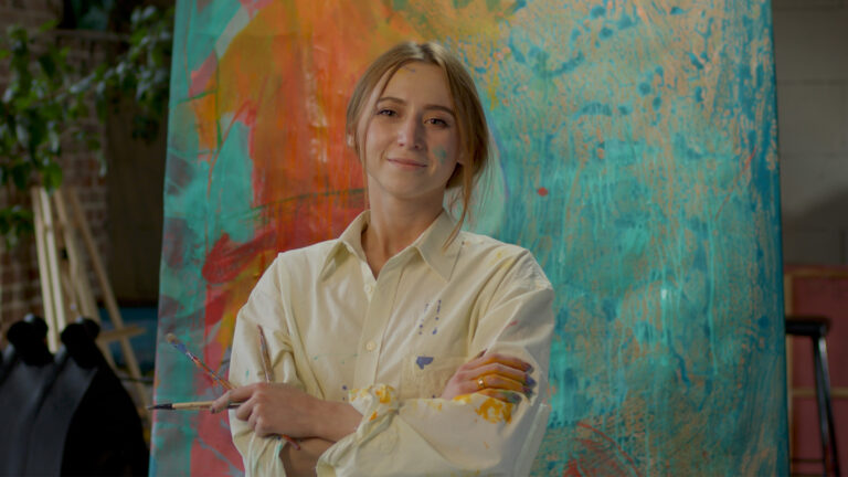
This first sample image is a great example where we might look at it and say, “Hey, I want to bring that in a little bit, it feels a little bit overexposed to me.”

The first thing that I do on almost any image that I grade, regardless of exposure concerns, is to just see what’s going on in the image exposure wise. Photographically thinking, I want to see what’s in the negative.
My preferred method to examine an image is via the Offset slider. For a bright image like this, slide the offset strongly to the left, deep into the negative territory, to lowever exposure so far that you see what detail remains in the image. This is way further than you really would go in a color grade, but again, it’s just to see what’s in there.
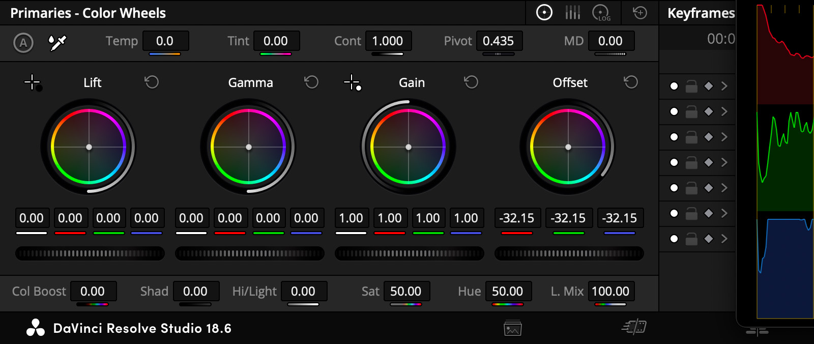
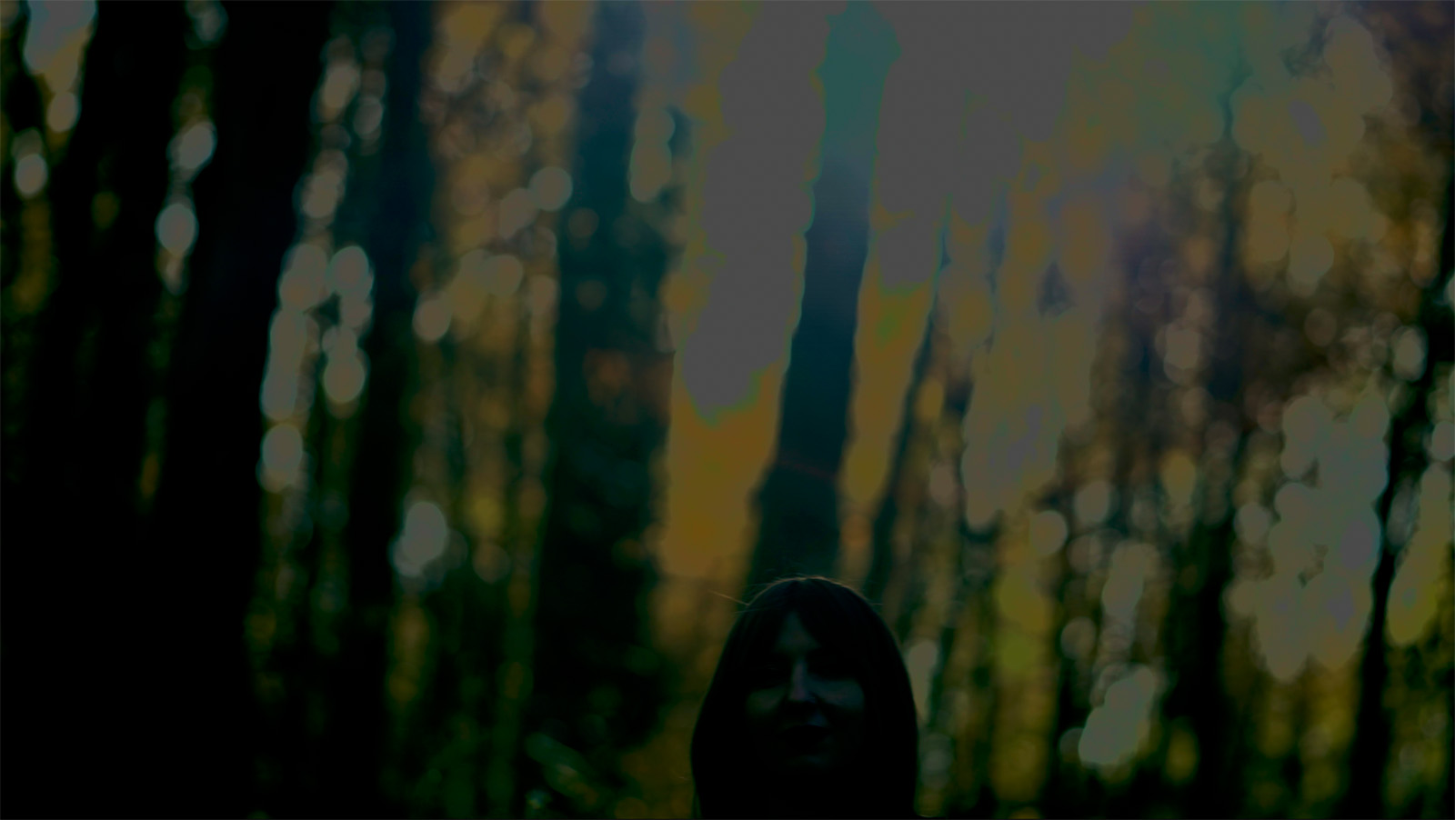
Notice those highlights that are not recovering detail? Those are what I would call pinned highlights and they’re burned into the negative. Keep those in mind and look at the sample image below, which I’ve corrected for a more normal “middle gray” exposure for our subject’s face.
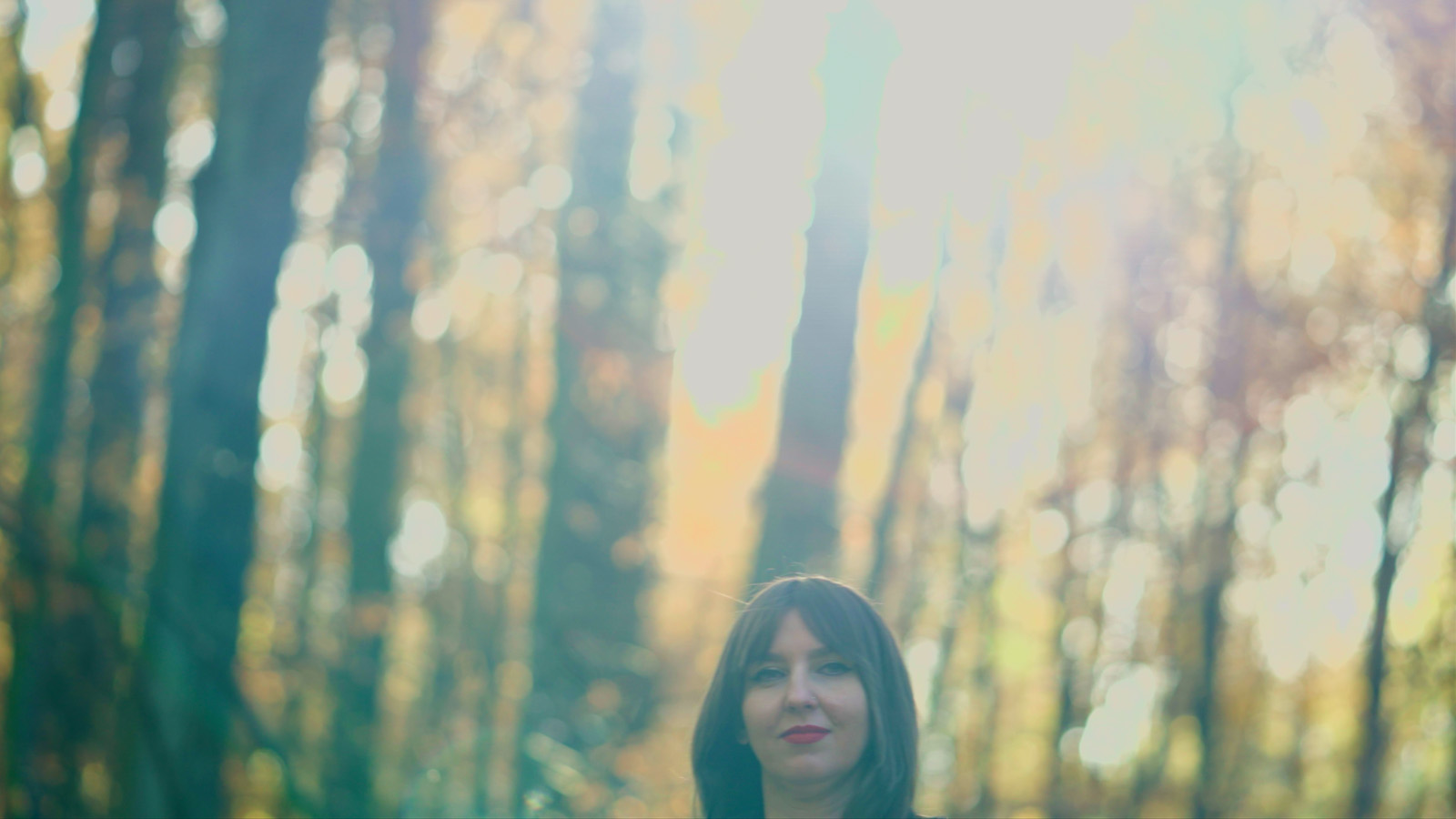
This new exposure puts us into something I talk a lot about, where we’ve devised a solution that is actually worse than the problem it solves. The subject’s face looks normal but all the pinned highlights are giving us this strangeness happening up in the high end.
Explore the evolution of your shots
Here’s a crucial thing that is really easy to forget with exposure–don’t forget to press play. Don’t forget that every shot evolves. Before you start swinging your exposures all around, you want to make sure you’re not misinterpreting the intent of the cinematographer.
Here’s a crucial thing that is really easy to forget with exposure–don’t forget to press play.
In this case, I would argue this is a shot that is designed to evolve. A few moments later, this flare goes away and I actually feel like this lands in a really sweet spot. Depriving a shot of its ability to evolve is something we really want to avoid as colorists.
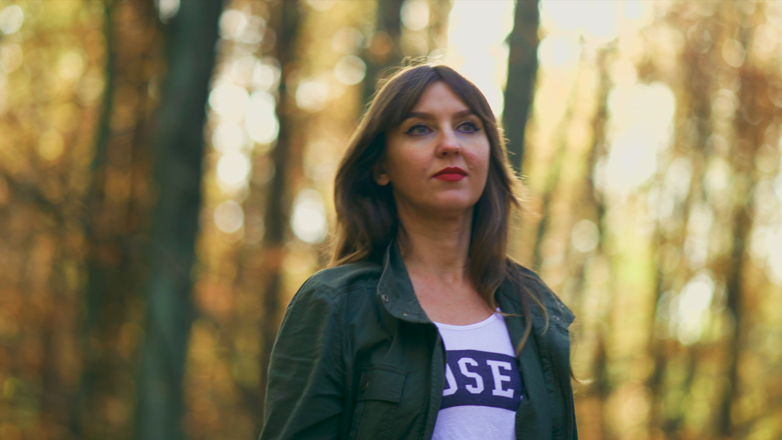
Knowing this shot evolves, I’m pretty good with letting it run hot at the beginning and letting it land where it does. If we wanted to get fancy, we could keyframe an exposure adjustment, to replicate an iris pull, but honestly, I really like watching shots evolve. So make sure that you’re not doing work that isn’t necessary or, even worse, running counter to the production team’s creative vision.
Softening the highlight transition via saturation
One last note about those is that they feel extra clipped because often there’s a hard edge between saturated stuff and very unsaturated stuff. My tip for handling that is go to the Lum Vs Sat curves, grab the rightmost control point, and just dip that down a little bit, around 0.8 is plenty.
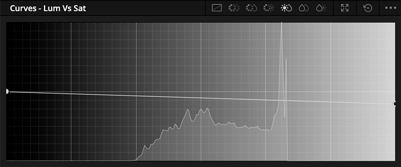
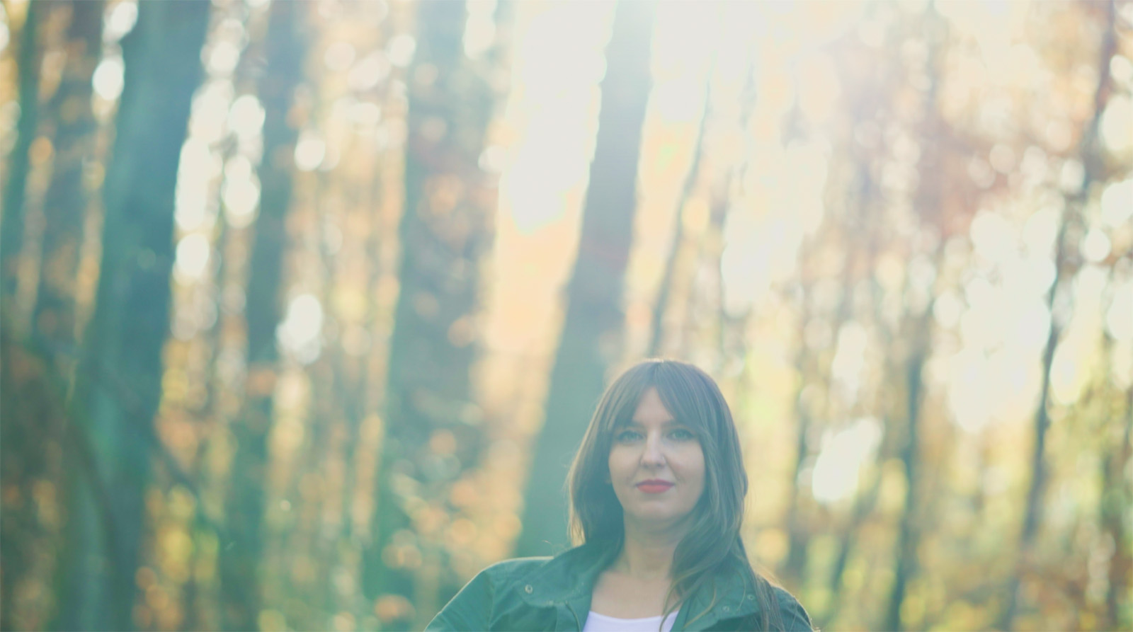
That’s going to have a pretty minimal effect on your subject and colors like her lipstick, but it’s just going to smooth out that transition between very high exposure and truly clipped values there at the top of the container.
How to create something from nothing
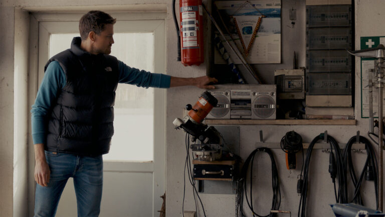
Moving on to shot number two, let’s talk about something we’ve all had to deal with at some point: optimal exposure on your subject but a sky that’s completely devoid of any detail. So what are we going to do here?
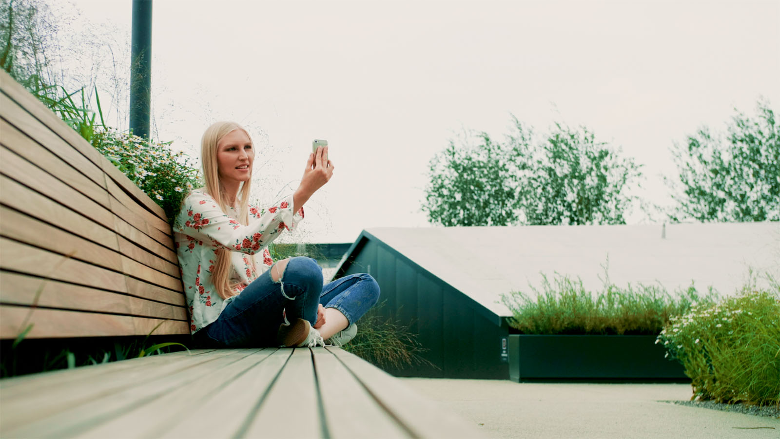
Well again, let’s explore this image with the Offset wheel and see what’s in there. Nothing, there is nothing in there. Whether that’s because the sky is clipped or whether that’s because there’s not much going on in the sky, it’s hard to tell exactly.
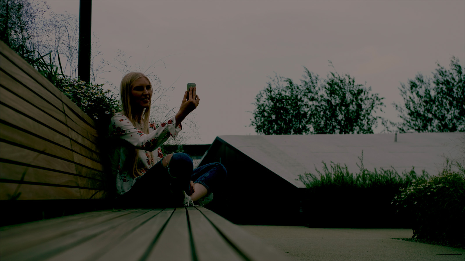
So that tells me I need to adjust my expectations and do what I can. Again, we’ll need to be cautious about devising a solution that is worse than the problem that it’s meant to solve.
Here’s what I’m going to do about this sky–we’re going to do a grad, or gradient adjustment. Create a circular power window and set the aspect ratio to 100, turning into a horizontal grad. Then, position the power window at the top of the frame and crank the softness up to go super, super soft.
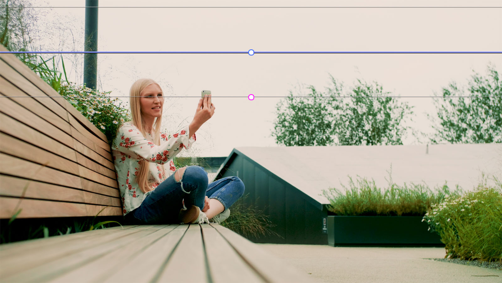
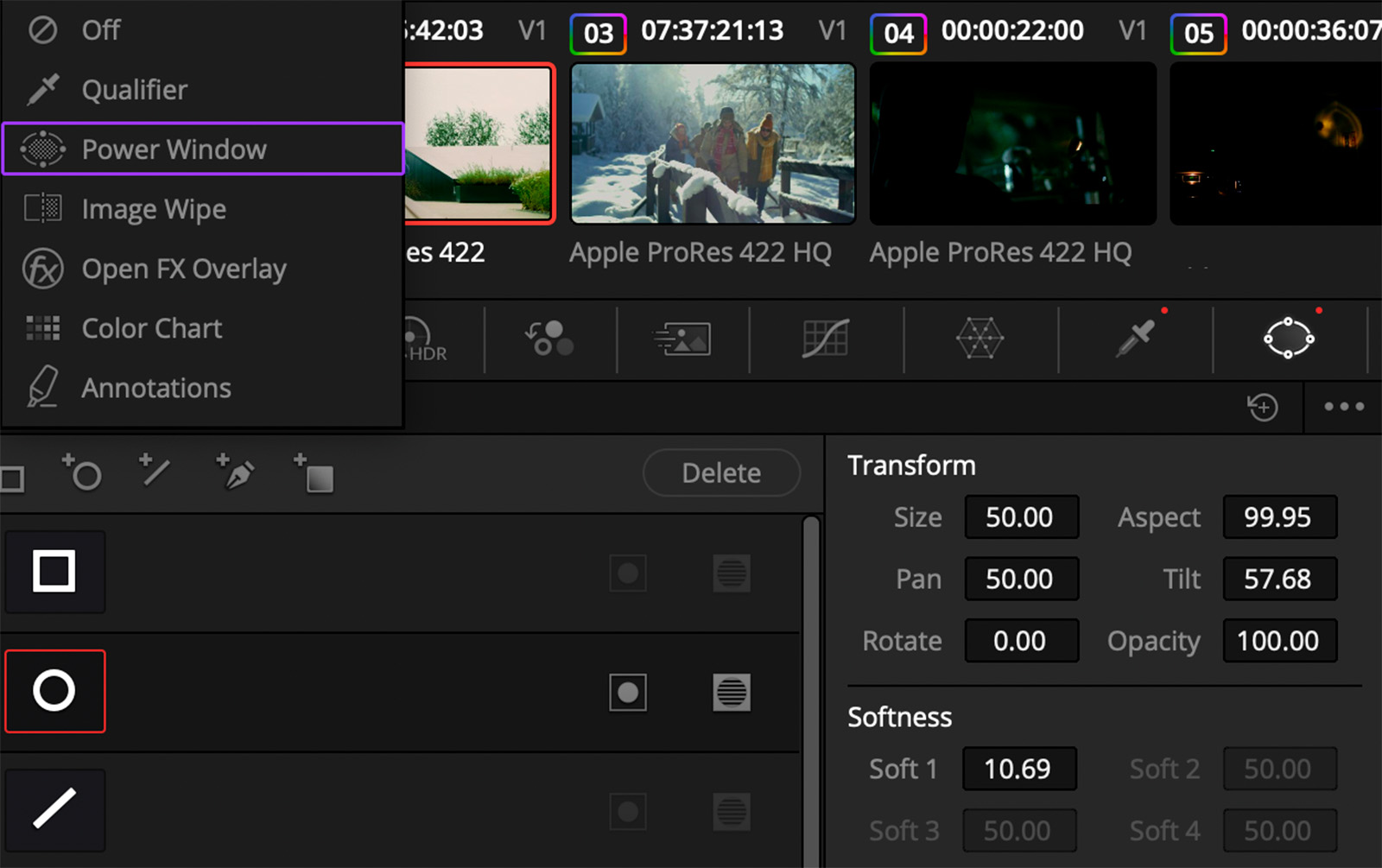
With the top of the node isolated, we can start to nudge things toward blue ever so slightly. This is all about being sneaky and it’s so easy to go too far. But if you do it just a little bit, it can give you a nice subtle feeling that maybe there’s a little bit going on up in the sky, adding some shape up there.
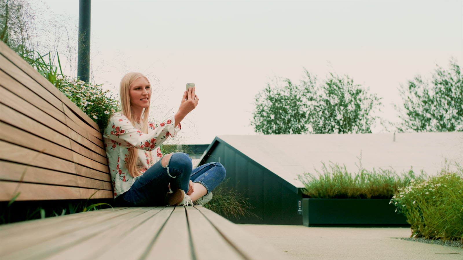
However, did you notice we added some blue into parts of the image that aren’t the sky, like the telephone pole? Remember, we don’t want our solution to be worse than the problem.
Go to your Qualifier and just using the Luminance slider, sweep up to only select the high end of the luminance spectrum, your sky. Now, the little vegetation there and telephone pole sticking into our power window are excluded.
OK, that sky is feeling really good to me but it shifts how I feel about the rest of the image. Using the Gamma color wheel, add some little nudges in a warm direction. We’re just trying to warm things up a little bit to help credibly sell the idea of a sunlit day.

We’re not magically re-lighting the shot; that’s beyond our domain as colorists, but we are making things a lot better without overly manipulating the image.
How to handle a high-contrast scene
Our next example is a winter scene, and there are few things harder to expose than high-contrast environments like snow. If we drastically drop our exposure, we again see the highlights are pinned and lack any usable detail. The digital negative is showing us the limitations in this image.
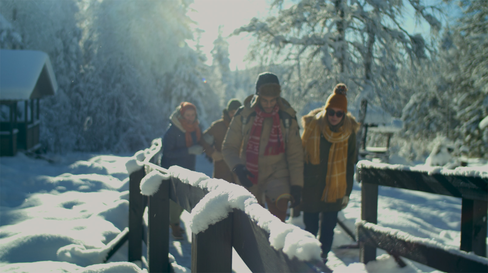
However, that’s really not a problem until I make it a problem. As long as I don’t pull the exposure too far in from what the negative will allow, that lost detail is totally fine. Snow is white, and the sun is shining–viewers will accept this scene. Here’s how I handle pinned highlights in a situation like this.
Bring the exposure down with the Offset wheel, just a little bit, to get the image at a good level overall. Next, we’ll lower our Contrast knob down while increasing the Pivot knob. This combination reduces overall contrast but shifts that adjustment more into the high-end luminance, softening the transition in the highlights.
To compensate for the lower contrast, increase overall Saturation slightly to make things feel a bit more vibrant. The last step is to copy and paste the Lum vs Sat curve adjustment we did earlier, smoothing that transition between colorful areas of high luminance and pinned highlights.
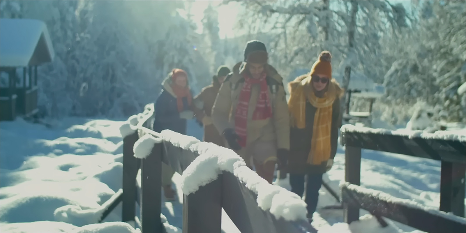
It’s funny how sometimes our awareness of clipped highlights can be worse than actually what we’re seeing.
Increasing exposure on images properly
To round things out, let’s look at the other end of the spectrum with exposures where we want to move things toward being more open.
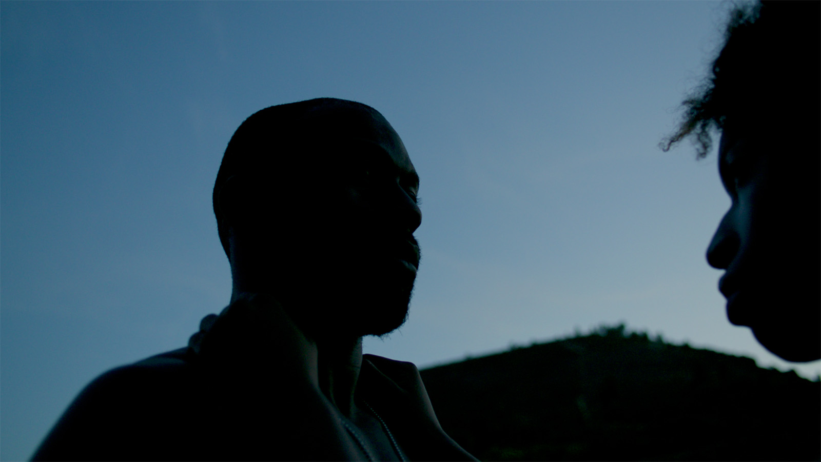
In this sample image, I know ultimately, I’m going to end up doing some amount of exposure opening but I just don’t know how much. Again, I want to be informed by the image, so instead of spinning the Offset wheel to the left, I’m going to spin it too far to the right and just see what’s in the negative.
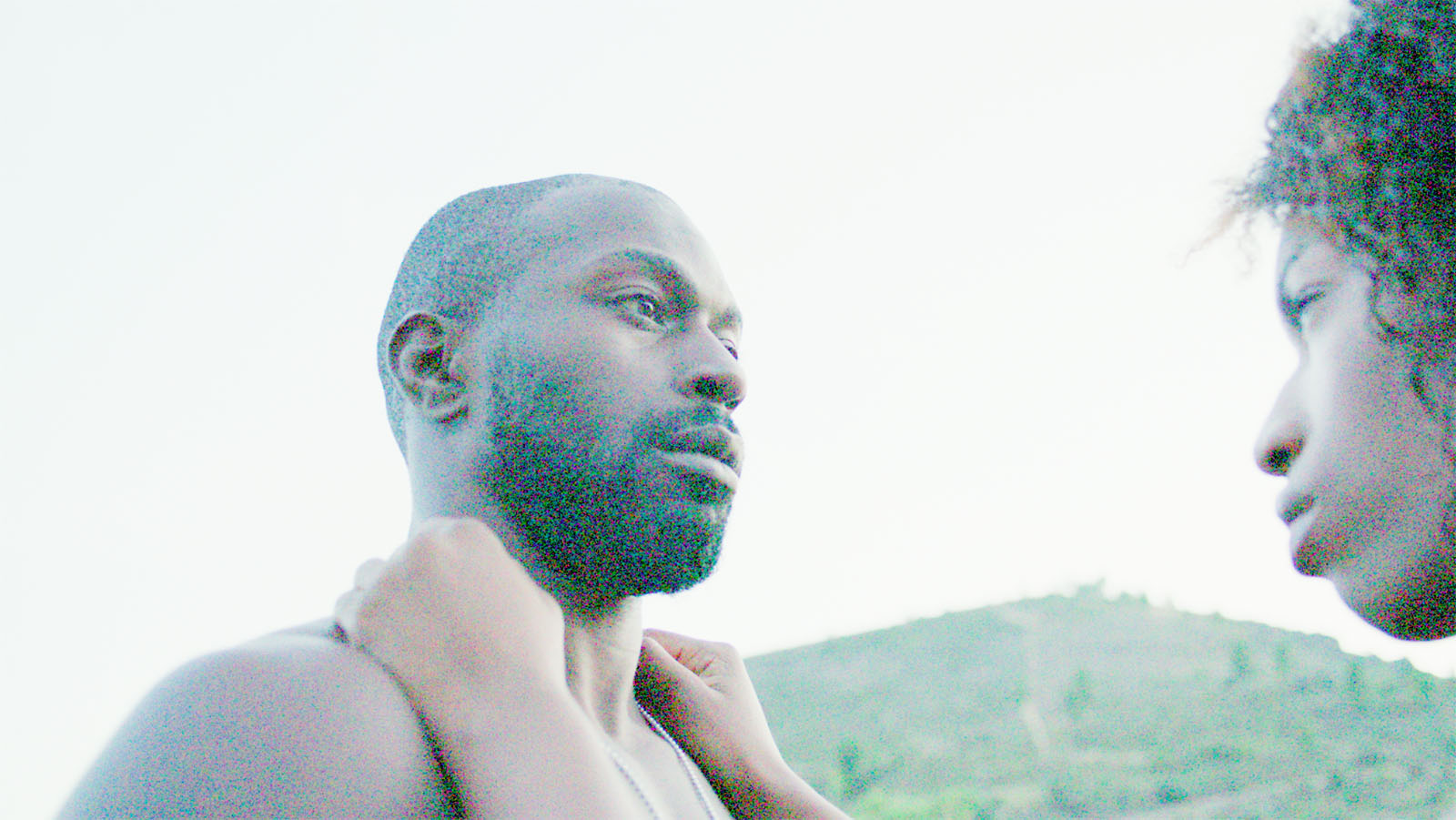
So we’re definitely seeing the noise floor here in the subject’s beard, but again, I’m not going for a specific grade, I just want to see what’s in the camera negative. This knowledge will help guide my adjustments and realize that there’s probably plenty of room for opening the exposure.
My preferred method for moving exposure is, of course, the Offset wheel. For this image, I’ve raised it a fair amount to see more detail but kept things feeling dark and moody.
After bumping up exposure, soften the overall contrast to bring in the ends of your luminance curve, similar to the snow image. Next, add a bit of saturation to compensate for the loss from dropping our contrast.
Now, because we’re opening up quite a bit. we are seeing a little bit of noise. I’m going to hit it with just a little bit of noise reduction, nothing crazy. Quick note: I like spatial noise reduction over temporal noise reduction, but that’s a topic for another time.
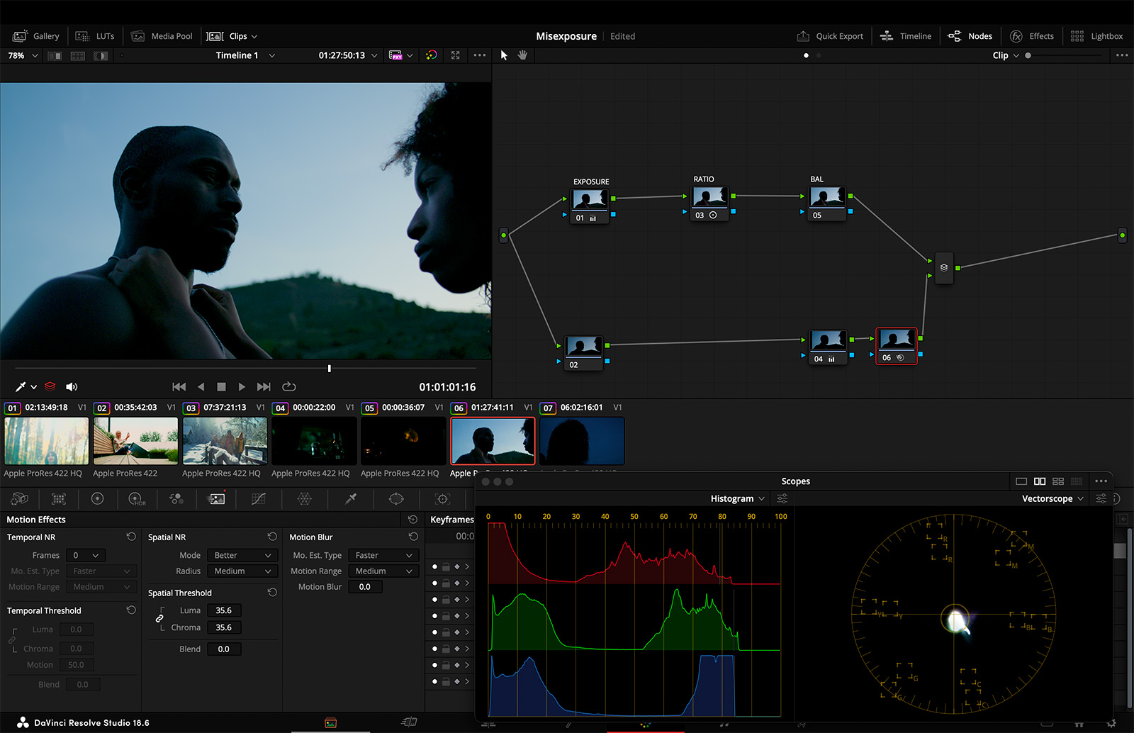
This is a good example of taking an image that could use some more exposure and doing that in a reflexive way, based on what the negative showed us. Again, it’s worth emphasizing that we’re not looking for a “correct” or a “good” exposure. If we want to move things more open, we can, up to the limits of what the shot will allow. But it’s not about getting it to some sort of arbitrary ideal.
Conclusion
So this is an emerging theme: we want to know where we want to go creatively, but we need to let the image guide us to get there. The truth is we can’t take a random image and guide it toward any arbitrary point on the map. All images have places they can go and places they really can’t go. And if we try to take our image to a place that it can’t go, we’re not going to succeed in our color grade.
I hope these are some useful principles to think about when moving exposure from point A to point B. It’s about balancing where we are and where we want to be and then moving that way while letting the footage inform the process. Remember, the footage will tell us whether it’s going to let us go all the way, halfway, or a little bit of the way, and then we navigate artfully with what it will allow.
There’s something strong and something beautiful about any image that we shoot, and ultimately, we want to lean into that.
There’s something strong and something beautiful about any image that we shoot, and ultimately, we want to lean into that as opposed to trying to get it to an arbitrary point that we’ve decided is going to be best for the material.
So that’s a good initial discussion on exposure, and honestly, there’s a ton to think about when it comes to designing and shooting and then ultimately finessing exposures. It’s a big subject, and in a way, it’s the fundamental consideration of filmmaking, so it would be hard to over-discuss it.


